Care that goes beyond ‘closure’
Reclaiming brand authenticity from a sea of fast-followers
A trendsetter in modernising Singapore’s deathcare industry, Direct Funeral Services needed a way to strategically differentiate itself from imitators.
BELIEF, NOT BUZZ WORDS
What if you question an industry catchphrase and discover a deeper truth about your brand? That is what happened when Direct Funeral Services approached &Larry to help with its rebranding.
Well known for the philanthropic acts of its founder Roland Tay, Direct Funeral had been amongst the first in Singapore to adopt a modern approach to funeral services. Now led by Jenny Tay, the company had adopted a formal western attire and updated its services and related designs for a younger generation. However, competitors soon followed suit and co-opted her talking points, especially about how Direct Funeral ‘brings peace of mind’ and ‘helps people find closure’.
During the brand audit, which included in-depth interviews with stakeholders and customers, we soon discovered that Roland’s heart for helping people ‘directly’ shaped the outlook of his business and the staff’s service attitude. The other key insight came from customer responses that fell outside the distribution curve: while most people said that ‘closure’ meant ‘performing rites correctly’ or ‘providing a good send-off’, a small but vocal minority raised the fact that they could never truly ‘close their hearts’ to departed loved ones. &Larry translated these insights into a new brand story and strategy that not only made sense to the owners, but also clarified the company vision.
It was as much about filial piety as it was about starting an honest dialogue about death – without the lingering taboo – and seeking a way to live on with the memory of the departed.
CODIFYING EMPATHY AS A CORE TENET
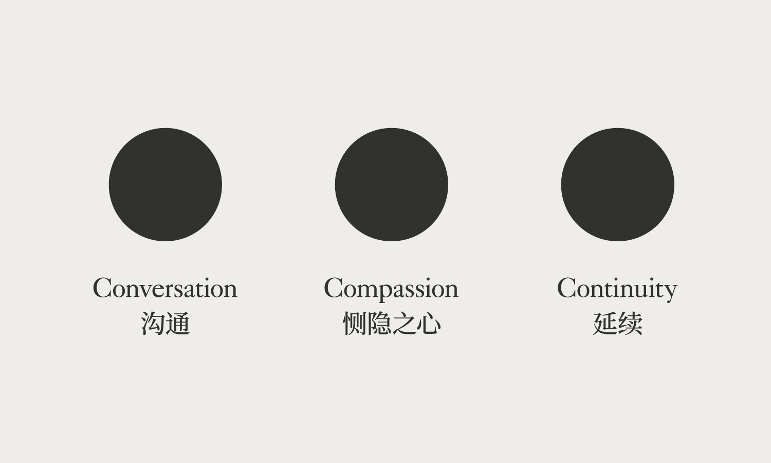
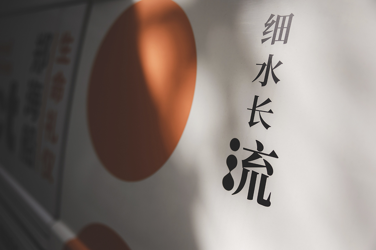
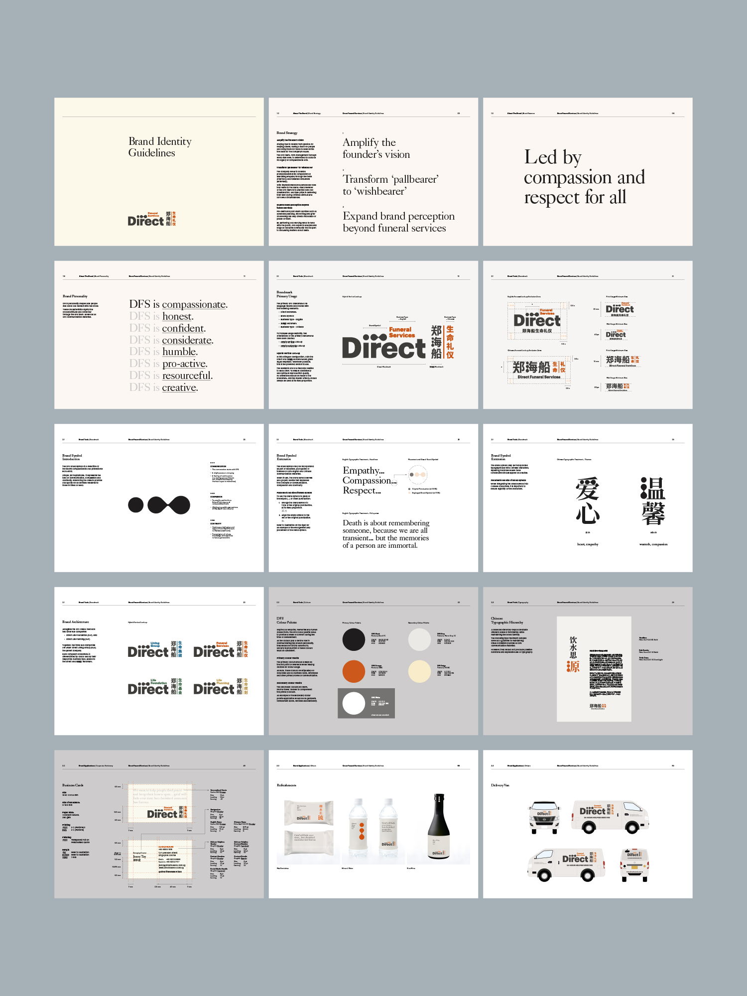
Leaving ‘closure’ behind, we now moved to develop a more authentic and meaningful way to differentiate Direct Funeral. Taking the totality of what we had learnt about the brand, we refocused the brand direction around the concept of ‘finding peace and keeping an open heart’. The three pillars of Conversation, Compassion and Continuity were codified into the Brand Strategy and represented by the visual device of an ellipsis, the punctuation mark that signifies ‘to be continued’.

A LIVING LEGACY
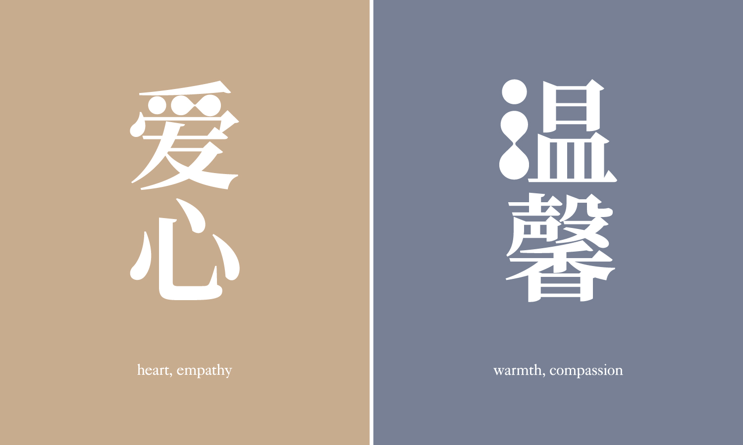
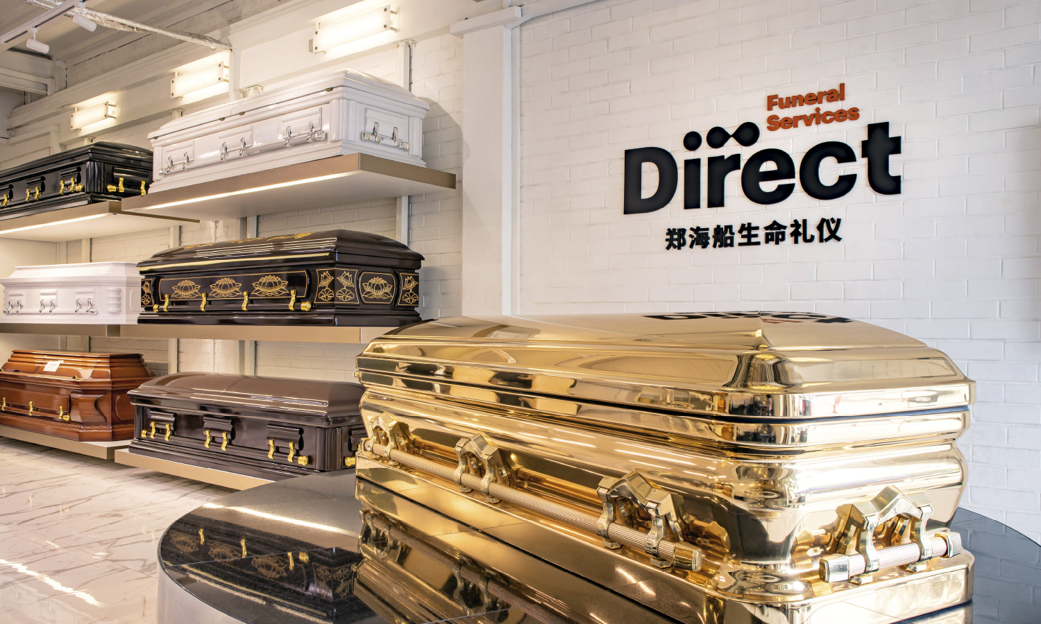
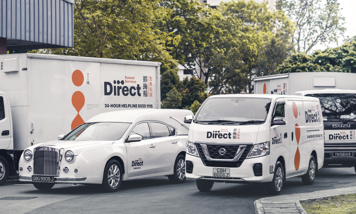
The beauty of the new branding is evident in the way the stylised ellipsis is meaningfully incorporated into the brandmark. In English, the three dots symbolise a continuation of life; when positioned vertically in Chinese, it becomes the radical for ‘water’ – symbolic of ‘knowing one’s origin’. Even the brand colour was atypical – a distinctive shade of orange to go with a tweak in the Chinese name to emphasise ‘life’ over ‘death’.
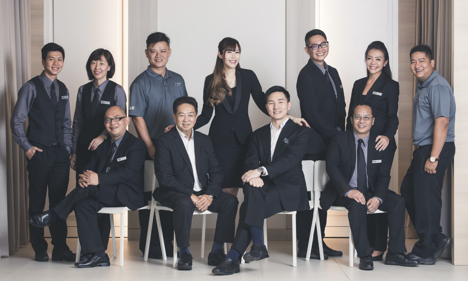
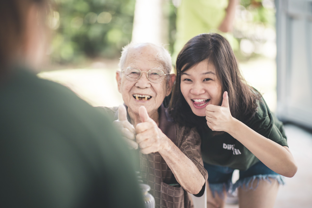
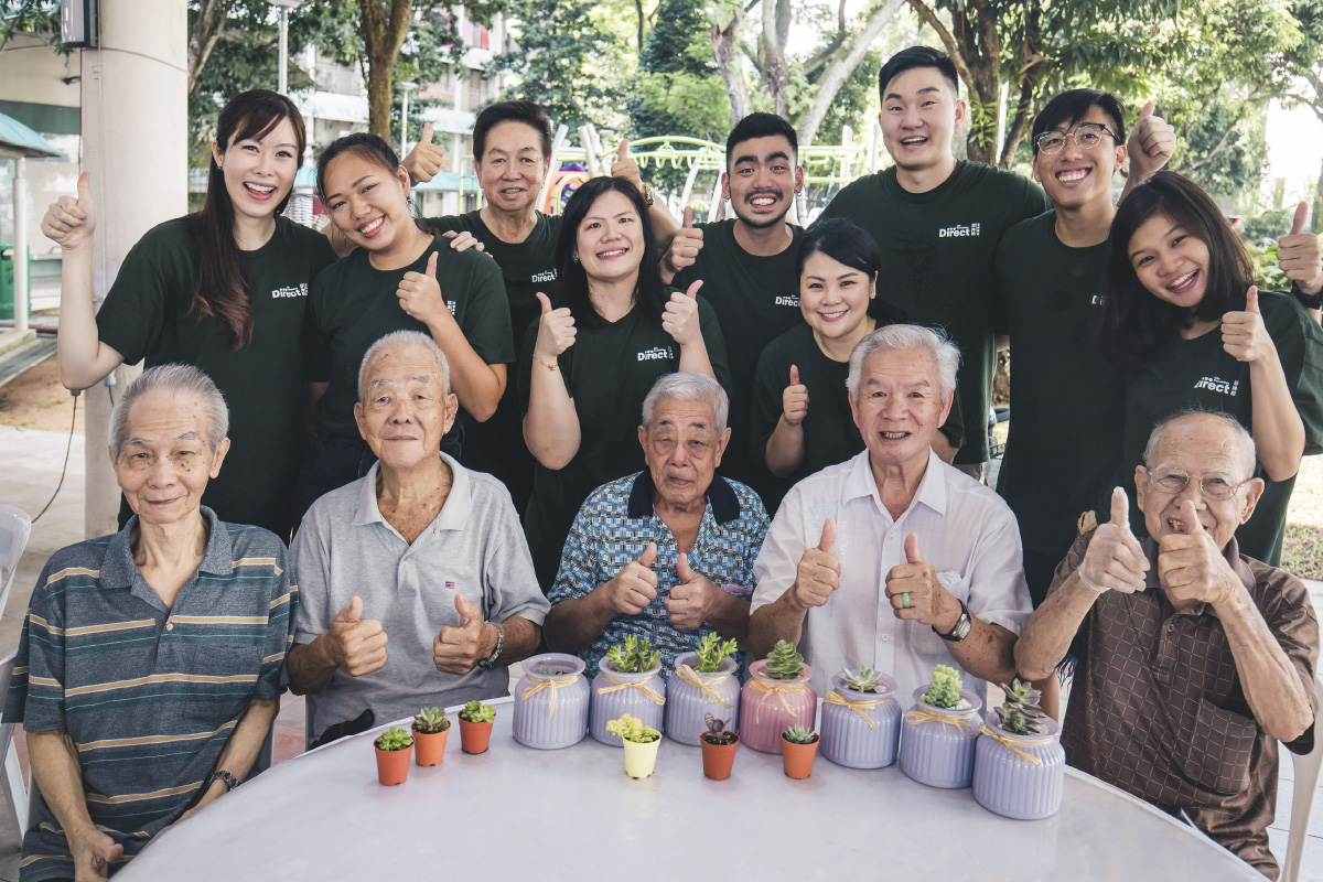
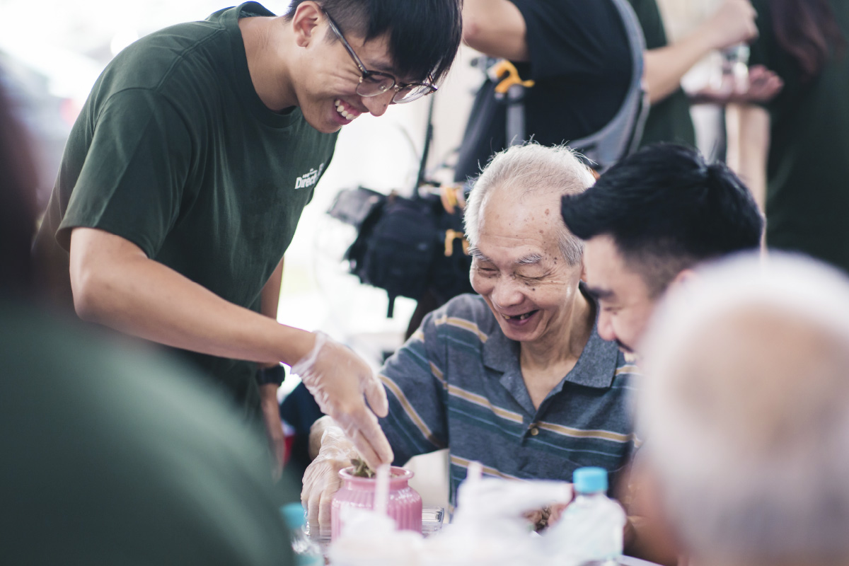
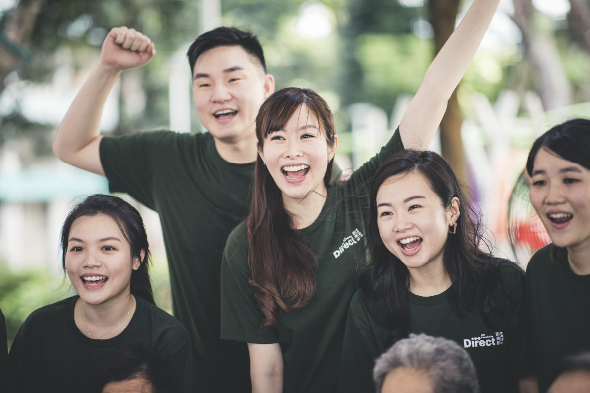
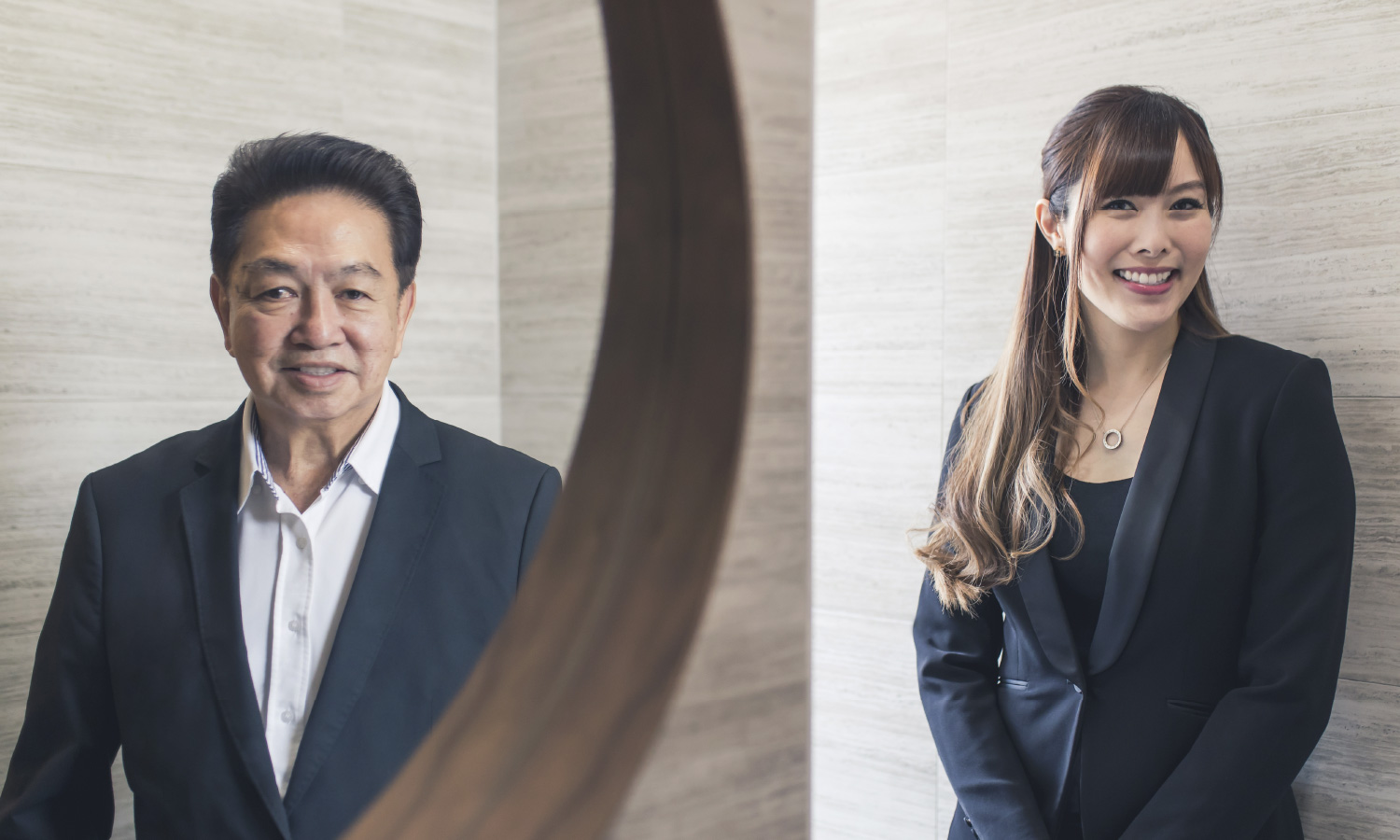
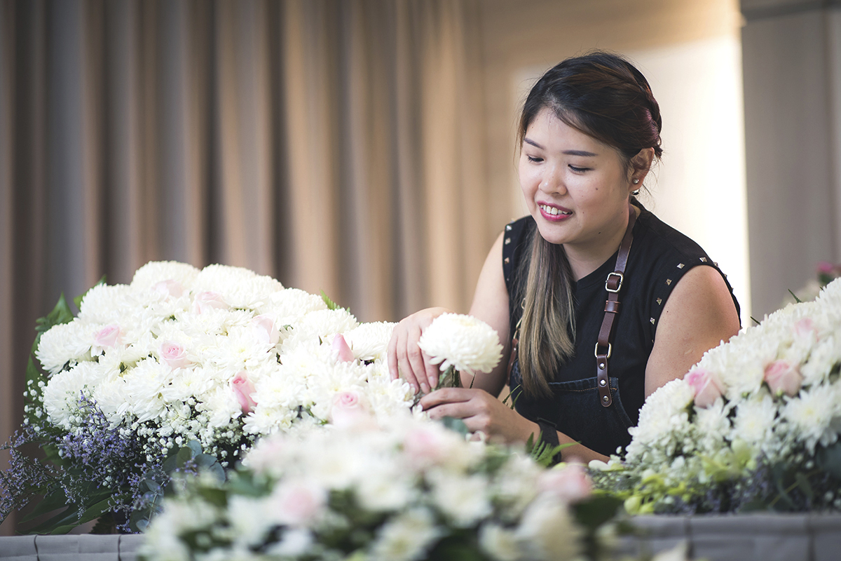
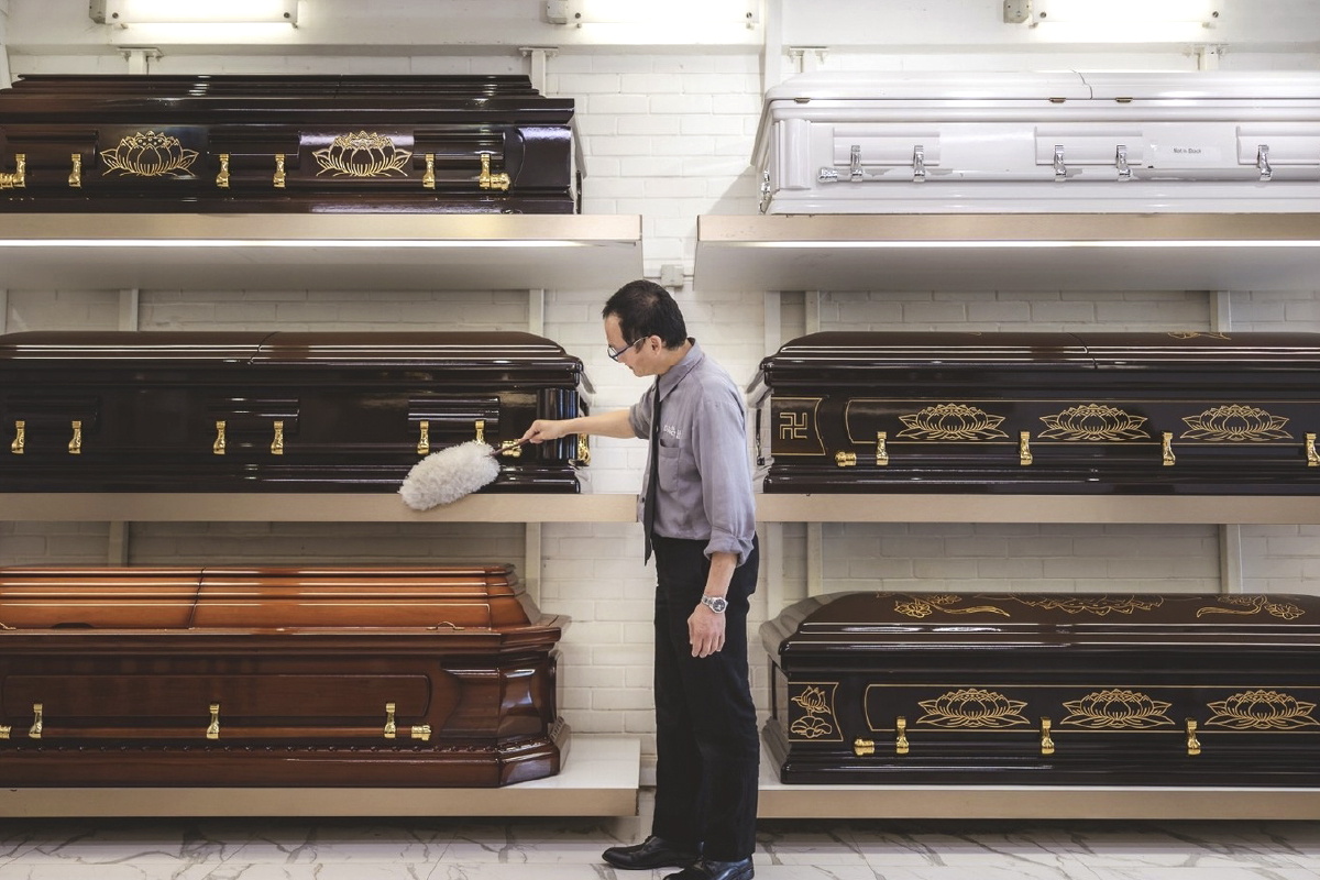
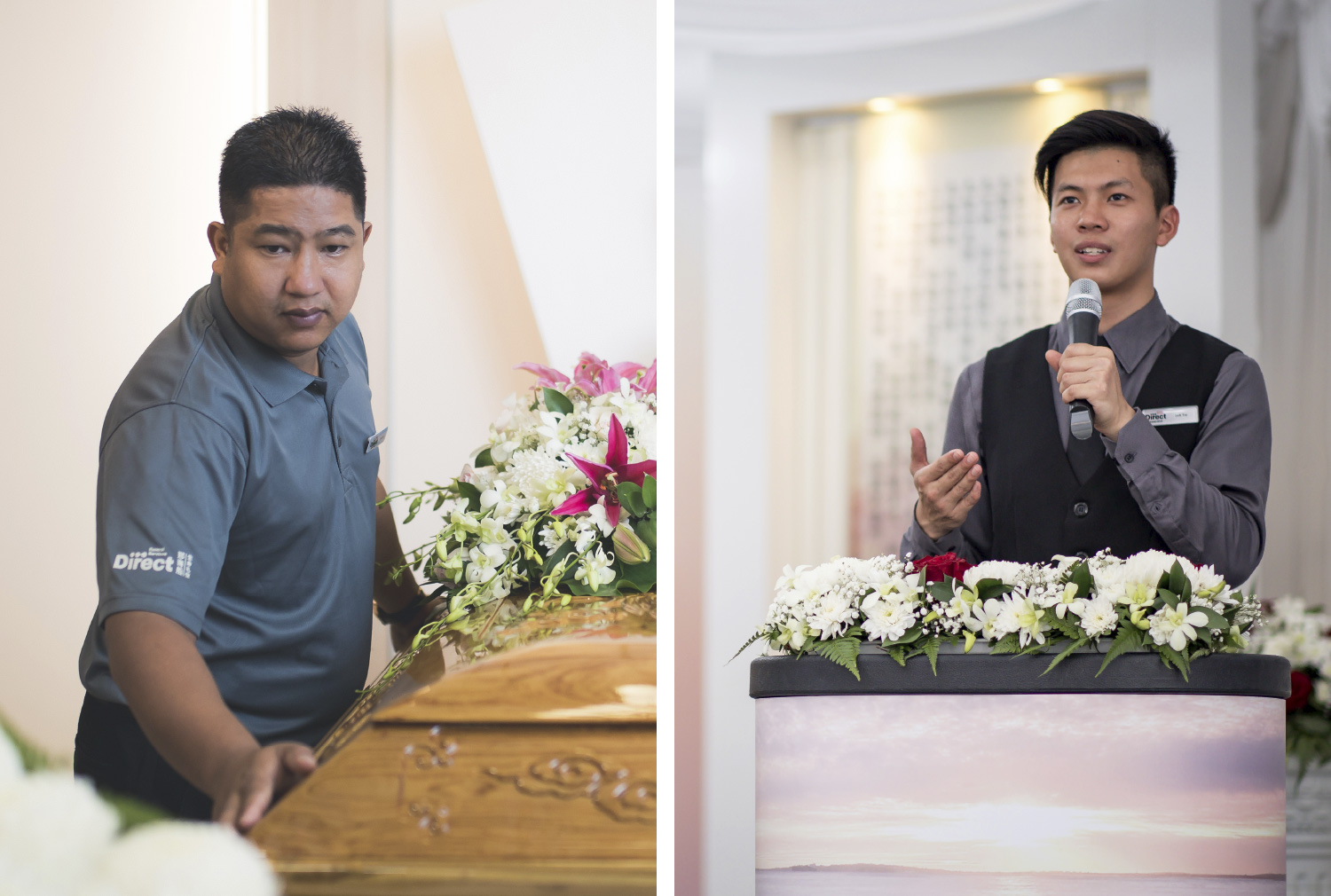
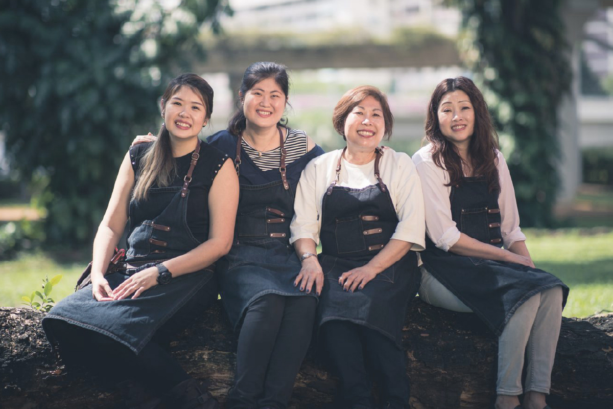
Because branding is so much more than just identity design, we also developed a strategy to sustain the Direct Funeral brand in the future. So as not to overly rely on the personal reputation of Roland Tay, brand imagery would now focus more on the rest of the staff, showing them in genuine moments at work or performing their duties. Visual guidelines were put in place to avoid posed shots that could come across as staged or impersonal. We also advised on the need to develop ‘Wiki’ style content that could inform and educate visitors.
After an on-boarding session that was conducted in Mandarin and Hokkien, staff members understood that ‘Direct’ meant that they were ‘Guides’ to help show the way forward, and became more confident when engaging with customers.
The new branding for Direct Funeral and the revised livery for its vehicles have also since become a recognisible touchpoint all across Singapore, changing perceptions of how deathcare professionals should look, sound and act, and opening the minds of younger talent to consider it as a career path.


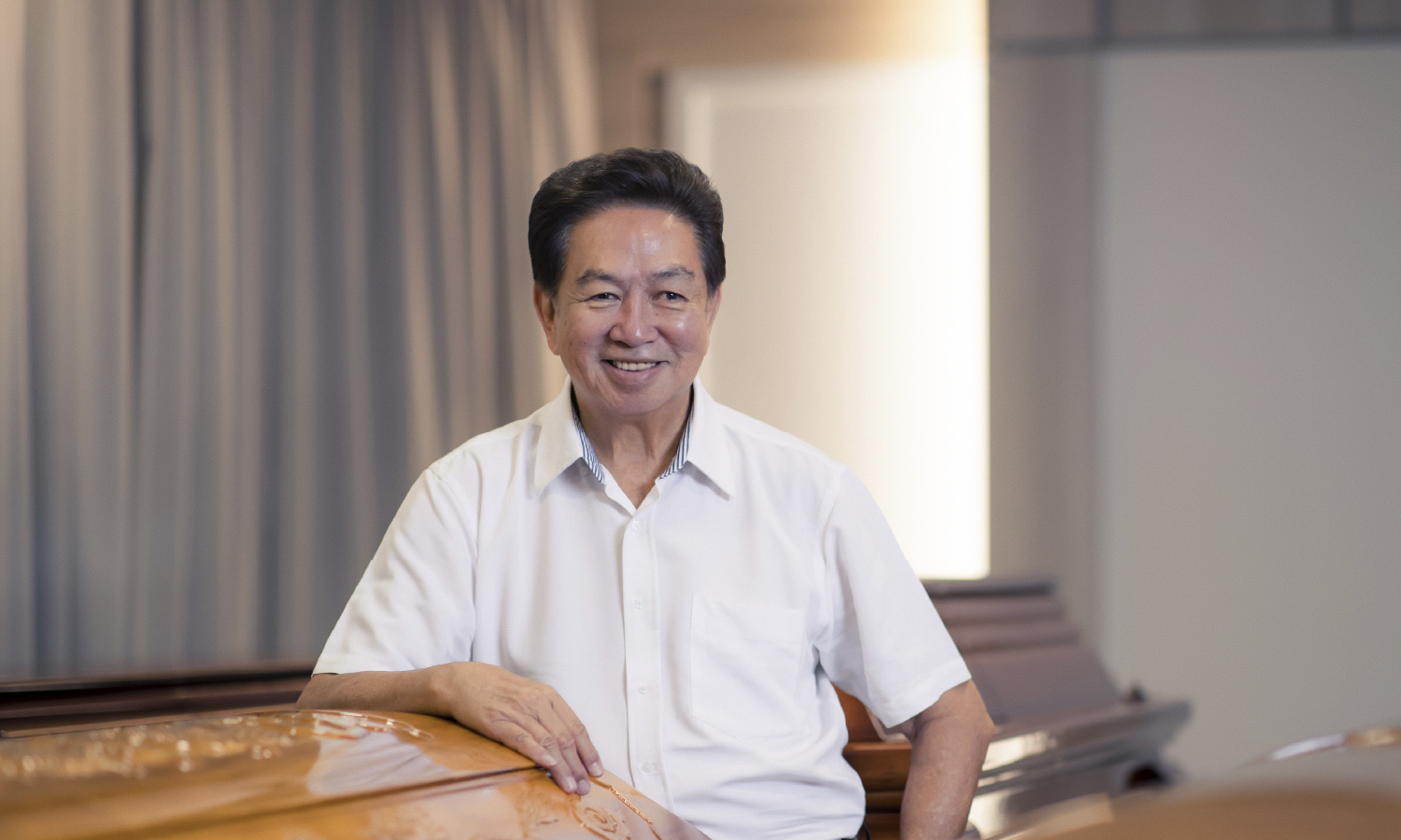
The overall brand ethos and values are communicated succinctly. Our team can relate to the new logo as well as the guiding pathos for the way we conduct our business. Since the rebrand, our image has become warmer and more approachable. We are very glad that the focus has shifted towards our service excellence and warmth, instead of the dollars and cents.
Jenny Tay
Managing Director, Direct Funeral Services
A STRONG FOUNDATION FOR THE FUTURE
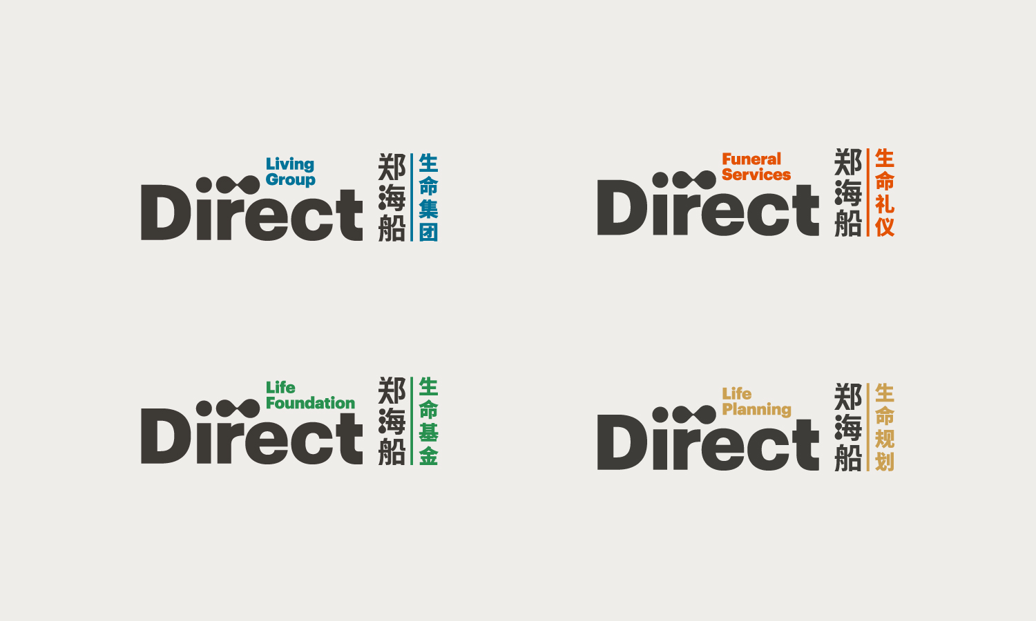
Through our conversations with Jenny and her husband Darren, we learned of their plans to expand the company laterally and horizontally. With this in mind, we advised on the naming of subsidiaries and their relevant business segmentations, which now included a charitable foundation to ensure the company’s philanthropic works could continue without negatively impacting the bottom line.
All of this came together in a new brand architecture that included a cohesive family of brandmarks, each with a clear visual lineage to the new parent branding, and a set of colours to differentiate them appropriately.
The biggest impact is from within. Our team feels more aligned with the values of the company, and more younger people choose to work with us because it is a meaningful career.
Darren Cheng
Executive Director, Direct Funeral Services
+2%
market share
Improved
internal alignment
Better
brand positioning recall
Overcame
societal taboos