Big things are powered by small wins
How we went back to the start to re-ignite the ShopBack brand
Known for the success of its cashback model, the real challenge for ShopBack was finding a better way to communicate its brand appeal succinctly and emotively.
A WINNING STORY FOR A WINNING IDEA
When ShopBack started in 2014, its purpose was to help new entrants to e-commerce attract new and repeat customers. As concepts like coupons and group discounts fell by the wayside, cashback emerged as a truly sustainable model that appealed to shoppers and budget-conscious affiliates alike.
From this toe-hold, ShopBack has been relentless in its efforts to improve and scale the experience regionally. By the time we met the team in 2022, they were already operating in 10 countries.
So, what was holding them back? For one, the cashback model had a learning curve – users had to go through the ShopBack portal or app for each transaction. And secondly, cashback rewards are tied to long term savings rather than instant gratification. Could the brand promise be distilled into a simpler yet still compelling message, and delivered with a bang?
FEEL THE SPARKS FLY
One thing was clear from our brand audit. The gungho, never-say-die spirit of the original startup was not just alive and well, it was always hustling to seize opportunities and make things happen for its partners, affiliates and users. Somehow, the very nature of steady, incremental gains behind the cashback business model had shaped the work ethic and culture at ShopBack. Every day was a chance to do better at every level of the company.
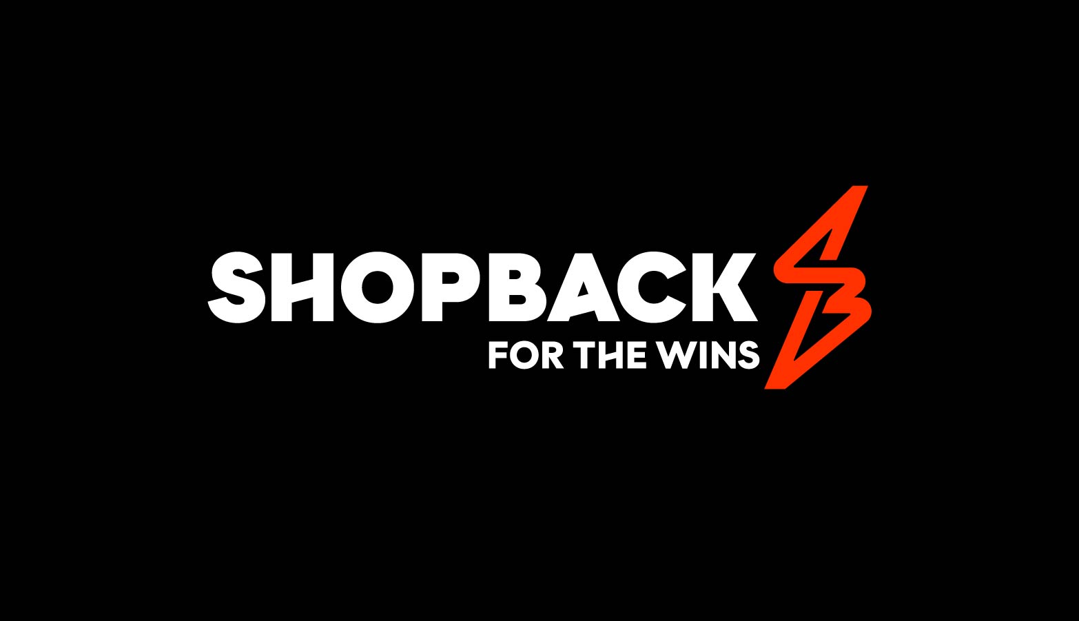
We also deep dived into the psychology of shoppers who made ShopBack an integral part of how they shop. No matter how good a deal already is, ShopBack always gave you more, that little tingle that you would look forward to. That was how the new tagline was born. Why use ShopBack? For the wins, of course!
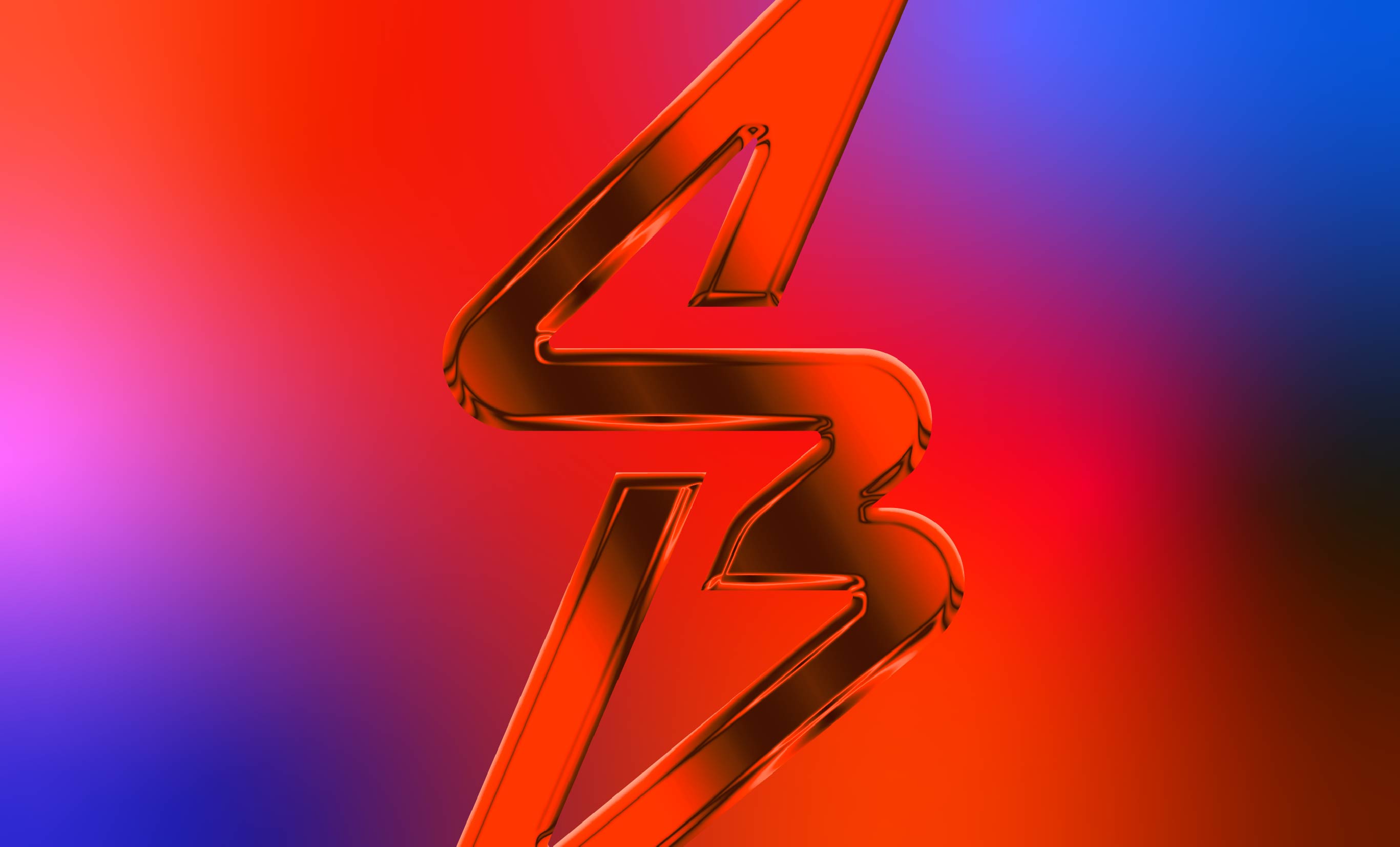
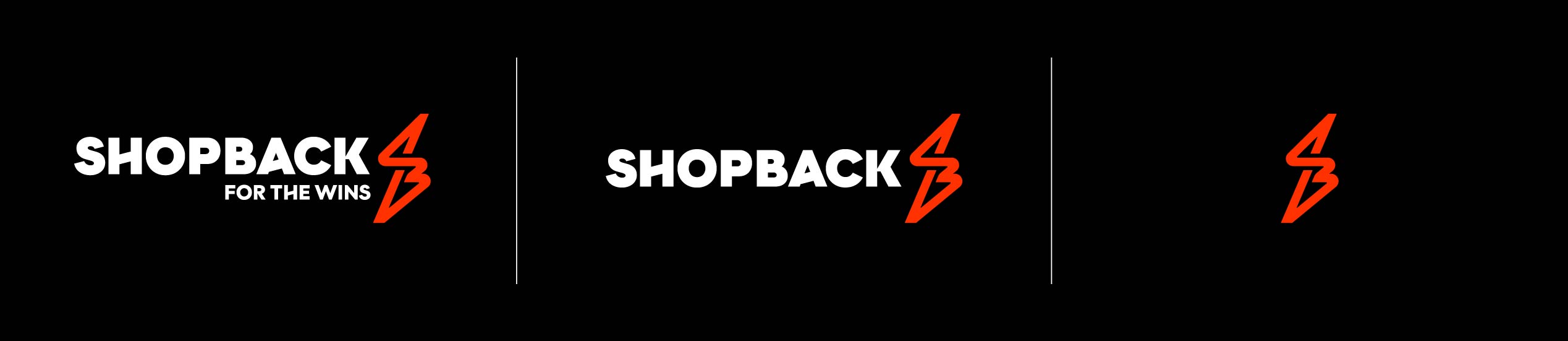
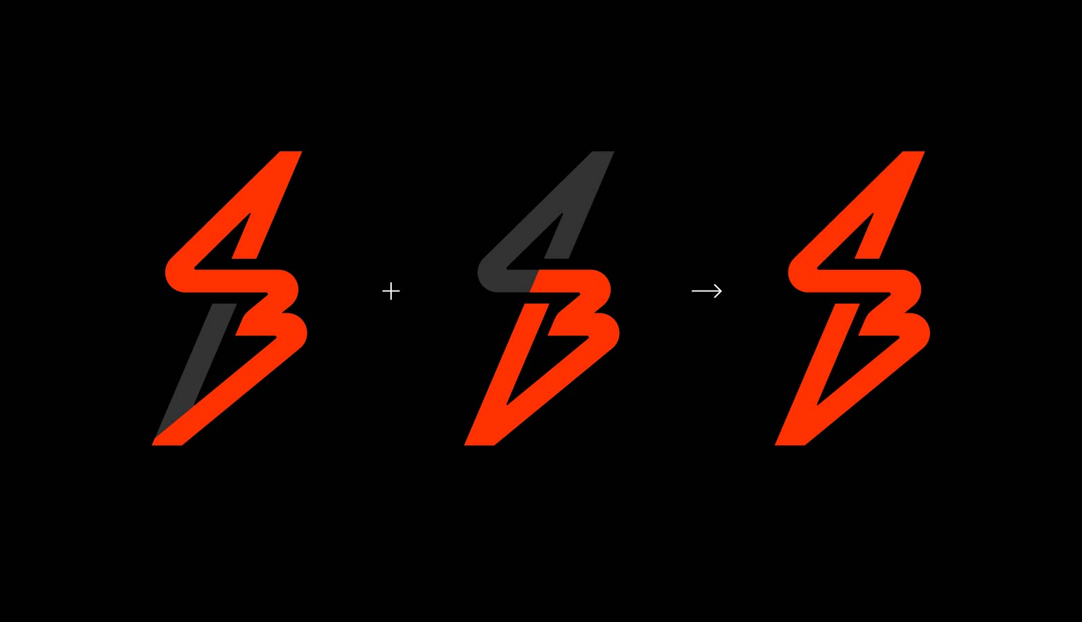
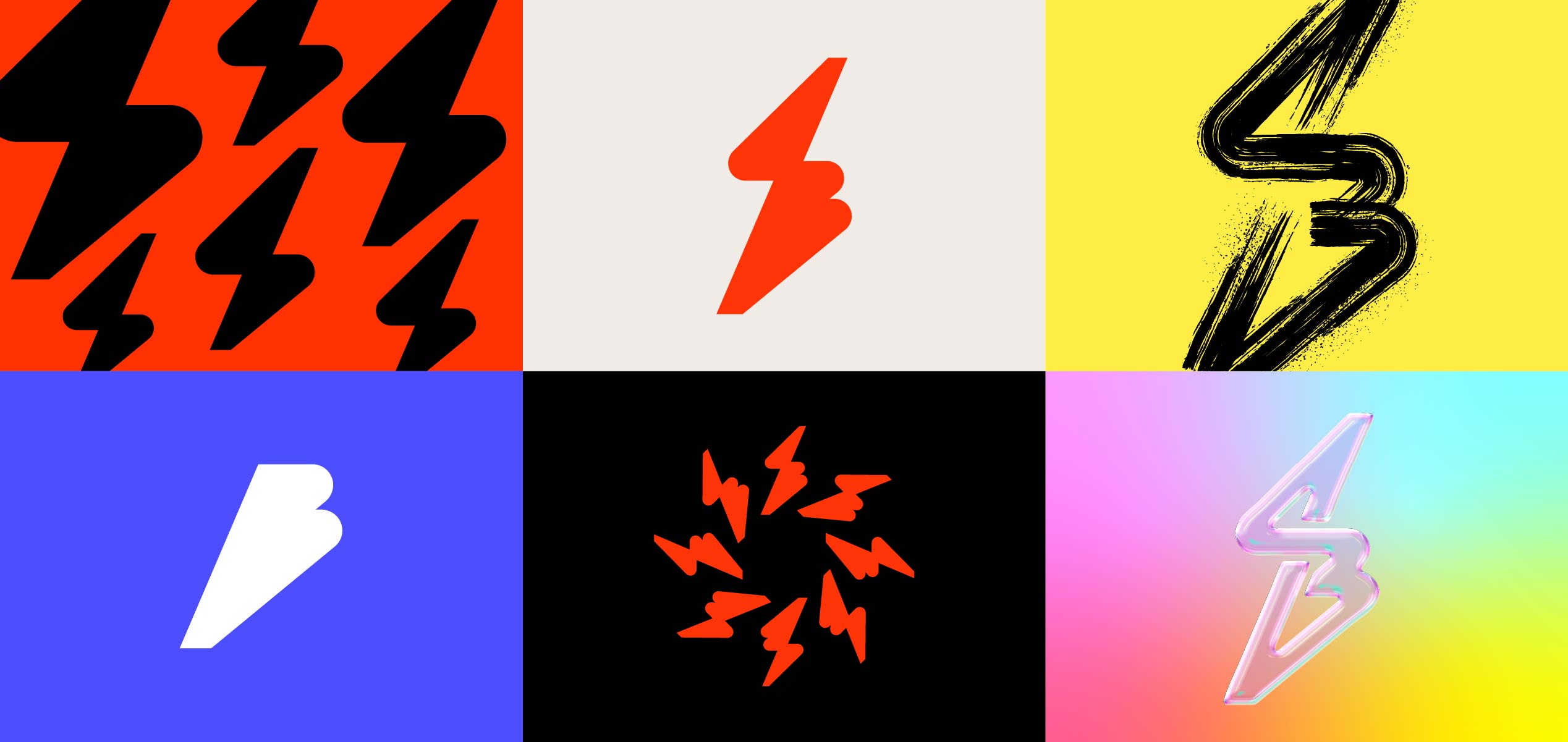
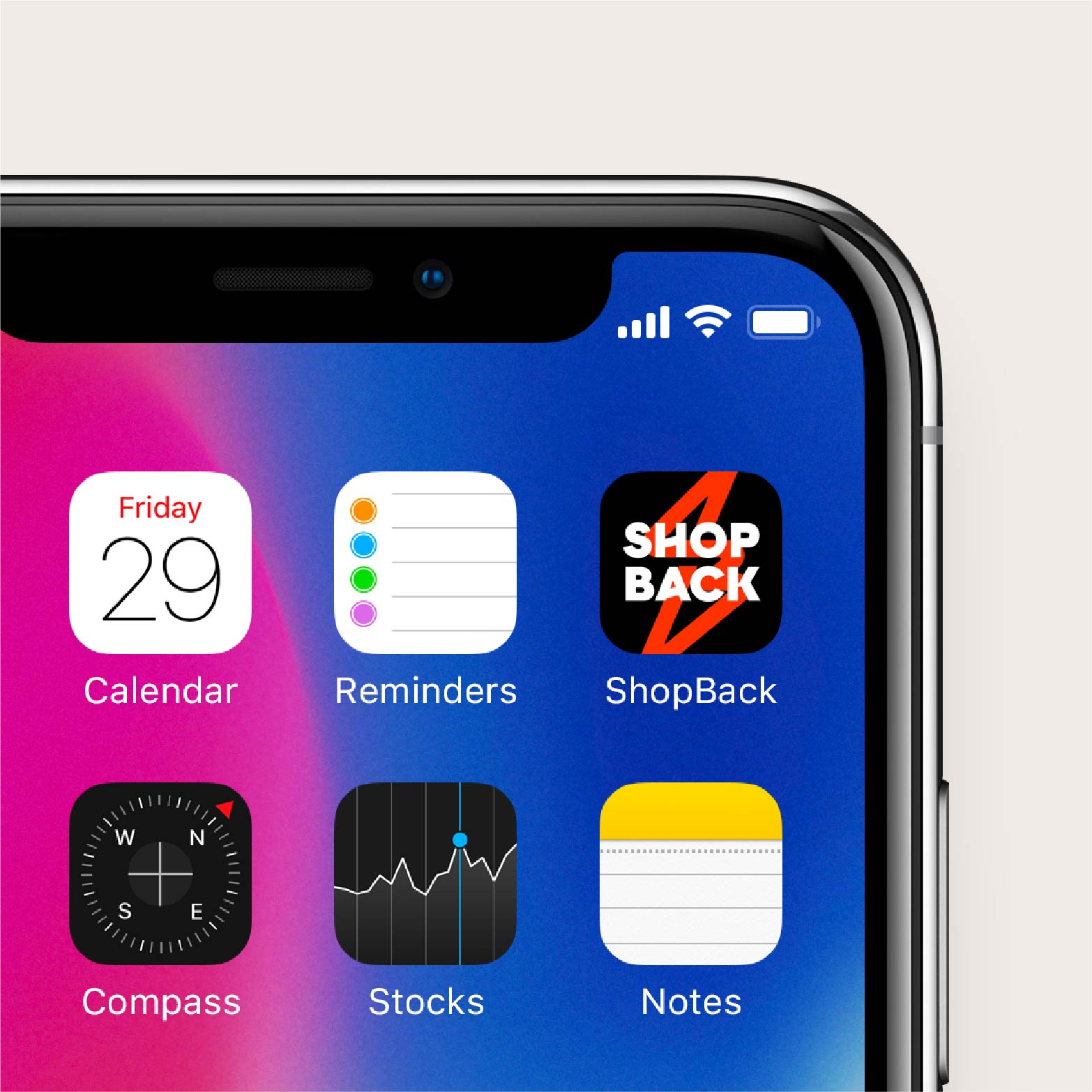
These insights gave form to the new brand identity. The SB Spark is an electrifying design that combined ‘S’ and ‘B’ into a dynamic symbol for a vibrant and always-on brand. The new wordmark lost the rounded naiveté of the old design to gain a more assertive presence, reflected in the angular strokes that mirrored those in the symbol.
Somehow, the very nature of steady, incremental gains behind the cashback business model had shaped the work ethic and culture at ShopBack. Every day was a chance to do better at every level of the company.
DEFINING A BETTER VERSION OF SHOPBACK
One of the key requests from the ShopBack team was for a new signature colour. When we weighed all the considerations, our advice was: do not lose the recognition and equity that ShopBack has earned over the last eight years. Instead of abandoning its warm red hue, we punched up the intensity, dubbed it ‘Orange Beat’ and introduced black into the palette.
SETTING THE VISUAL TONE
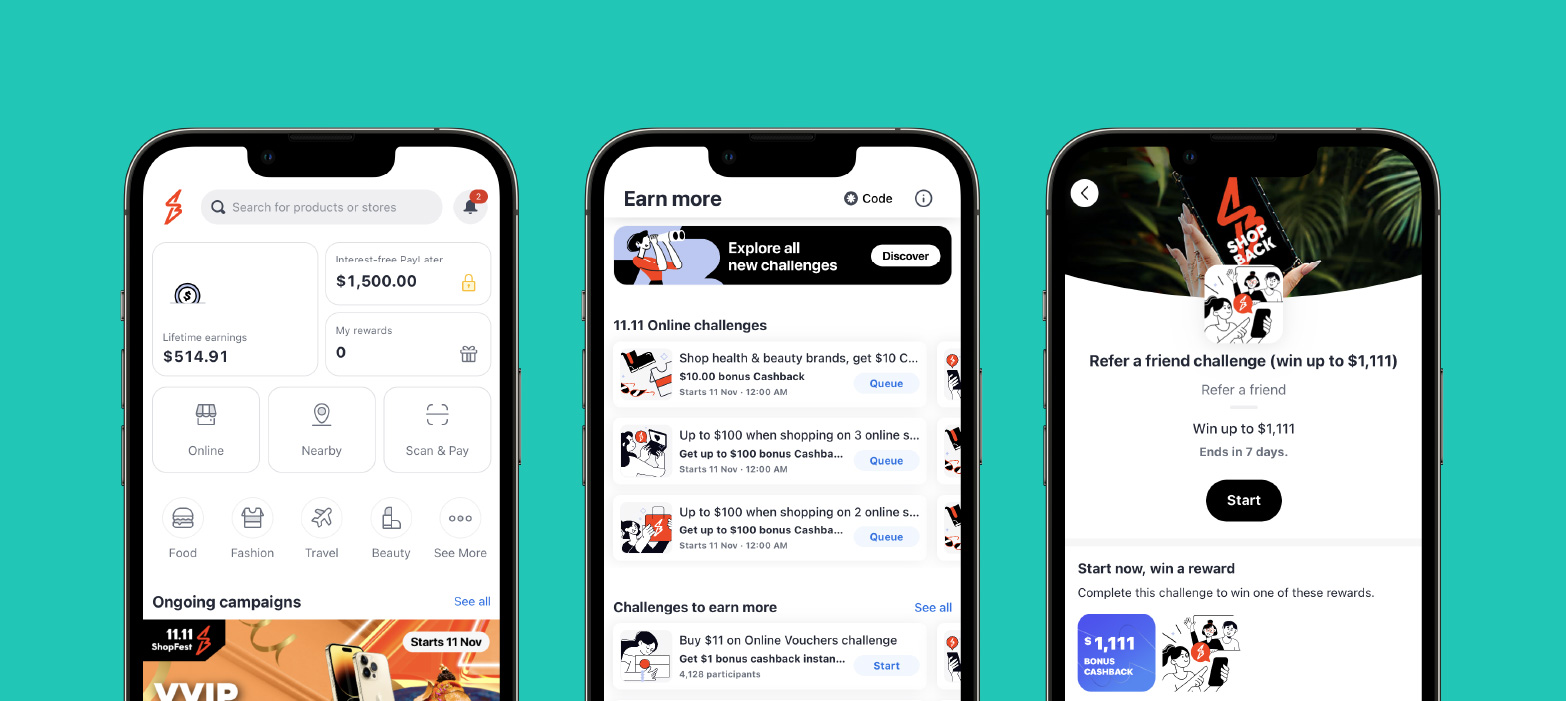
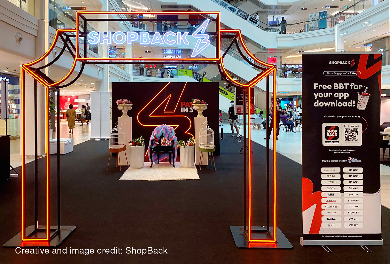
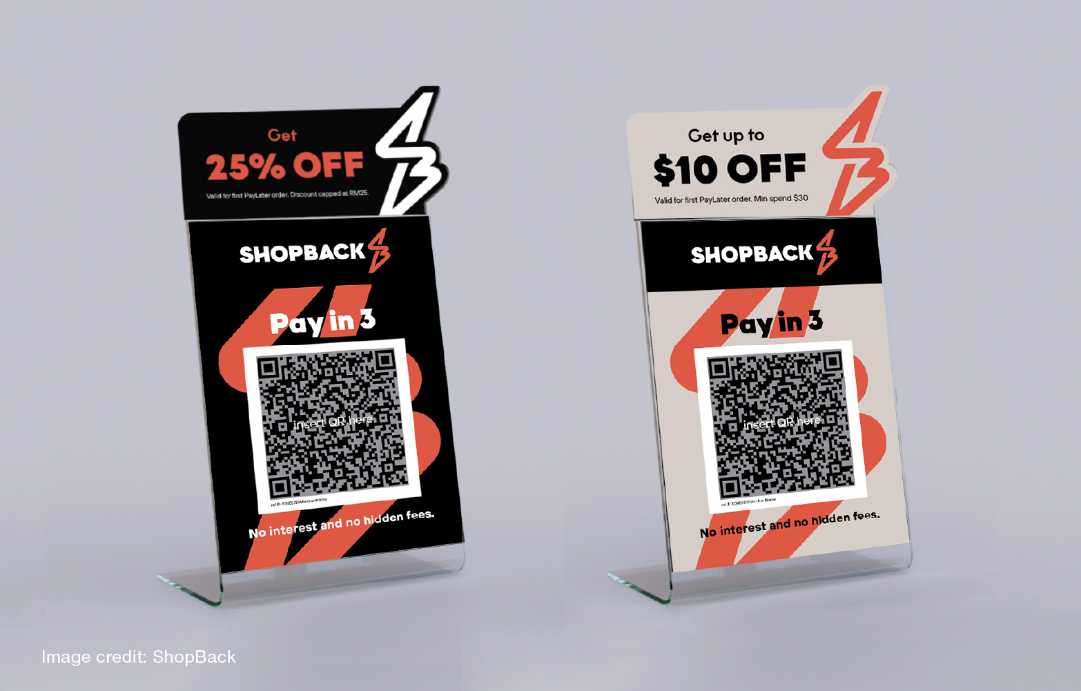
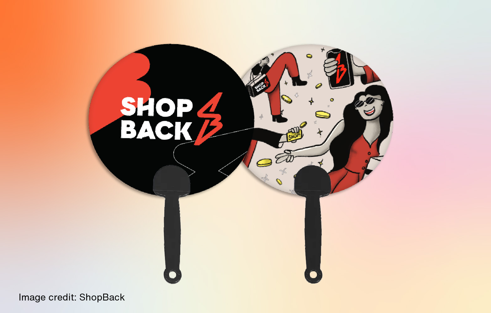
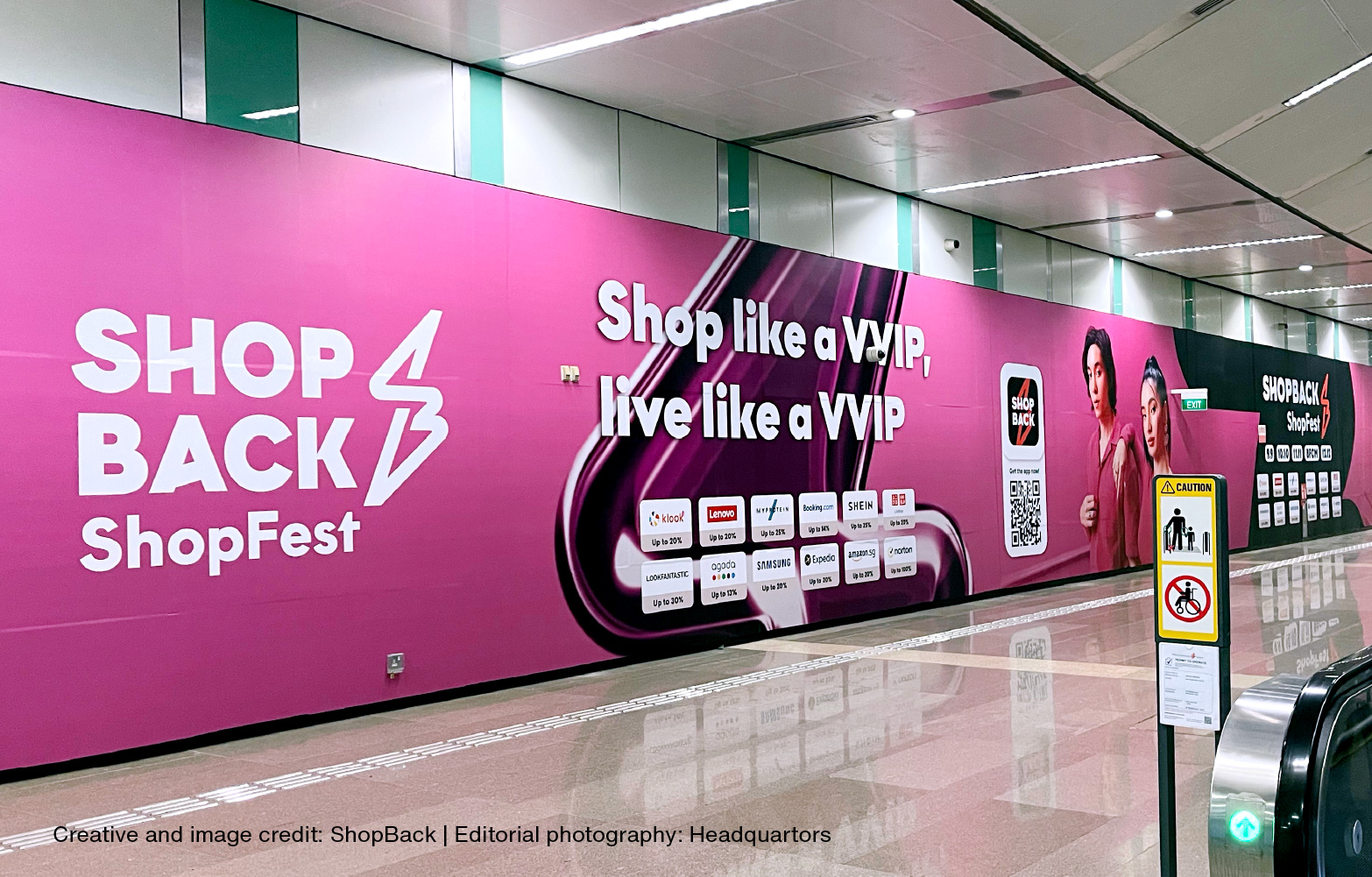
For Point of Purchase collaterals, this new approach broke away from the current trend of overwhelming shoppers with a blast of monotone colours. Instead, our multi-tone designs delivered welcome visual relief, making it easier to pick out Shopback from a sea of coloured squares. This design language has been embraced by the ShopBack team, resulting in a slew of visually exciting and distinctively expressive items for the brand’s relaunch campaign, from freebies, out-of-home (OOH) posters, banners and environmental graphics, in-app illustrations and icons, to digital ads, videos and more.

WAYS TO KEEP ON WINNING
To take the brand forward, we developed a brand strategy that factored in other aspects of the ShopBack experience that applied to both shoppers as well as partners and affiliates. It opened up new ways to look at crafting more evocative messaging, and also offered different approaches to how new ventures, initiatives and product features could synergise with the new branding.
To connect with a new generation of shoppers, the freedom to experiment was baked into the guidelines. As part of the brand identity system, special use lock-ups and usage principles allowed for lively visual and graphic expression, together with a family of brand graphics developed from the SB Spark.
Handing over the brand assets and guidelines in June 2022, it was breathtaking to see how quickly the inhouse team worked with Headquartors to execute and evolve a plethora of designs for the ShopFest relaunch campaign, and thereby taking ownership of the brand’s future direction.
&Larry has been instrumental in taking our brand into its next phase of existence. From the early conversations to the later stages, the team has worked well with our internal design team to produce something that has garnered positive feedback from users, our own ShopBackers, as well as the merchants we work with. And thanks to the team, we were all able to roll this out within a short span of time. Well done and thank you!
Team ShopBack