Journal 01: A. Lange & Söhne
Watch the Type
Bucking the traditions of conventional watchmaking, there are many things about A. Lange & Söhne that are markedly different and thus alluring.
Perhaps it was the large date display (or outsize date as the company would term it) and the resultant typographic focal point of the “25” that first piqued my interest as a design student in the 90s. Or maybe it was the asymmetrical dial design of the Lange 1 — an unorthodox movement layout hidden underneath Lange’s hallmark three-quarter plate — that was based off the harmonious proportions of the golden ratio. Or, perhaps, I was simply charmed by the uncompromising rigour and forbidding austerity of German design.
All things considered, it was love at first sight, though unattainable then for a fledgling designer. Fast forward a couple of years, and armed with considerably more life experience, I gradually realised that it was the simplicity, legibility and elegance of the dial that attracted me most – in particular the typeface used and the distinctly arced brand signature.
The symbolic significance of “25” in Lange’s history, while another story on its own, echoes my personal fascination with this number. Invited to contribute to the August 2016 edition of 品PIN Prestige magazine, I chose to pay tribute to Lange’s famous twin apertures.
Having been recently commissioned to redesign the identity and website of Watches by SJX, I felt it was opportune to engage the founder and editor, Su Jia Xian, for a conversation on the history of A. Lange & Söhne and the Saxon watchmaker’s typographic choices.
Ahead of its time
The Five-Minute Clock, set atop the proscenium arch in Dresden’s Semper Opera House, is arguably one of the world’s first digital time display. Constructed by master clockmaker Johann Christian Friedrich Gutkaes, whose apprentice on the job was Ferdinand A. Lange, it was a highly legible, bold and revolutionary precursor of an identity and a trademark feature that Lange would inherit, engineer and patent 150 years later with the launch of the iconic Lange 1.
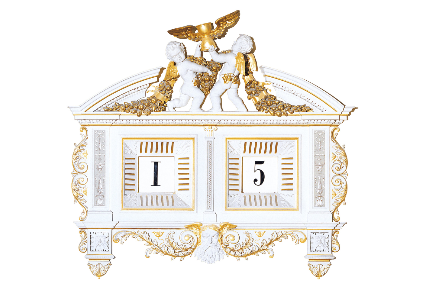
The iconic Five-Minute Clock at Semper Opera House, Dresden.
Suitably reflecting its period, the Roman and Arabic numerals of the Five-Minute Clock are displayed with a Didone face. Functionally speaking, this lofty time-teller was born from a need to negate the interruption of performances by audience members persistently checking the time on their pocket watches. To put things into a more modern perspective, this measure is not unlike signal jamming mobile phones in theatres.
Respectfully traditional
Always a little more partial towards serif faces, I was drawn (and still am) to Lange’s stringent use of the Engravers face when the brand was relaunched in 1994. As a typeface cut by an engraver (and German by birth) Robert Wiebking, Lange’s choice was conceptually sound – it is bold yet delicate; a congenial marriage of heritage and craft.
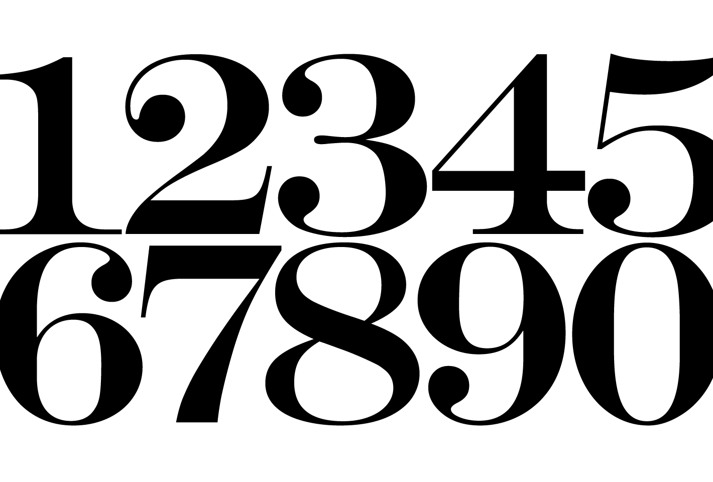
Engravers, originally designed by Robert Wiebking in 1899, has undergone redesigns and reissues by a number of foundries in the 20th century. This cut shown above was issued by Monotype.
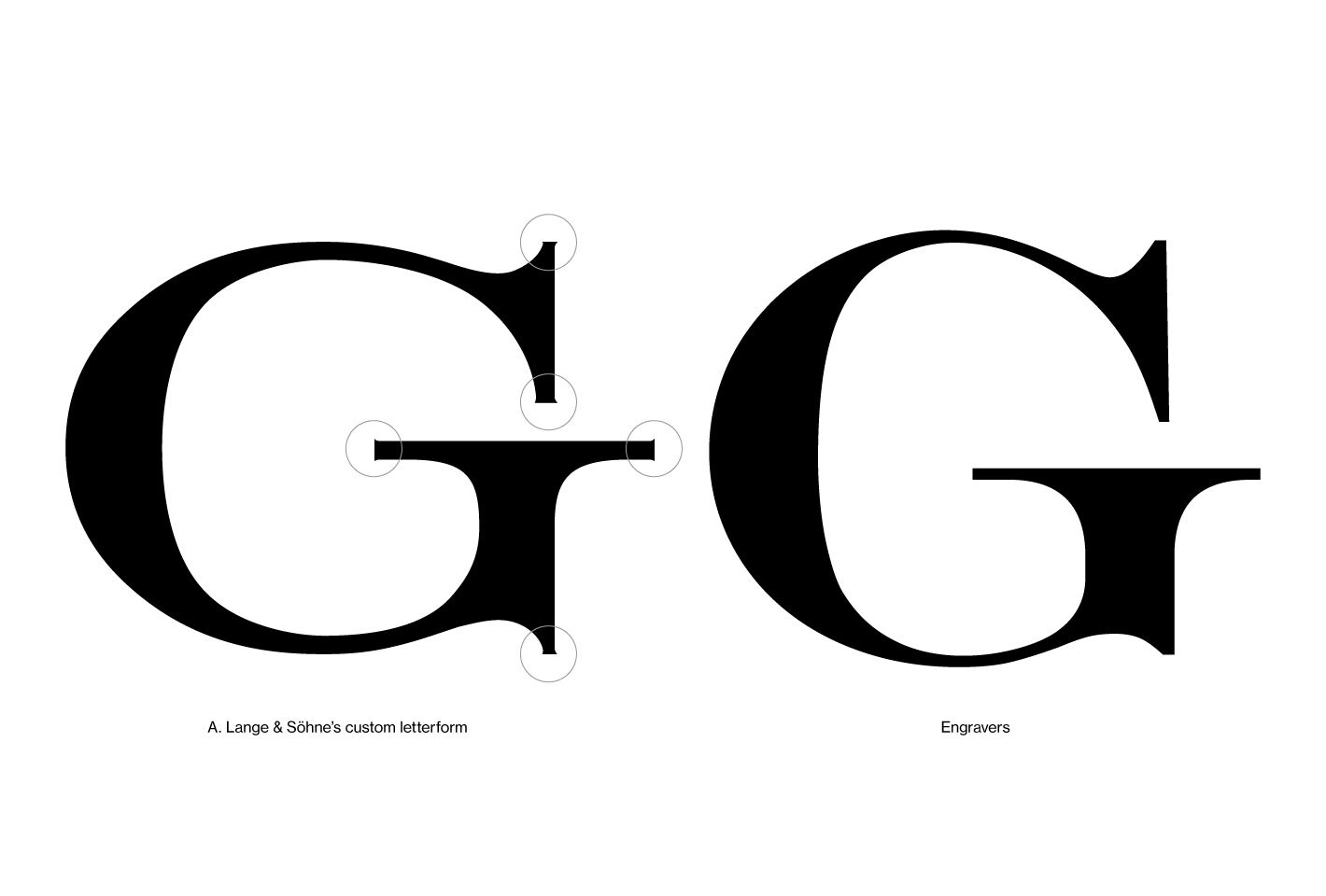
Ordinarily a display type — a high contrast character set in uppercase only — it is observed that a custom cut had been commissioned for A. Lange & Söhne. There are key features that distinguishes this readily from Wiebking’s original.
1. When comparing the iconic “25”, it is evident that the custom cut has its contrast lowered, thickened to increase legibility and circumvent technical difficulties when cut at minute sizes.
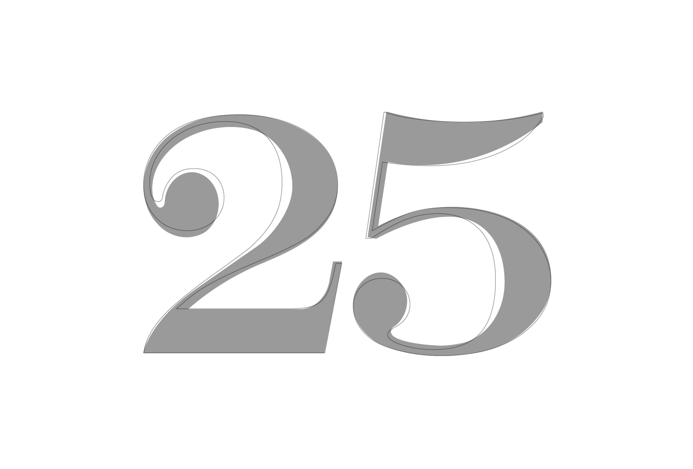
A Lange & Söhne’s custom Engravers (in grey) is considerably thickened from Monotype’s cut (in grey).
2. When magnified, additional glyphic serifs and sharpened corners adorn the ends of all characters – most likely a symbolic expression paying tribute to chiselled letterforms in the 19th century and, of course, Lange’s engraving heritage.

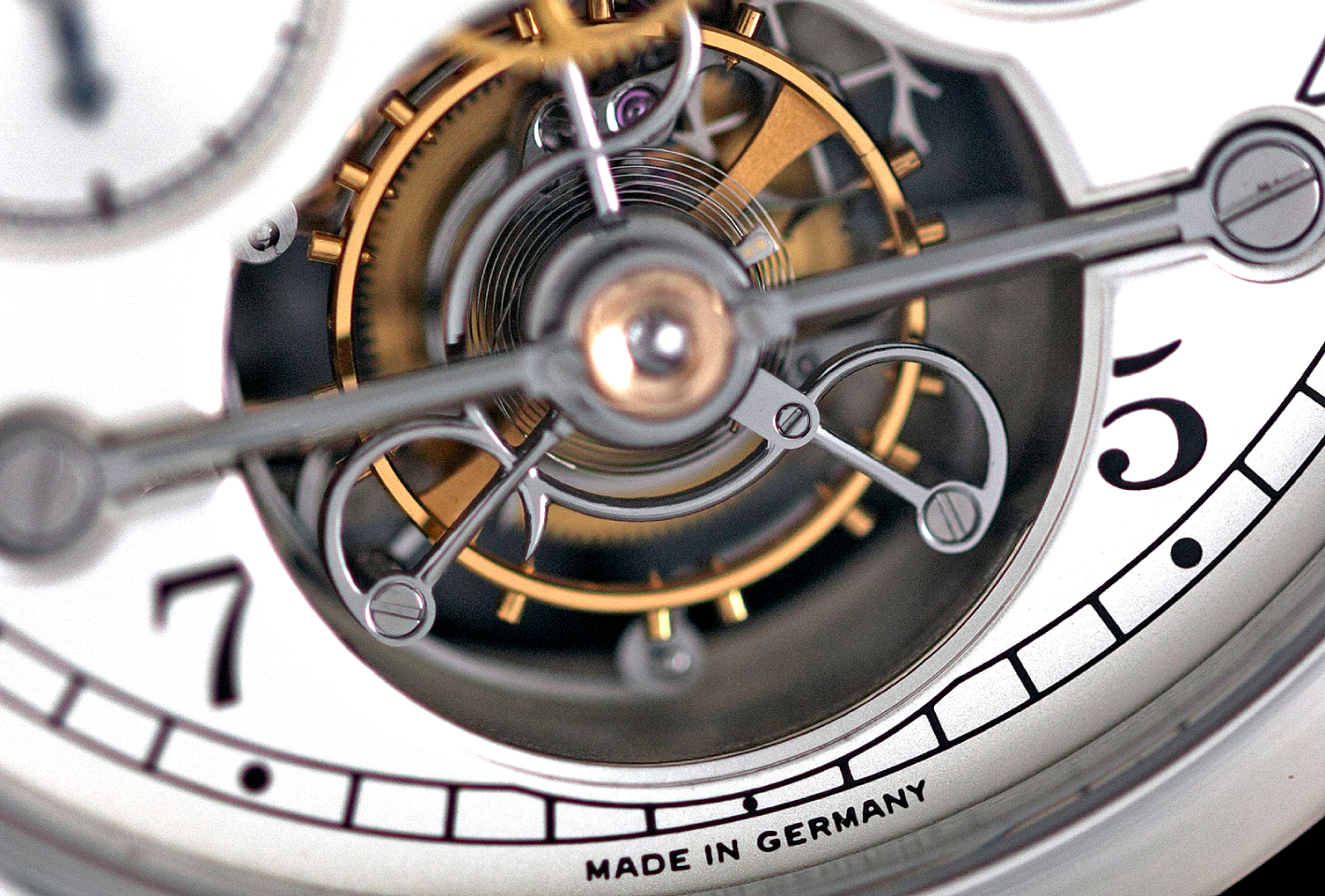
Interestingly, for the early re-founded Lange timepieces, the “Made in Germany” liner was rendered with a sans-serif face with inferred geometric qualities. In later and more recent pieces, however, all text elements on the dial are displayed using the bespoke display face.
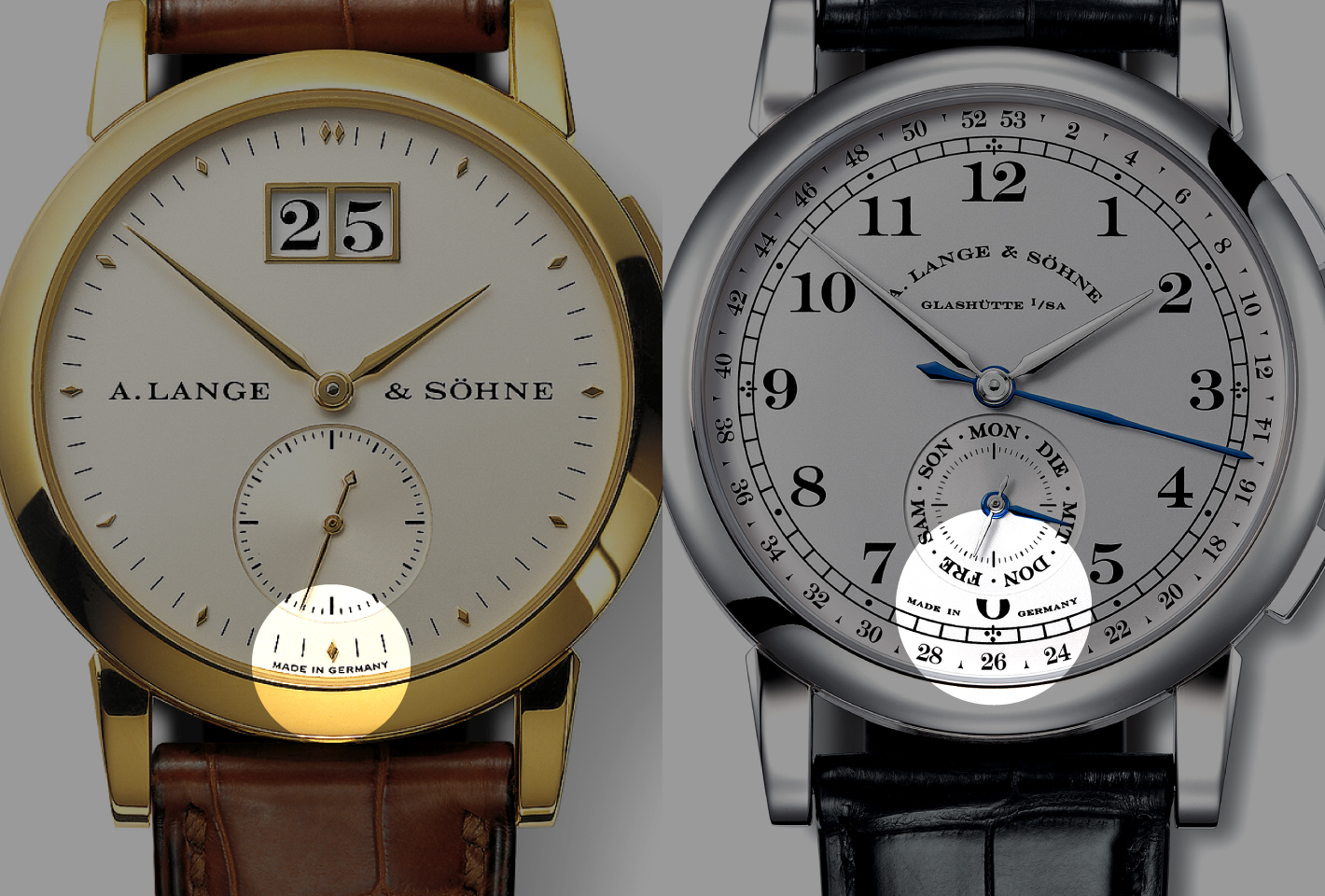
(Left) Typeset in sans-serif. (Right) Typeset in custom Engravers.
Of curves and flats
When one traces Lange’s pre-war history as a maker of quality pocket watches, it comes as no surprise that early instances of the wordmark had been already arranged on an arc, parallel to the curvatures of the dial and the circular form of Lange’s timepieces. Does form follow function? In this respect, it is likely the case.
Perhaps careful typography on the early Lange watches, which set the tone for all later models, was because aesthetics were an exceptionally important consideration early on. Lange was a start-up, and resources were limited, so the goal was to make unique looking watches without breaking the bank. The company did not have the resources it has now to develop several movements simultaneously.
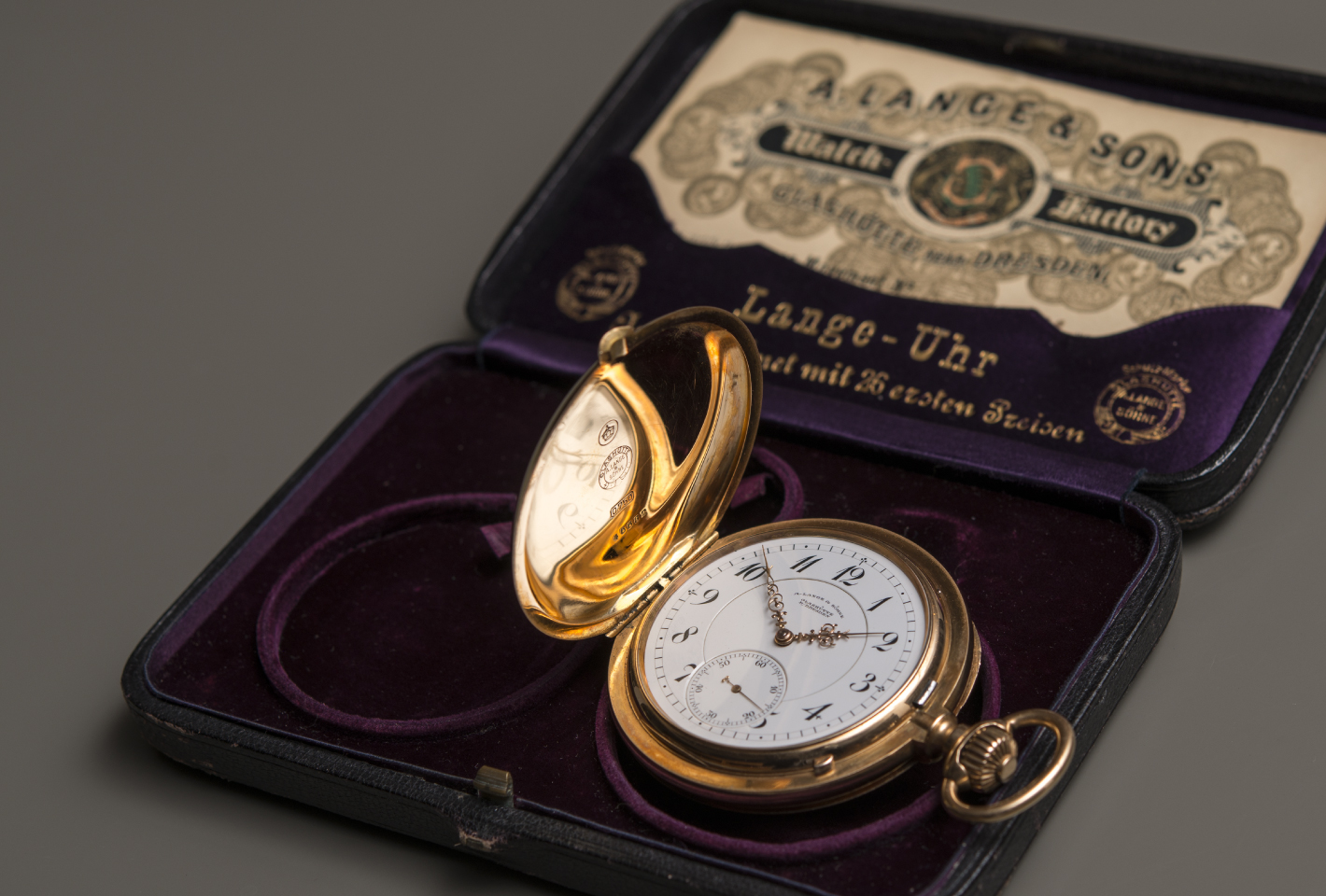
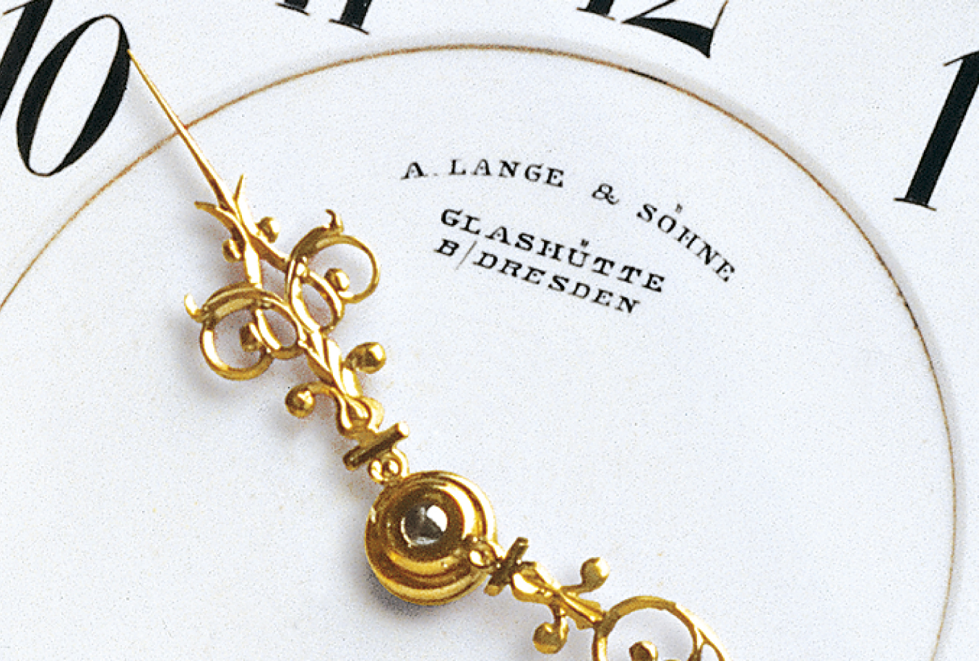
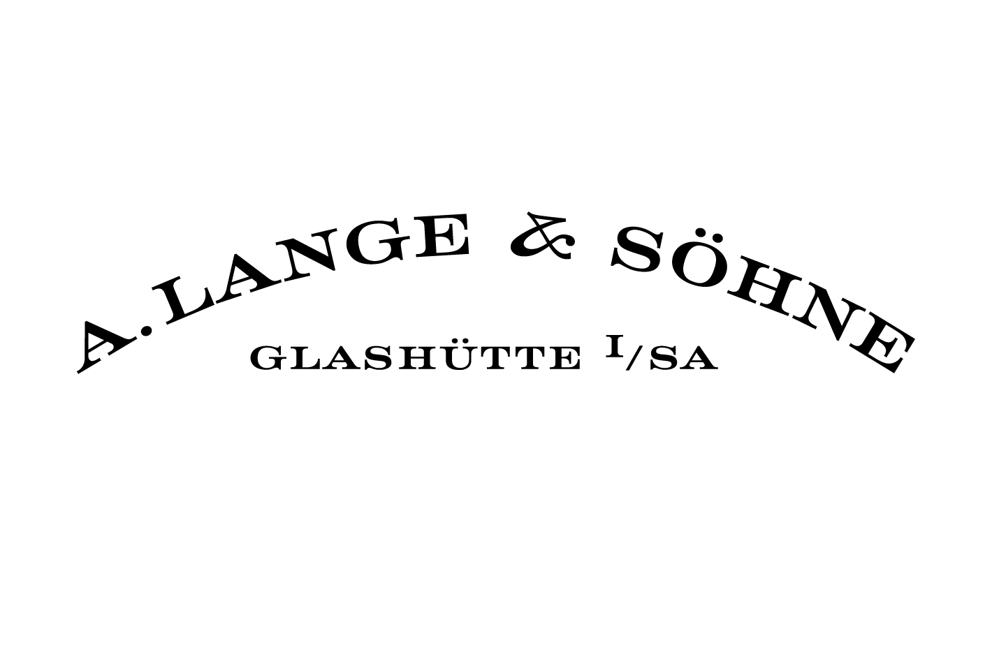
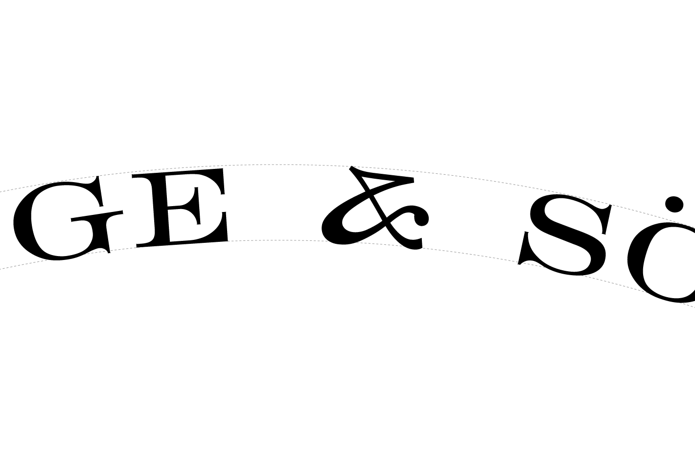
Examining Lange’s wordmark post reestablishment, the visual focus falls undeniably on the unique, calligraphic flat-top ampersand at the apex – an anomaly for most ampersands. Recalling elements from Wiebking’s Engravers series and Engravers’ Gothic (a traditional, incised face digitised for desktop publishing), the observer can only presume that Lange’s trademark ampersand is an amalgamation of various “engravers” faces designed in the early 20th century.
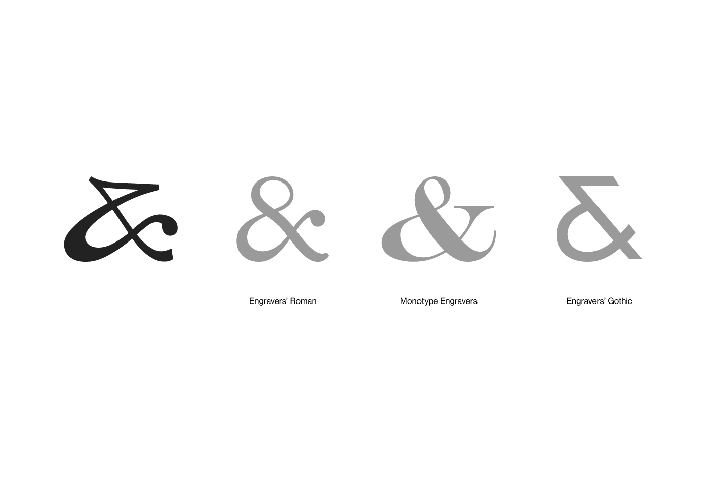
(Top, left to right) Engravers’ Roman, Monotype Engravers. (Bottom, left to right) Engravers’ Gothic, Lange’s custom ampersand.
By keeping to the height of the characters, one could also surmise that the absence of the loop is perhaps a sound choice from a visual standpoint, preserving the geometric integrity of the dial and the dial rings enclosing the wordmark.
Beyond the face
With the emergence of more identity-conscious corporations in the marketplace, there is a higher level of attention paid to the visual language and typographic expression of a brand. Proprietary typefaces communicate subtly and subliminally, conveying personality and profound characteristics. It is not surprising to note that Lange has invested in exclusive cuts from the Linotype library for its brand identity.
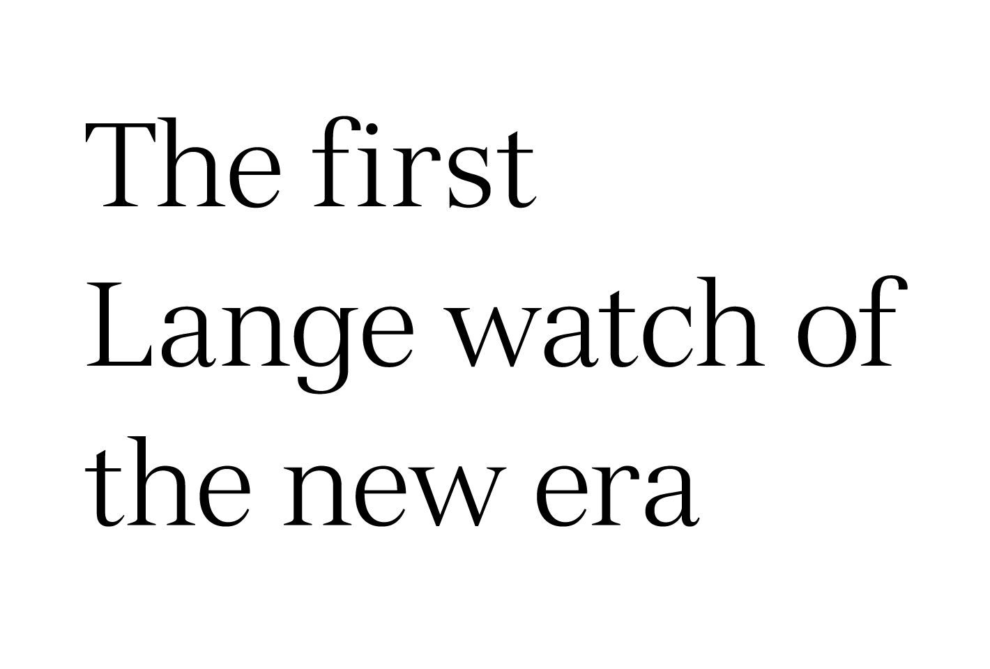
Lange’s primary corporate typeface is based off Versailles, originally designed in 1984 by celebrated Swiss type designer, Adrian Frutiger. Inspired by metal-cut letterforms, the typeface possesses “serifs so sharp they could draw blood” – an evident throwback to watchmaking tools and engraving techniques.
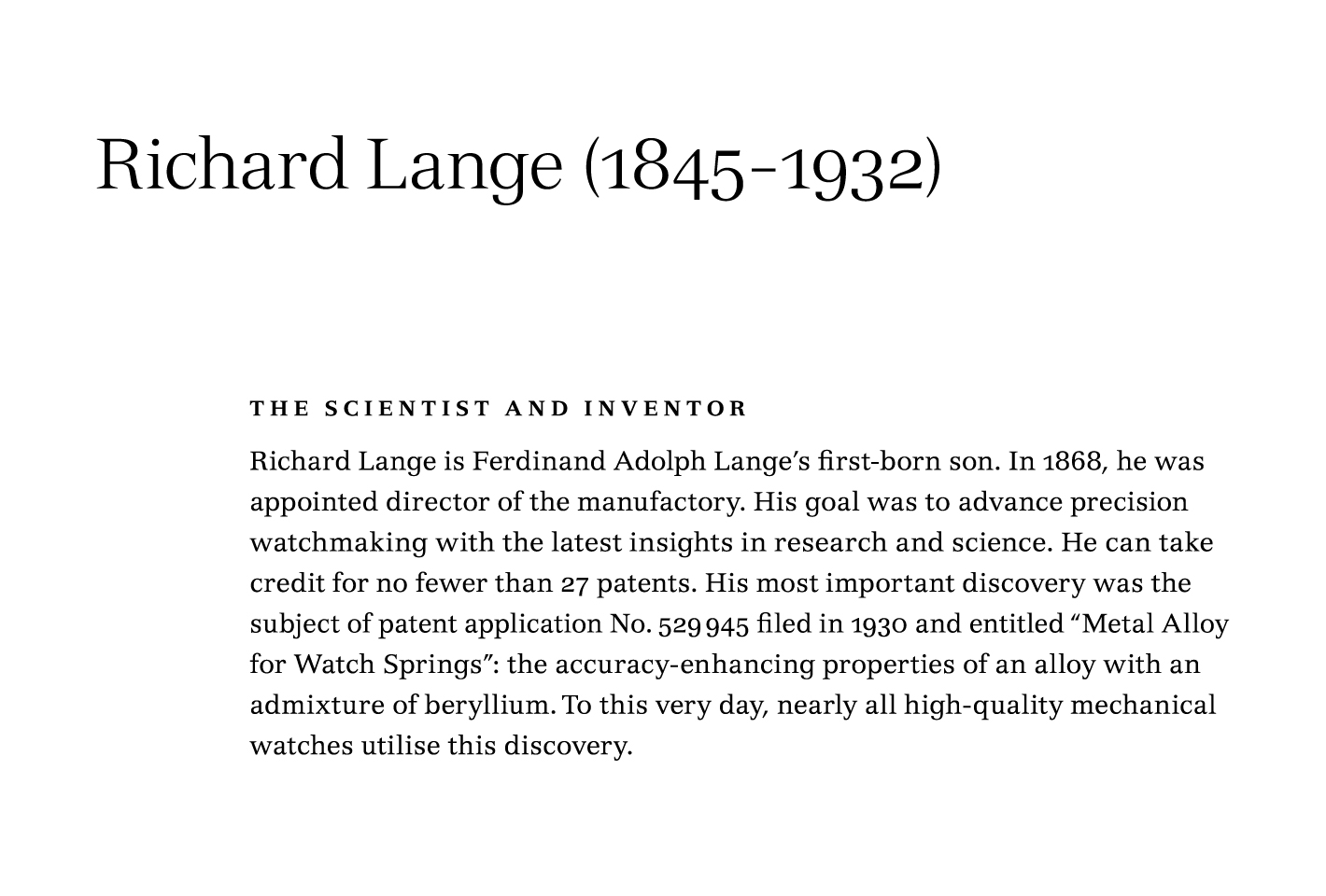
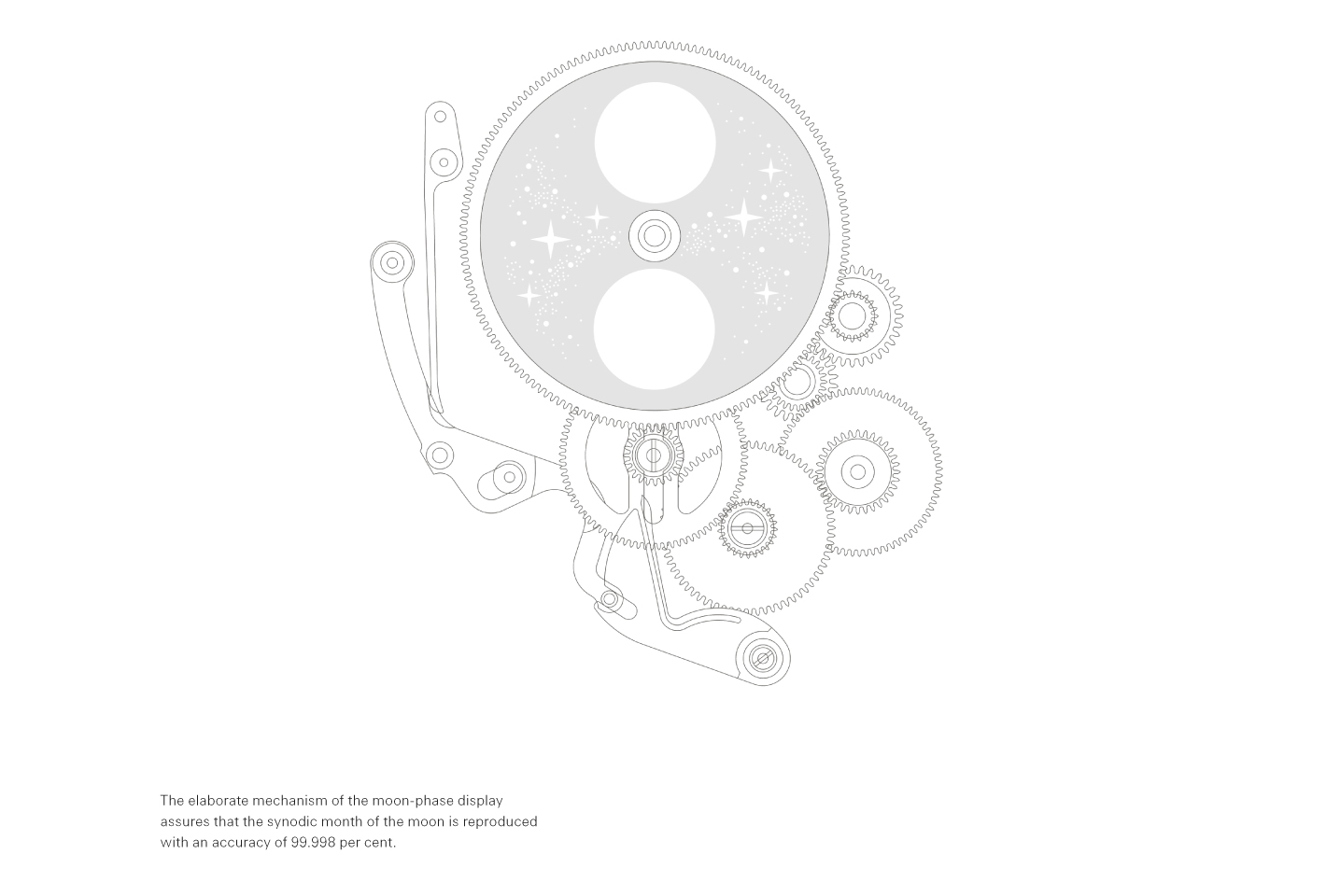
To complement the serif face is a variant of a Frutiger and Linotype original, Univers Next, described as “an expression of cool elegance and rational competence”. Its utilitarian and functional characteristics are further emphasised by Lange restricting its use on technical information, captions and legends.
A matter of space
While A. Lange & Söhne is clearly judicious with its typographic choices, a few refinements are perhaps necessary. The first, I believe, would be to further develop a range of variants for Engravers on the dial’s design. When analysing technical drawings and photographs of the Richard Lange Perpetual Calendar “Terraluna”, it is observed that the characters for the day-of-the-week and month displays were re-sized disproportionately, giving the appearance of distorted characters with ruined proportions.

A comparison between a distorted typeface (Custom Engravers) and a proper condensed version (ITC Garamond).
Using the above example of “OCT”, it is evident that the character widths were scaled disproportionately to height; the curves of the “O” loses its contrast, and the serifs of the “C” and “T” are elongated unnaturally. In comparison, when a properly drawn type is used (ITC Garamond to illustrate the case), its contrast and proportions are narrowed accordingly. A type family with a range of compact styles is an absolute necessity when space is at a premium – in this instance, within the narrow confines of a watch’s dial.
Next, a better (and more professional) spacing format across the double-digit hour numerals could be incorporated. As an evolution from traditional typesetting, the early days of digital typesetting incorporated glyphs from movable metal types without little width variation across its character set; numerals are often cast in the same width.
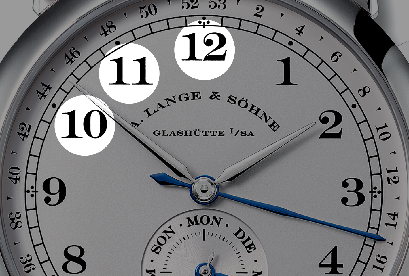
As such, the differences between proportional figures and tabular figures are especially pronounced when relying on digitised traditional faces like Engravers. Tabular figures, with its uniform and fixed character widths, sacrifices visual uniformity and aesthetics (i.e. kerning) for clarity in displaying statistics and numerical data in columns.
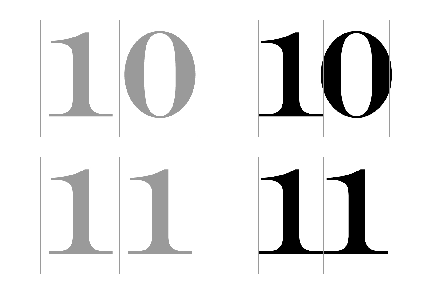
‘10’ and ‘11’ typeset in Engravers: tabular figures (grey) as compared to proportional figures (right column).
With the inclusion of proportional figures by reputable type foundries, the intelligent OpenType format, and modern desktop publishing programmes that recognise this feature, it is refreshing to see perfectly kerned numerals featured prominently in Max Bill’s range of timepieces for Junghans in the 1960s.
Making the right moves
While A. Lange & Söhne remains one of a handful who pay particular attention to professional typography of their timepieces, other watchmakers are relying on either ubiquitous system fonts, ones that come bundled with computers (which result in some of the most boring looks), or on typefaces drawn from historical designs (which compromises legibility). And when questions about the type choices were posed during visits to the design department at the factories, the answer typically reveals that typography isn’t really part of the design consideration.
This perhaps is due to the fact that many watch designers are not formally trained in typography or graphic design. Some come from the world of automotive design, others are trained as artists, and some don’t have a design background. While an education in typography is not necessarily to produce beautiful objects, it can lead to incongruous choices.
With the growing focus on typography at the core of the form and function of timepieces in the marketplace (cue Google and Apple here), I suppose the time is now for traditional watchmakers to begin questioning the way typography is treated as secondary. For analogue watches to cost tenfold and more, shouldn’t well-executed typography form an intrinsic part of the premium paid?
Type designer Jonathan Hoefler probably sees the irony in this as well.
For just $18,000, you can look at gruesomely distorted Times New Roman all day long
About Su Jia Xian
One of Asia's leading watch experts, Su Jia Xian, better known by his initials SJX, has been involved in the watch industry for over 15 years. SJX current contributes to over a dozen publications in Asia, including Singapore, Hong Kong, China and Japan. In 2011, he founded Watches By SJX, aimed at creating unique and opinionated content, as well as original photographs that offer an unvarnished view of a watch.
