Journal 03: Larry Peh
Fish out of the Bag
Every so often, someone will ask me to name my most prominent work and I would say, “You know those throwaway plastic bags with the fish graphic on the side?” And they would give me an incredulous look. “Those plastic bags? You designed it?”

An invisible icon
How could such a ubiquitous object of no consequence, that a large proportion of people in Singapore have seen, touched and used over the last 25 years, have sprung from the mind of one particular designer called Larry Peh?
After all, those bags have never called attention to themselves, and probably never inspired anyone to think, “I wonder who drew this fish? Surely someone made it? I wonder if they were paid?”
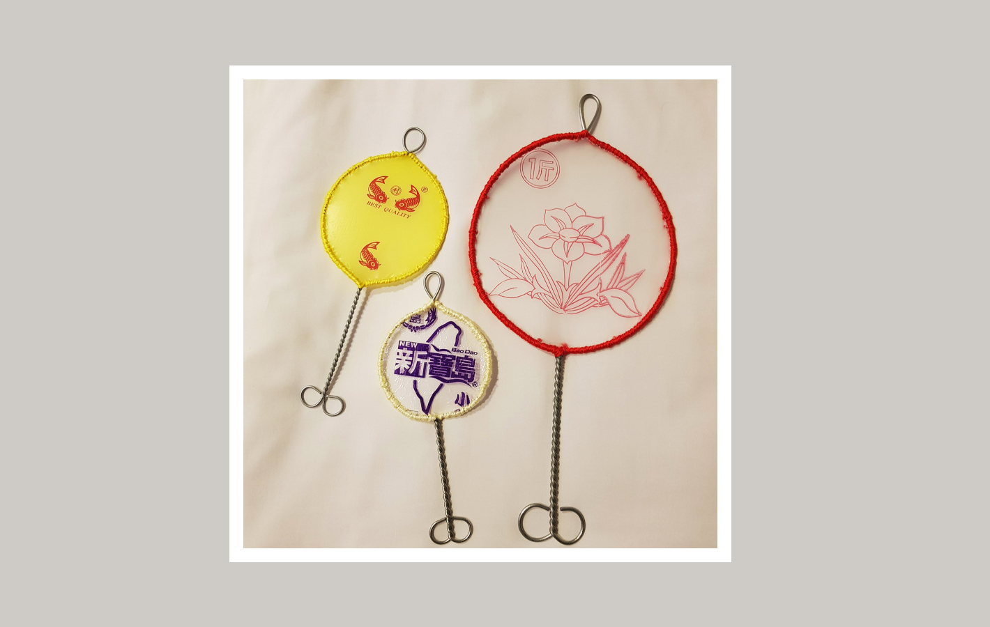
Justin Lee, Small Singapore Show 2.0, the carp motif embroidered onto a fish catcher
But the fact is, that very inconspicuous carp illustration, was painstakingly hand-rendered by yours truly. I think, in the public consciousness of Singaporeans, the nearest example would be the Merlion motif, which has been reproduced on countless trinkets and mediums.
If you are feeling generous, then consider Matthew Carter’s Georgia, one of my favourite typefaces. Freely included with every Microsoft Windows PC, it is a deftly crafted design that is so simple and democratic that one easily overlooks its inherent beauty and technical triumphs — and the fact that it was the result of conscientious effort by a human being.
Auspicious beginnings
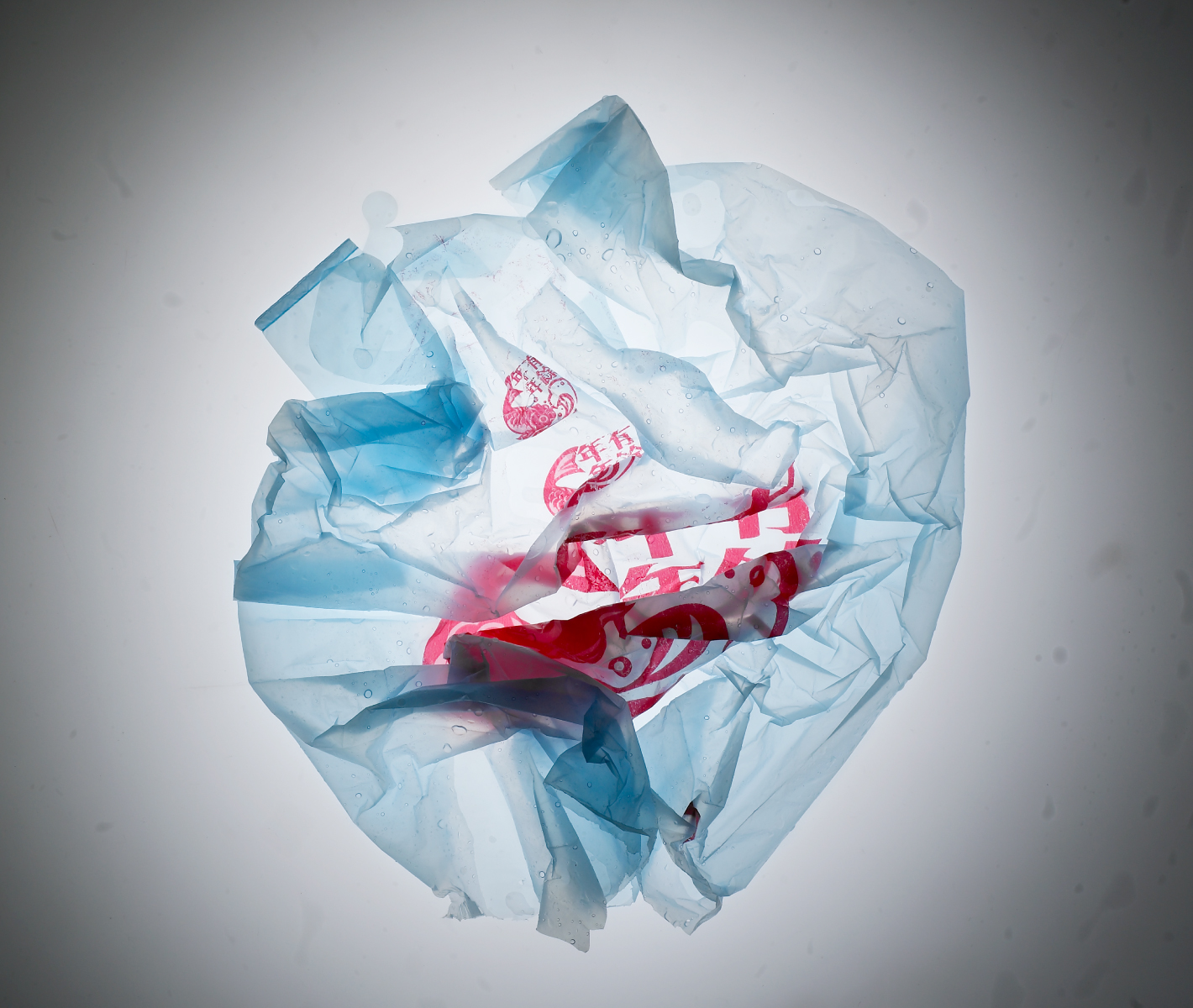
Back in 1995 when I was still a design student at Temasek Polytechnic, it happened that I met with a plastic bag manufacturer. After learning that I was trained in graphic design, she commissioned me to create a symbol for her plastic bags, using the design to increase perceived value and stand apart from the competition.
Naturally, I was excited about my first commercially reproduced design, and set about my research with great enthusiasm. I made a trip down to my neighbourhood wet market to observe my ‘target market’ (no pun intended) — the stall vendors. Being a budding fashion aficionado, the fishmongers with their striking waterproof aprons and rubber boots particularly stood out to me.
Since plastic bags are essential to the fishmongers’ business, and fish are considered auspicious in Chinese culture, I decided to merge the two ideas. Hence my design for 年年有余 (nián nián you yú), or ‘May each year end with abundance’ was born. The title is a play on words that are commonly used during Chinese New Year, where 余 (surplus) is a homonym for鱼 (fish).
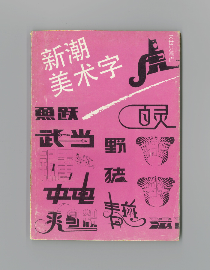
Old Chinese art and graphic reference books
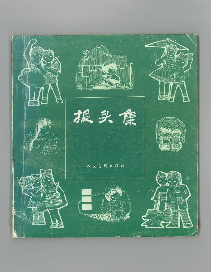
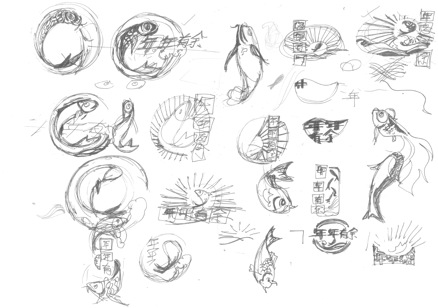
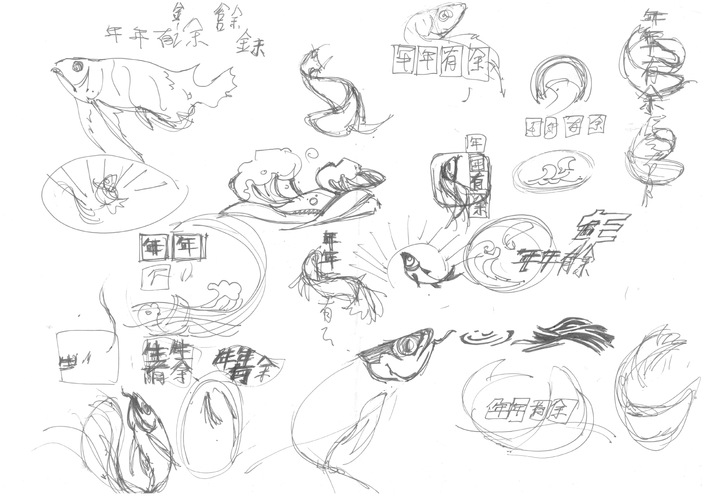
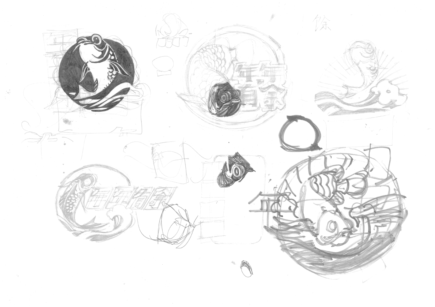
Without a doubt, the most popular fish depicted in Chinese culture is the carp, known for its longevity, dragon-like scales and rich cultural connotations. Eager to please my very first client, I consulted countless Chinese art and graphic reference books before producing sketch after sketch.
The final design that I sold was a circular carp emblem framed with waves and hand-drawn Chinese characters. It was then stacked vertically in ascending sizes and printed onto blue plastic bags. Looking at my modest pay cheque, I had no inkling of how far and wide this fish of mine would travel.
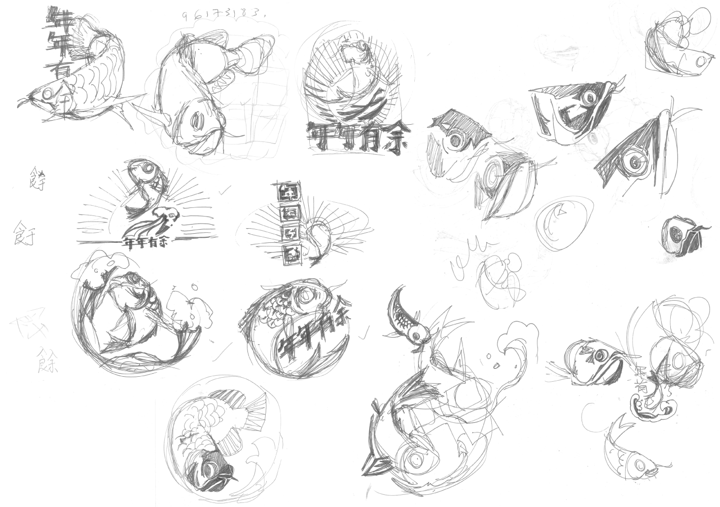
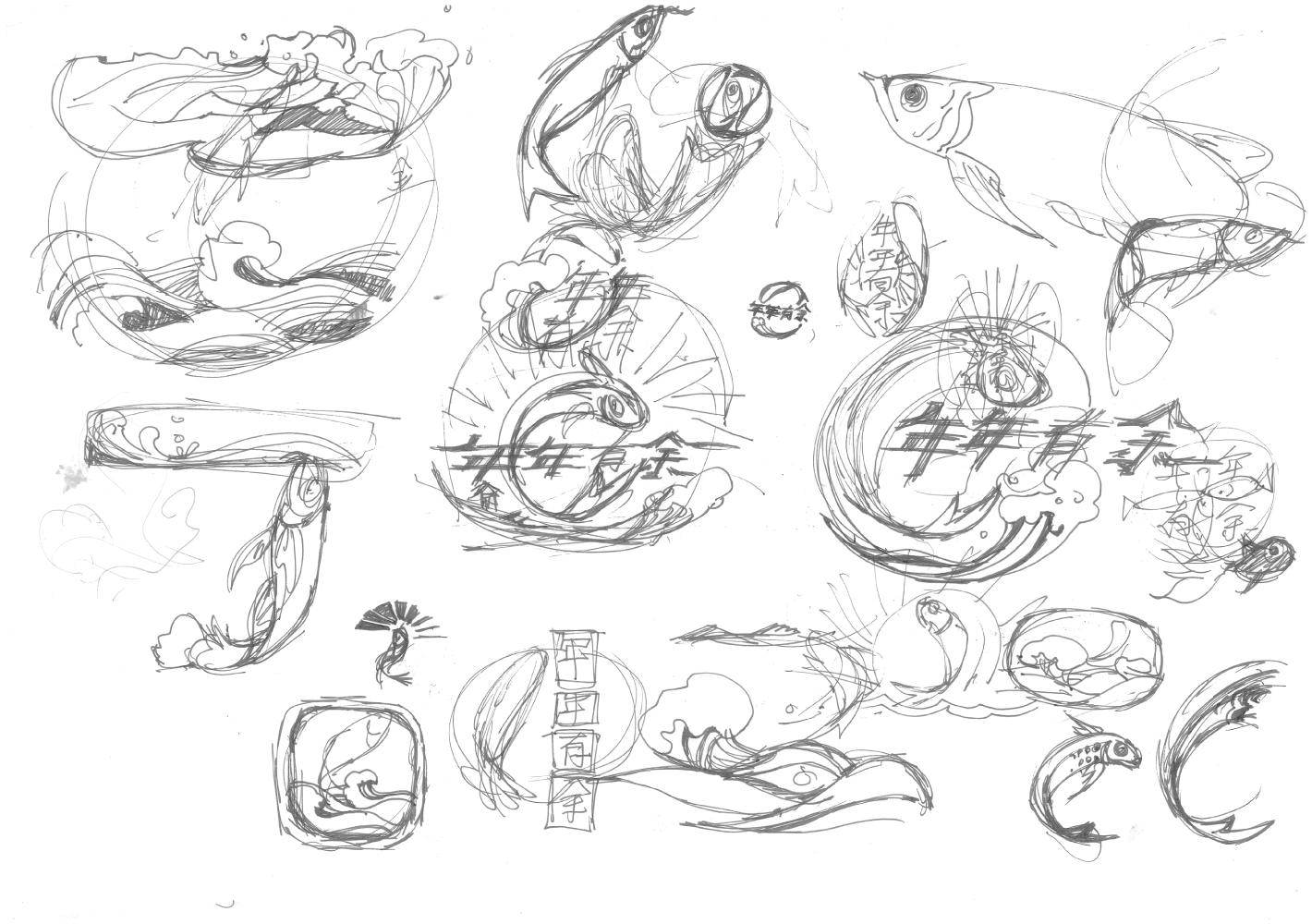
Development sketches of the carp emblem
It was a few years later when I came across the first mutations of my carp. Apparently one or more of the competitors had managed to extract the carp motif and replicated it onto plastic bags in all kinds of colours that were circulated islandwide. My carp design was out in the wild and nothing would stop it from multiplying for as long as any manufacturer found it sellable.
Looking back now, considering that I was paid only a few hundred dollars for my efforts, I can only imagine the royalties I could have amassed if I had the savvy to negotiate such a deal all those years ago.

First batch of plastic bags using the full carp emblem
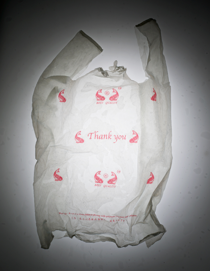
Current version of plastic bags using only the carp motif
Longevity like the mountains
More than two decades later, I can still see my carp every time I go to market. To my own amusement, this insignificant piece of work has become my most highly reproduced design.
Ironically, rather than being a point of pride, its ubiquity and pervasiveness chafe at my conscience — an immutable reminder to myself to consider the environmental consequences of my creative decisions.
I will always have to live with the fact that my most impactful work is condemned to the medium of a disposable, and probably non-biodegradable, plastic bag.
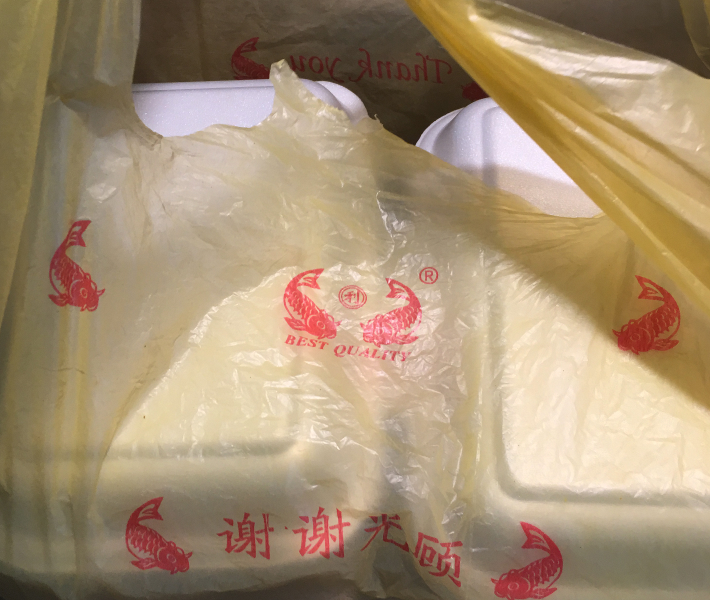
A typical Singaporean takeout featuring the carp plastic bag
A new lease of life
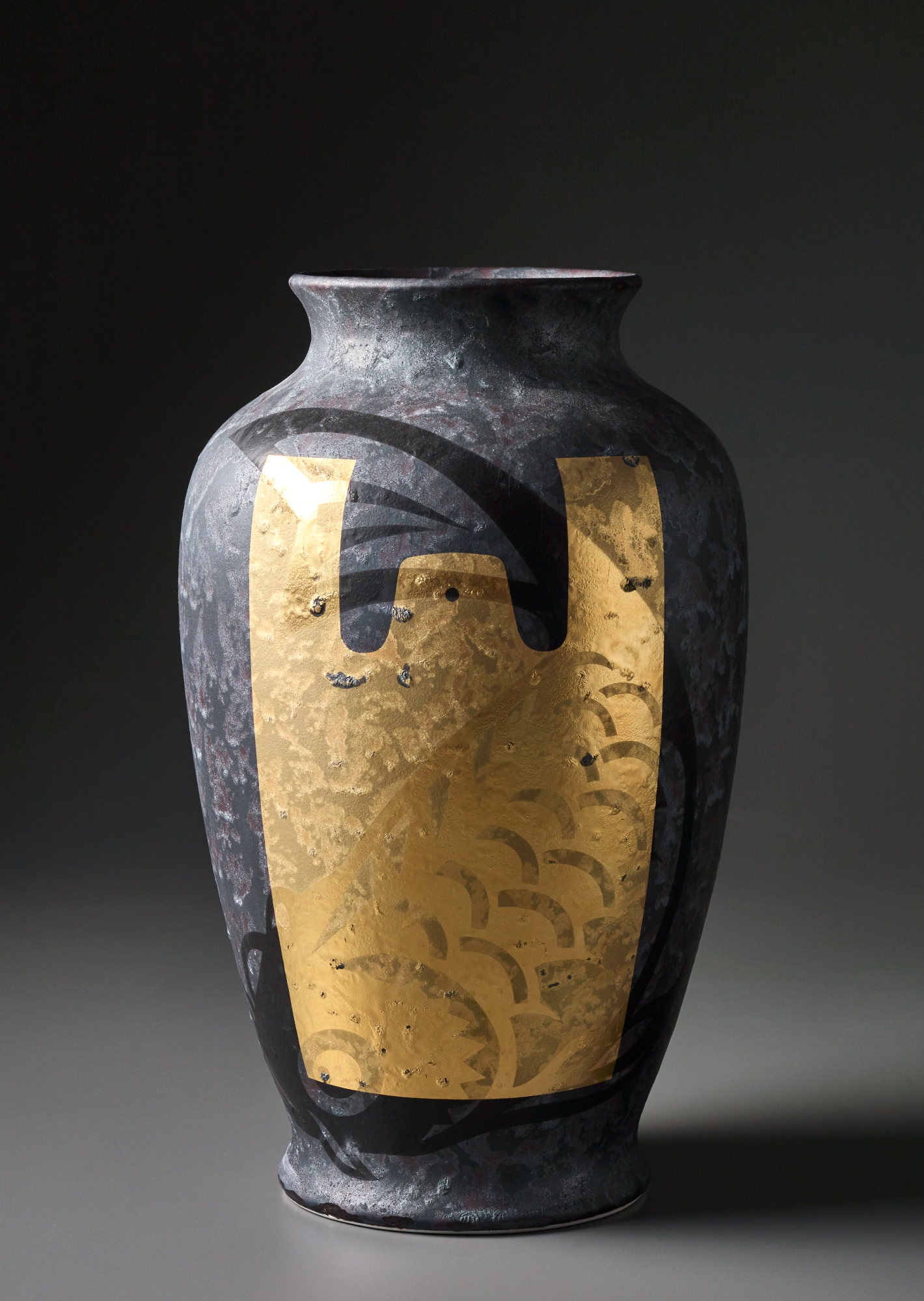
In 2016, Edwin from Supermama approached me to curate and participate in his Vessels exhibition, a collaboration between five Singapore designers and Japanese porcelain label Kihara Inc. Each designer was tasked to design a porcelain vessel marrying contemporary design with traditional craftsmanship.
In a flash, I seized the opportunity to reclaim my carp from its mass-produced, disposable nature and elevate it to more exalted and immortal state.
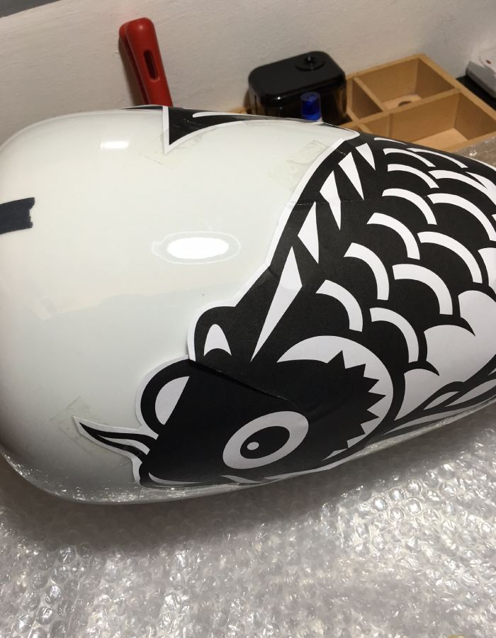
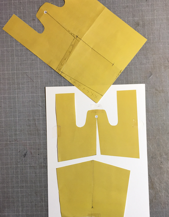
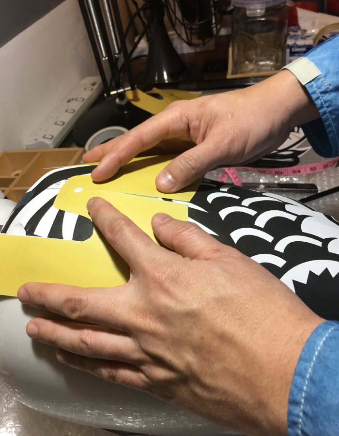
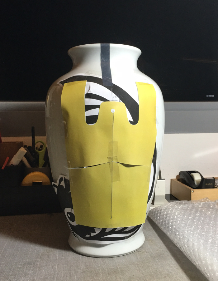
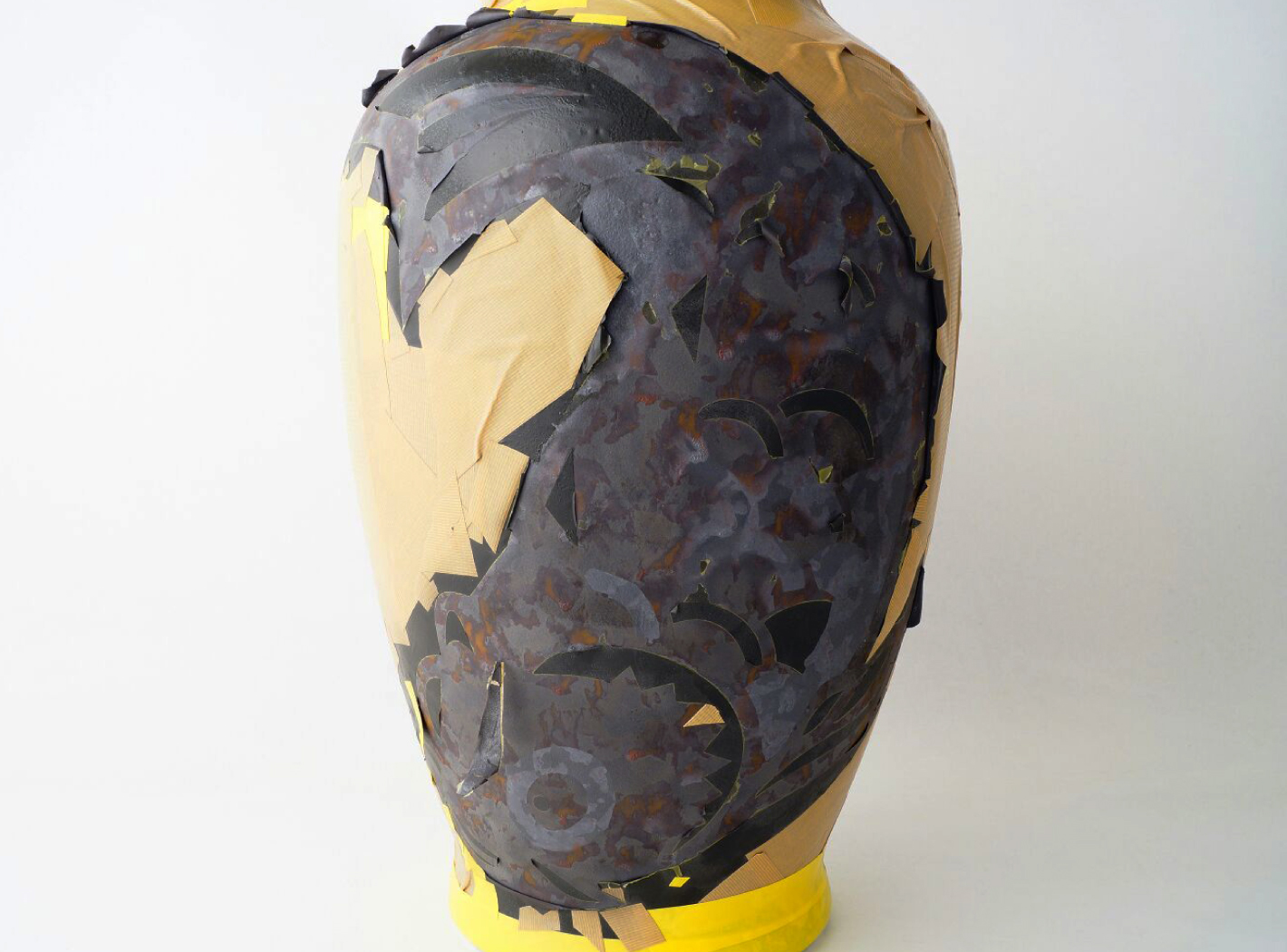
The original carp symbol was scaled up to fit the vase, and hand glazed with a unique rough texture. Gold leaf, thin as ash, was then delicately applied over the design, in the silhouette of a plastic bag. It proved to be a challenge, requiring several rounds of revisions from Kihara and a visit to Japan to sort it out. But at last, I have let the fish out of the bag, leaving the sea of plastic behind.
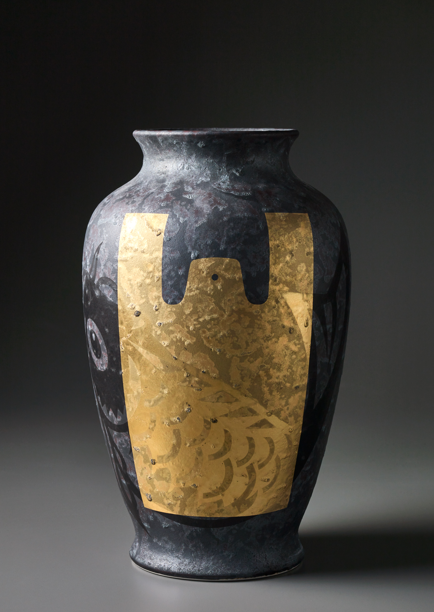
Fish out of the Bag, Supermama – Vessels
