It takes two hands to clap. If you like what you see and are interested in working together with us, let’s chat.
GET IN TOUCHSJX
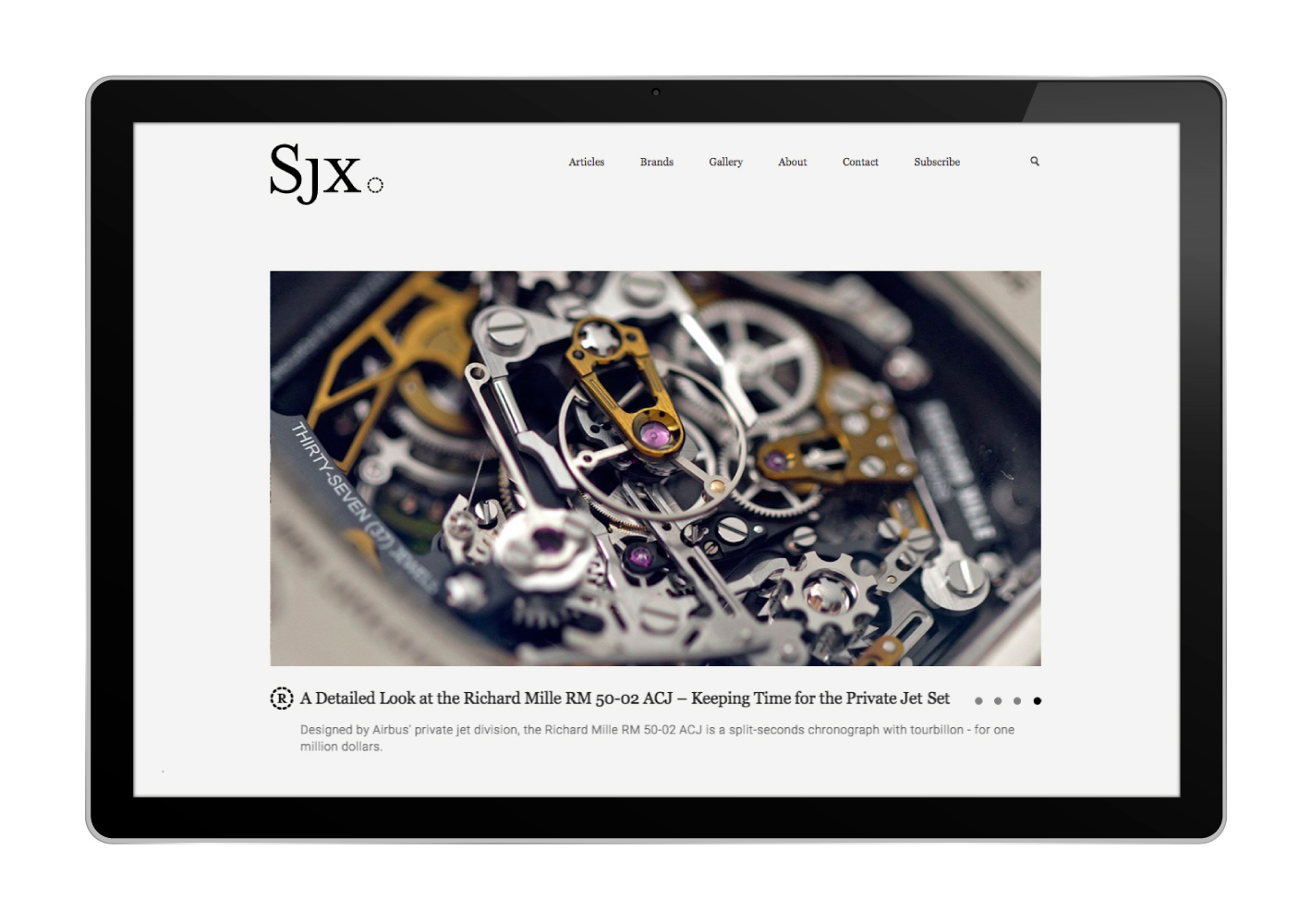
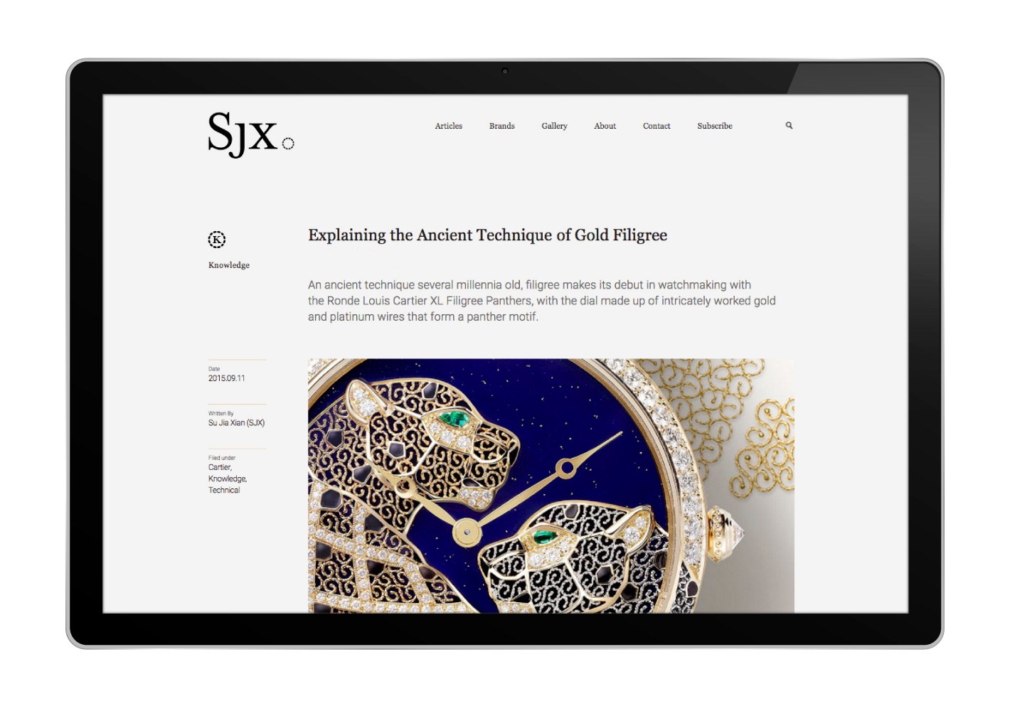
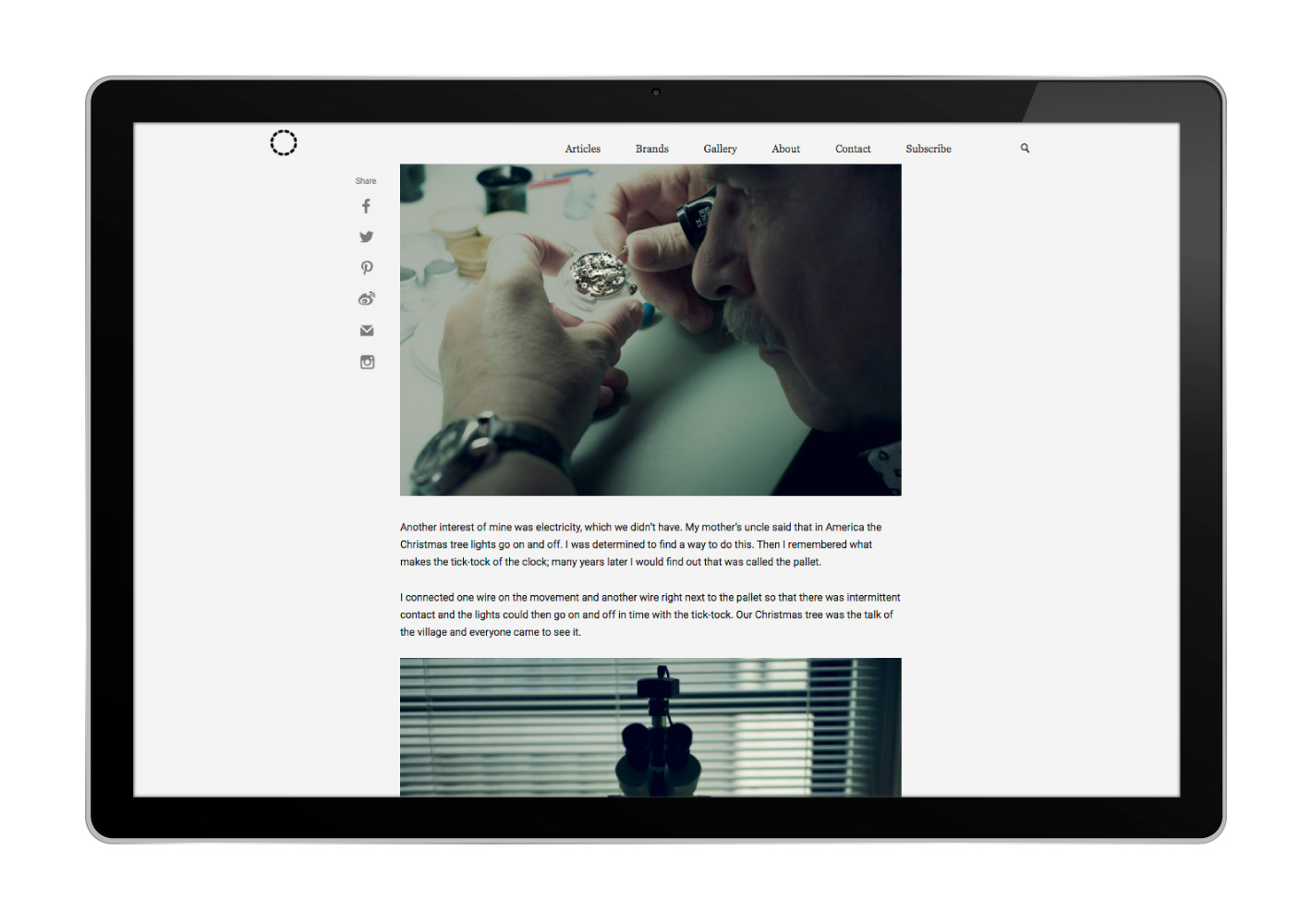
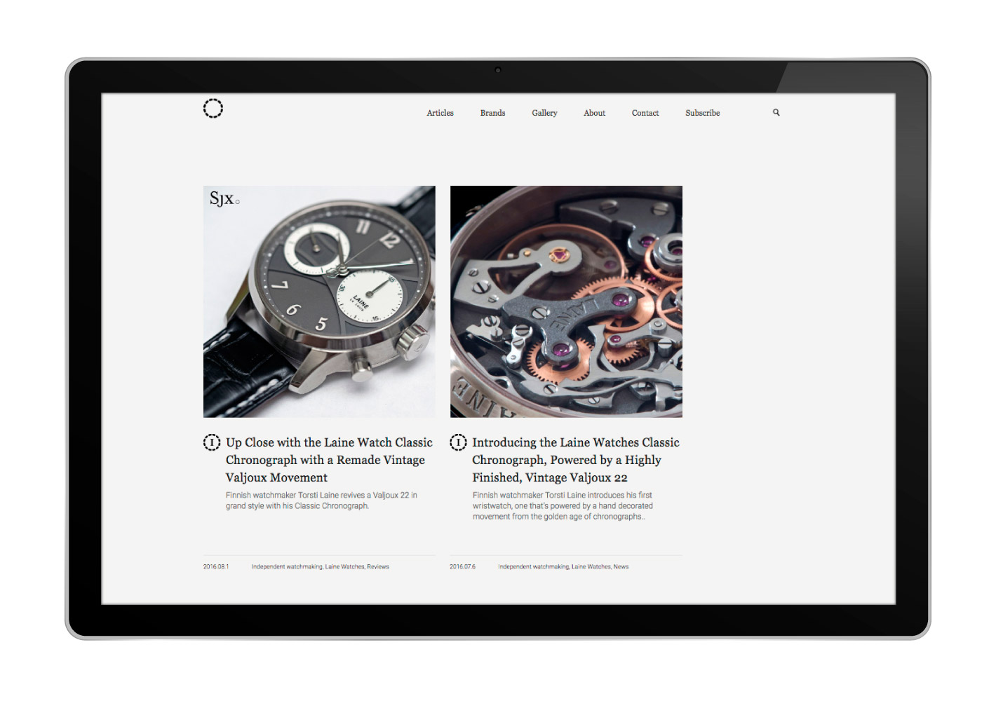
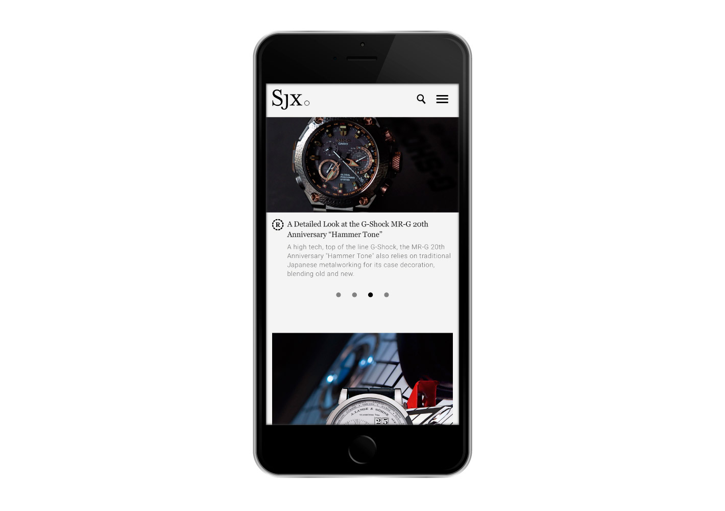
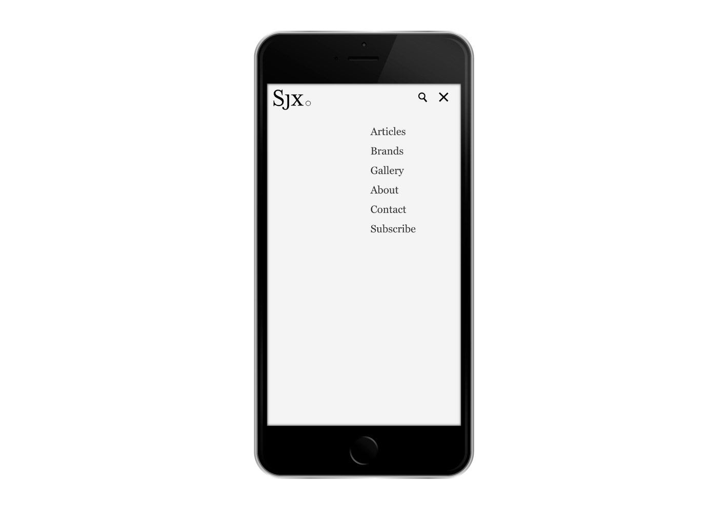
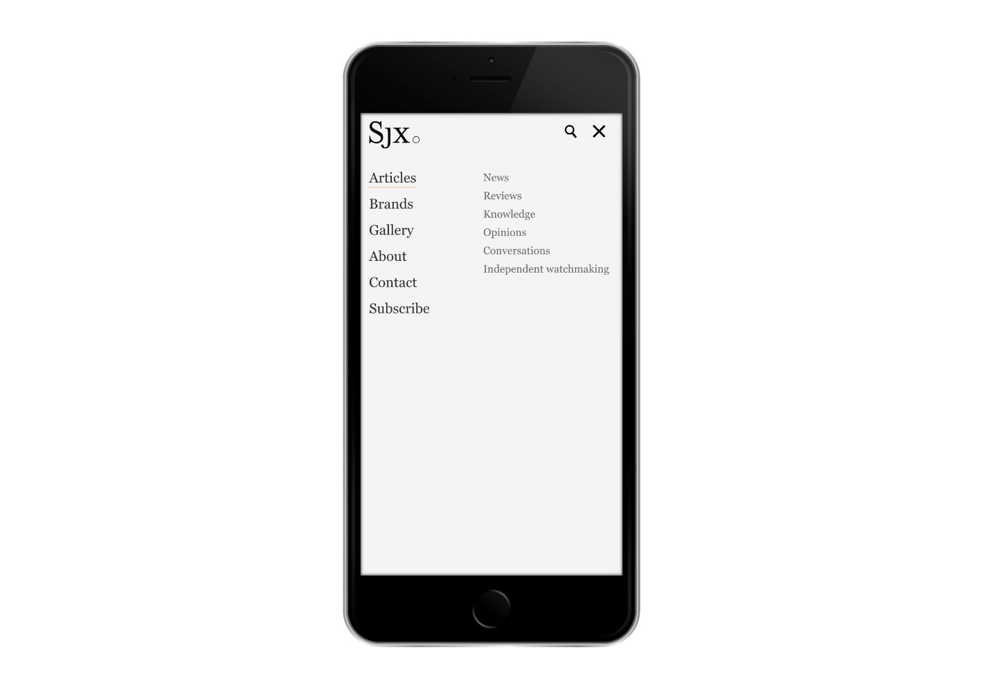
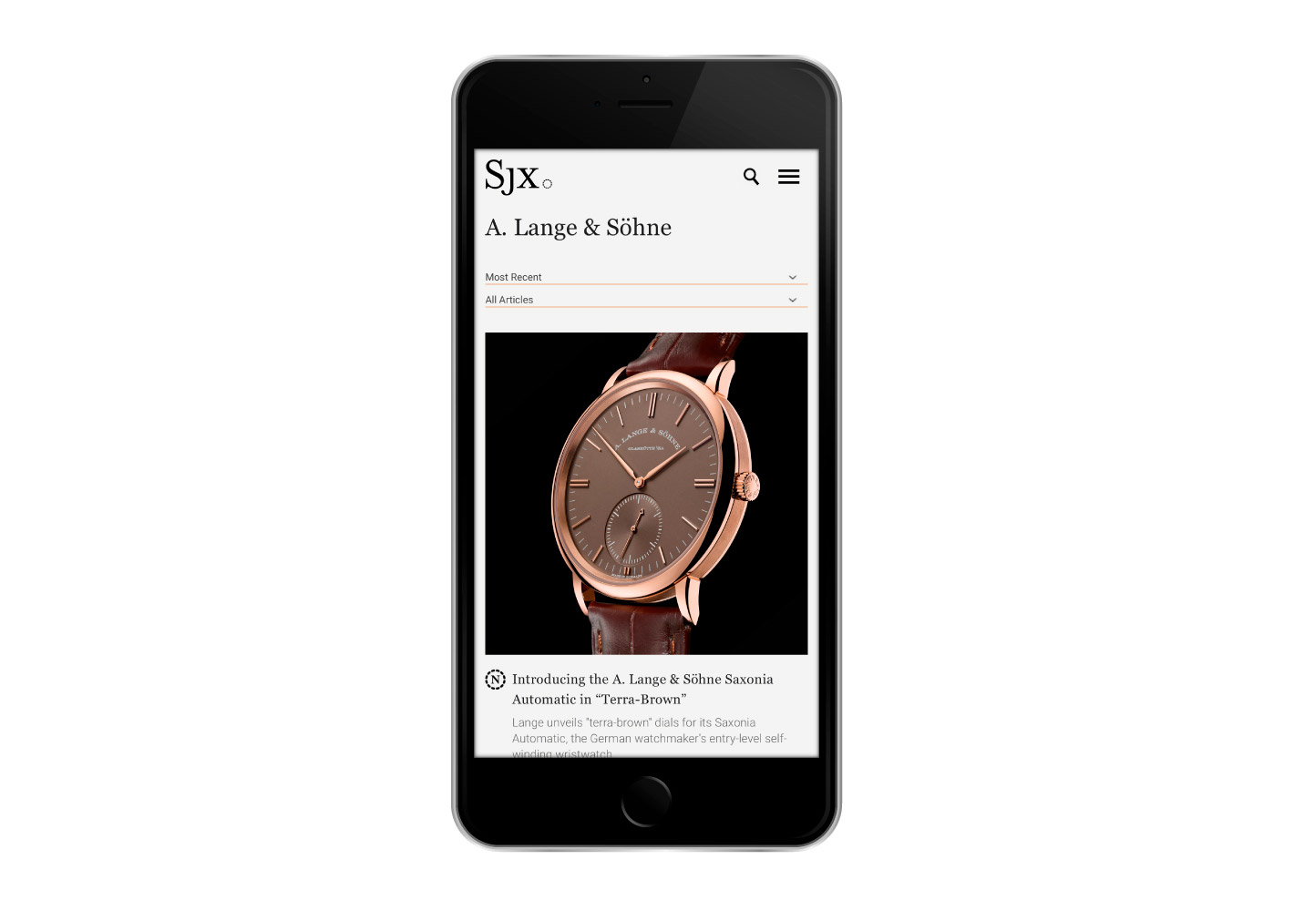
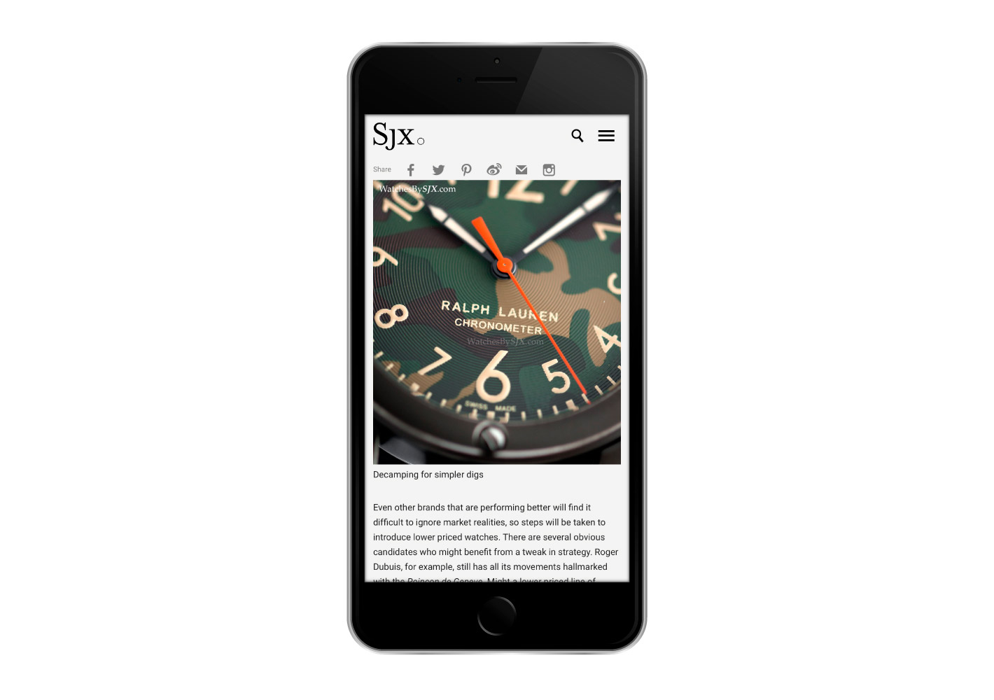
SJX is the brainchild of Su Jia Xian, one of Asia’s leading watch experts. We were commissioned to design the brandmark and his website.
SJX’s logo represents what Watches By SJX is: incisive, straightforward and having the last word, hence the use of the period at the end of the logo. Upon closer inspection, the period is actually made up of 12 sections – an abstract representation of time, and, more literally, a watch dial or bezel. It was also created to look like a link bracelet, representing the succession of connected ideas delivered under one voice.
The period symbol was also deployed as a encasing device, housing key elements for easy categorisation.
www.watchesbysjx.com
