It takes two hands to clap. If you like what you see and are interested in working together with us, let’s chat.
GET IN TOUCHSir Manasseh Meyer International School
How do you rebrand an organisation when it potentially involves a whole community’s cultural identity? This was the question posed to &Larry when we accepted the challenge of designing a new identity for Sir Manasseh Meyer International School (SMMIS), Singapore’s premier Jewish school. Together with Design Sojourn, we began with a brand audit that involved workshops with staff and parents, interviews with the board of directors and also parents who have left the school after its move from Orchard Road to its new premises in Sembawang. We gained insights to the Jewish community and its many differing perspectives, as well as the appeal of the school to non-Jews, despite non-ideal location.
We then developed a new brand strategy that included recommendations for the schools’ curriculum, communications and brand direction to improve community relations and brand appeal to expatriate parents. A new identity was then designed to encapsulate SMMIS’s values and brand ethos: “Pursuing wisdom for a better world”.
Identity
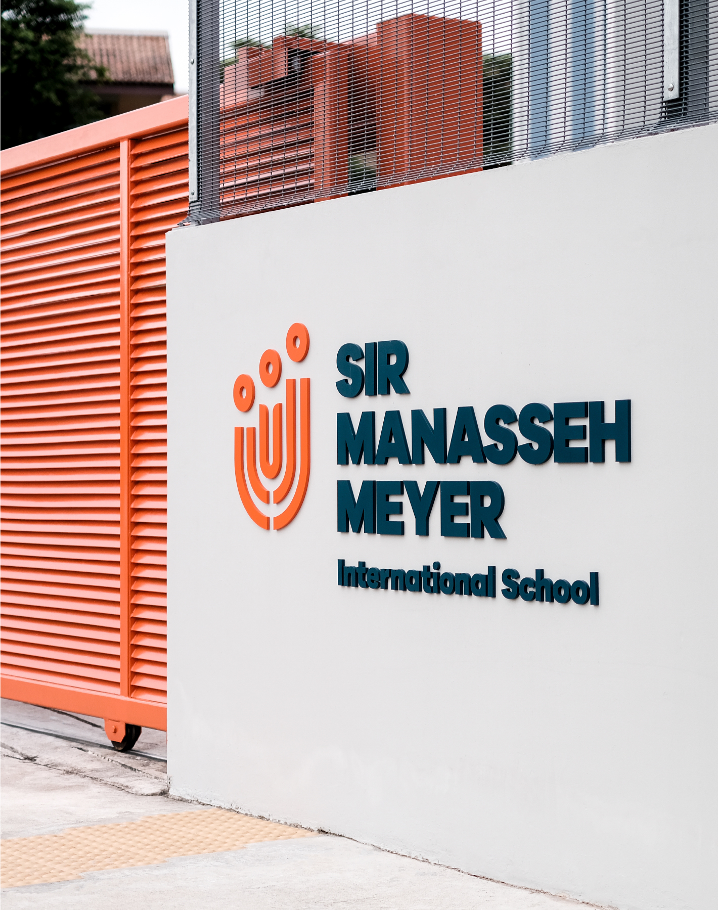
Our design of the new logo takes into consideration the need to preserve SMMIS’ Jewish identity while having broad appeal for an international school. The symbol itself is filled with meaning, incorporating elements such as the Jewish menorah, and symbols of universal values such as knowledge, growth, mutual support, community and respect for a child’s individuality.
Photography
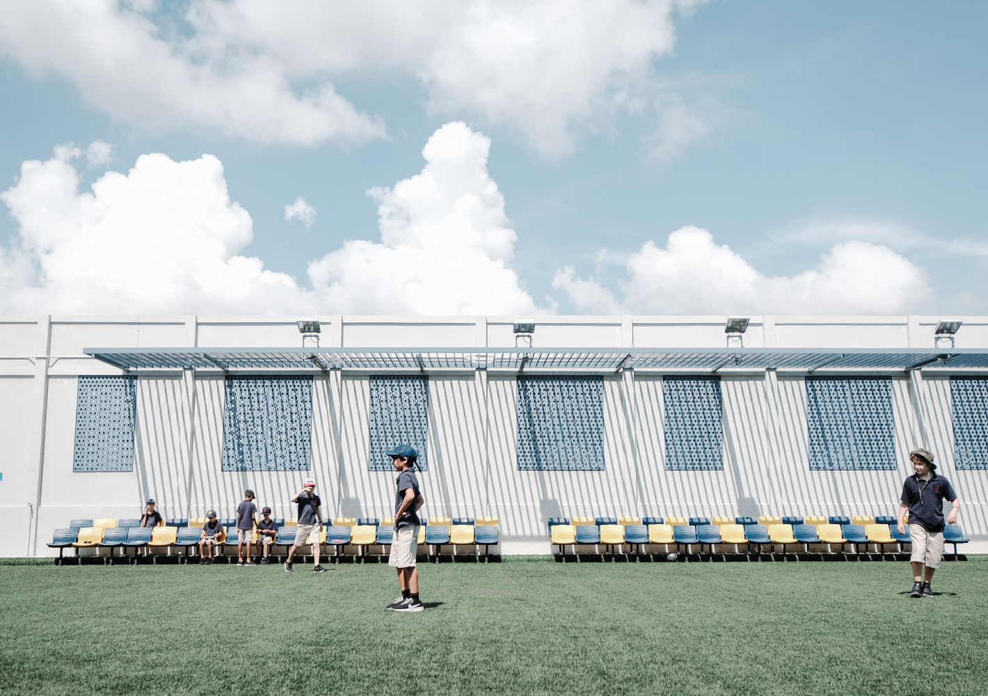
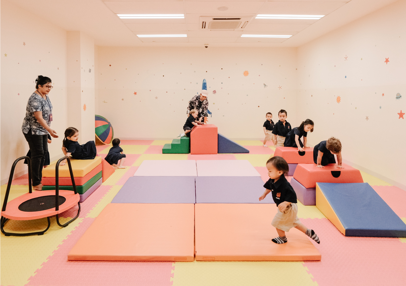
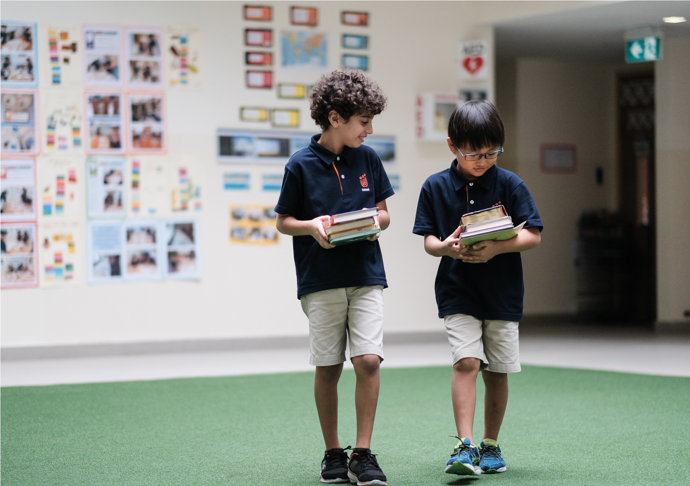
To support the new identity, we developed a new direction for the style of photography – emphasising natural light, spontaneity and authenticity, natural expressions and students engaged in active learning — all the better to showcase the camaraderie and vibrancy of the SMMIS campus. The new direction was executed by photographer Rebecca Toh.
School Façade
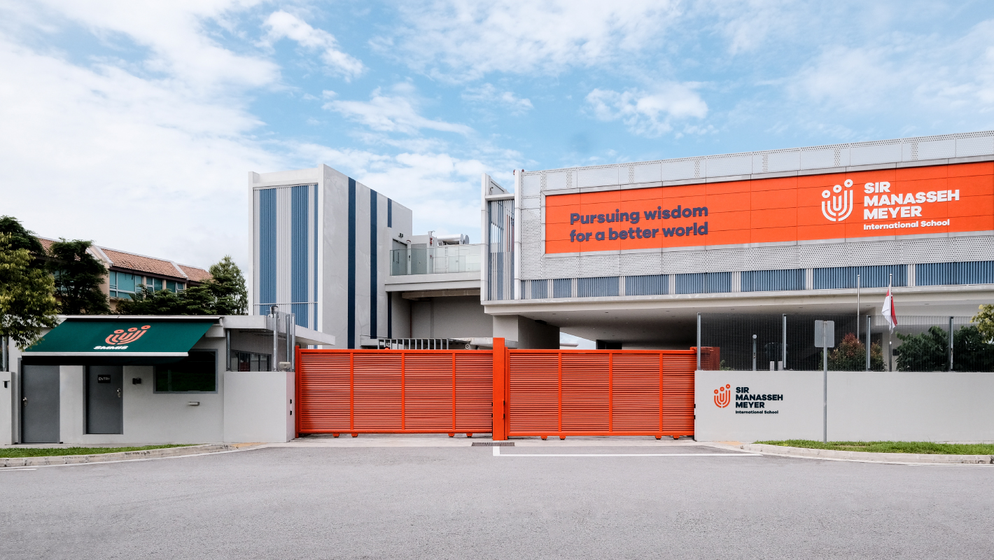
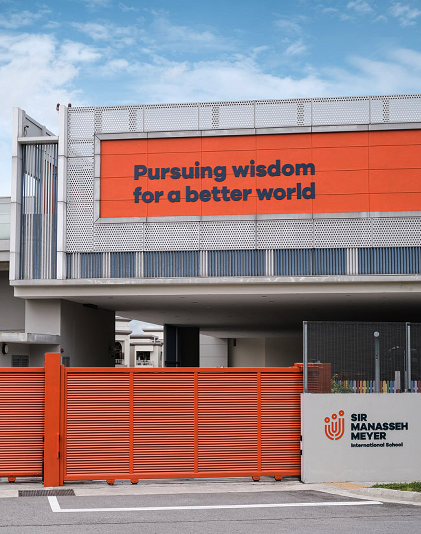
Where previously the school gates were imposing walls of grey, they are now in a lively shade of orange, as is the school’s façade, which boldly proclaims SMMIS’ ethos: “Pursuing wisdom for a better world”. The effect is a decidedly warmer and more welcoming reception for visitors coming to SMMIS for the first time.
Mural & Signage Design
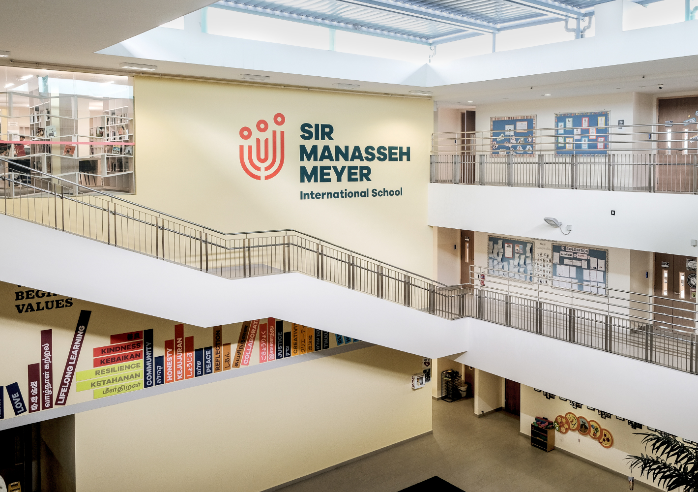
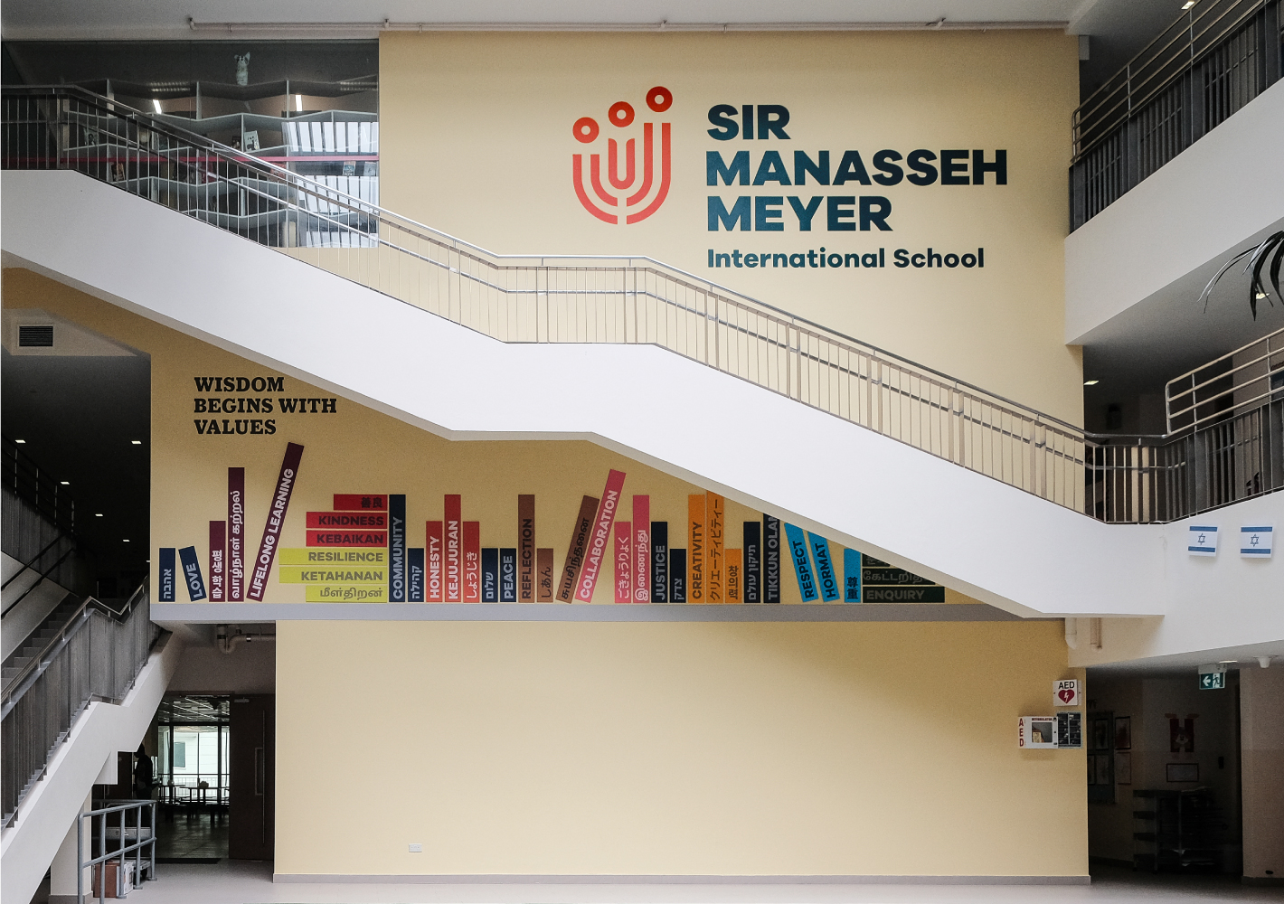
As part of the spatial branding for SMMIS, we redesigned the facing wall in the main atrium to feature ‘books of wisdom’ titled after the schools’ core values of Love, Lifelong Learning, Kindness, Community, Honesty, Peace, Reflection, Collaboration, Justice, Creativity, Respect and Enquiry.
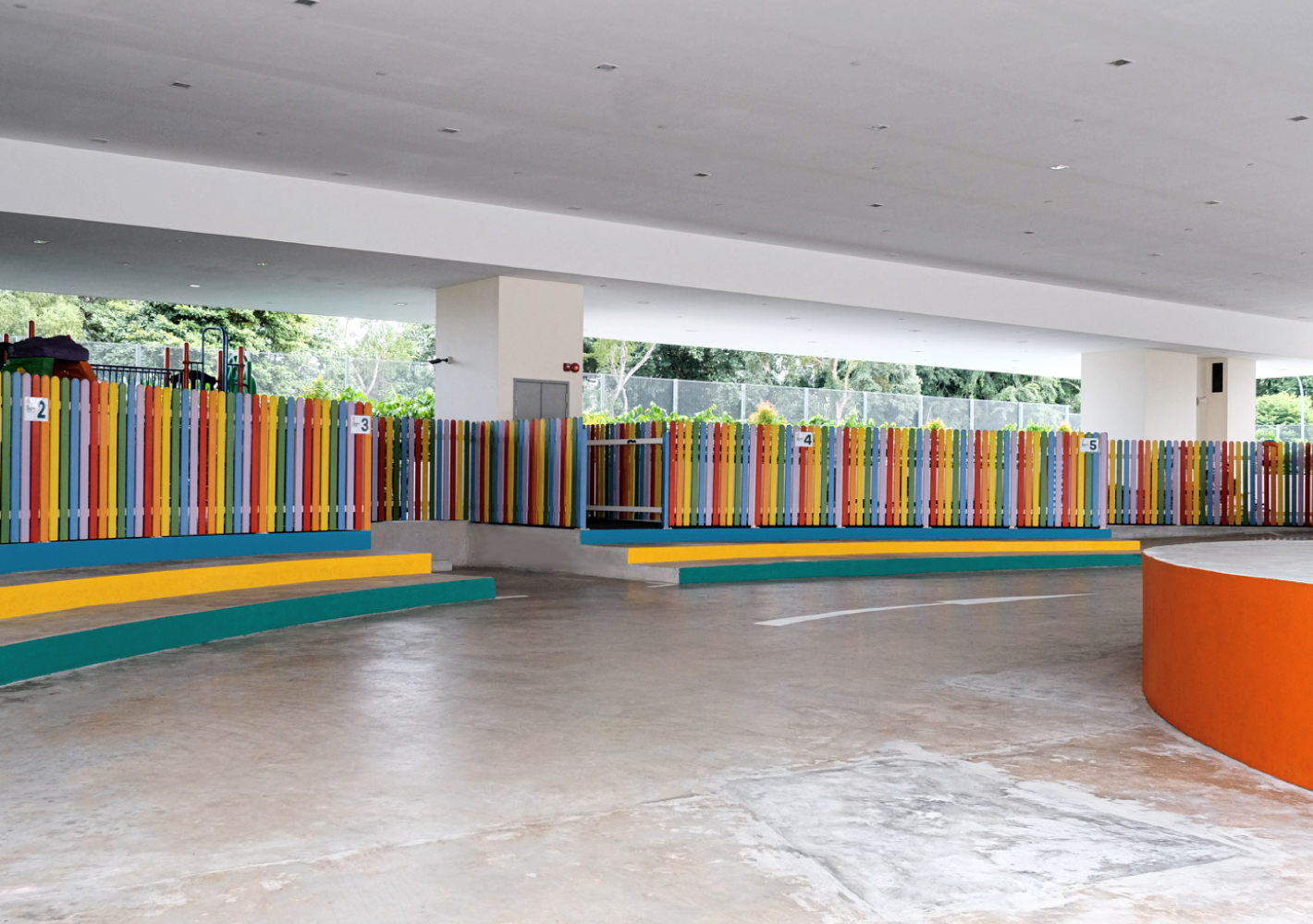
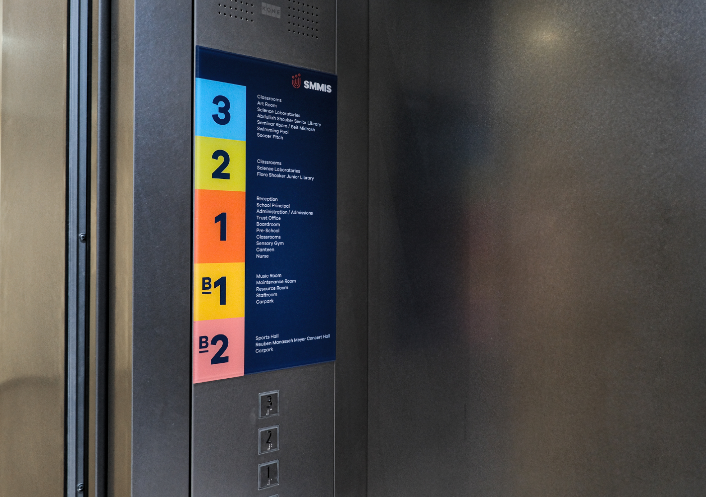
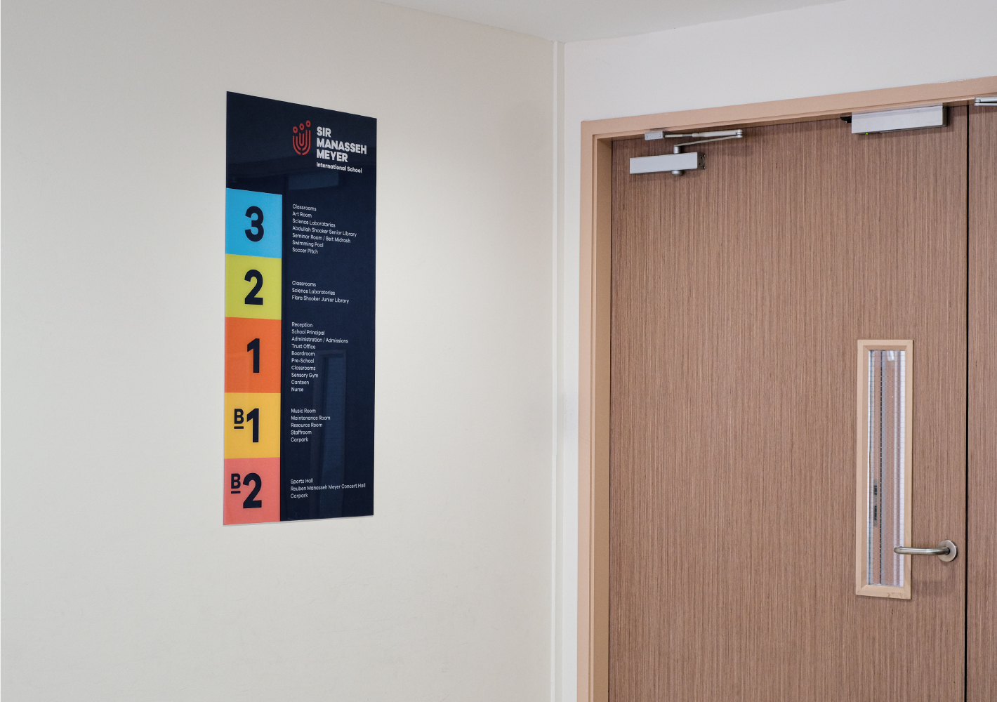
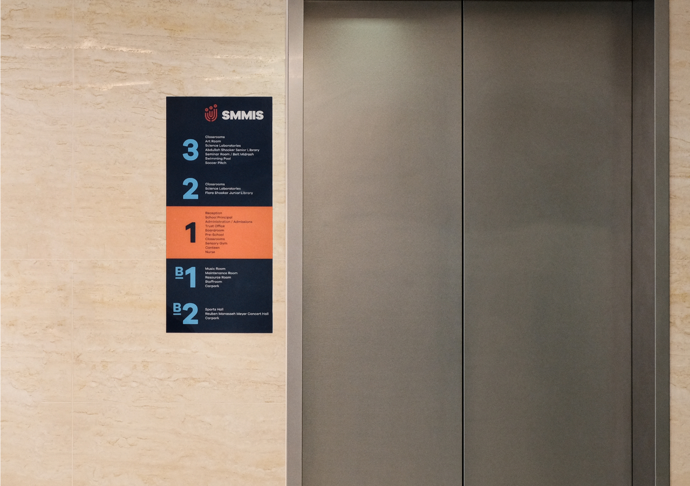
We also advised on the use of colours throughout the school to create a more joyful environment. From the driveway to corridors and the design of wayfinding signs and lift directories, colours perform both functional and emotional roles in the overall identity of the school.
Brochure Design
A new marketing brochure was designed for SMMIS, succinctly packaging the schools’ unique value proposition as an International School that emphasised values and culture as much as it does for the academic excellence of its students.
Iconography
The identity for SMMIS was further developed into a versatile system of icons, where the logo serves as the graphic basis for all manner of activities involving learning, sports, arts and music.

Website
A new mobile-first website was also developed to bring the new SMMIS brand to life on the Internet. Eschewing the corporate look of typical international schools, SMMIS’s website is a true reflection of its non-profit status. The use of colours, imagery and language come together to give visitors, and especially expatriate parents, a good sense of what the school offers and what it truly cares about: the academic growth and moral and emotional development of its students.
Brand Extension
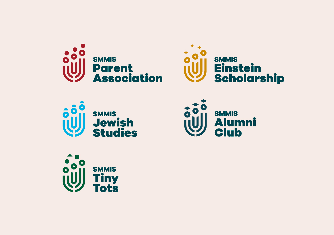
As a final touch, we developed brand extensions for SMMIS-related organisations, using the graphical elements and the new colour palette to provide ease of differentiation while retaining a shared identity with the school.
