It takes two hands to clap. If you like what you see and are interested in working together with us, let’s chat.
GET IN TOUCHDirect Funeral Services
What if you question an industry catchphrase and discover a deeper truth about your brand? That is what happened when Direct Funeral Services approached &Larry to help with its rebranding.
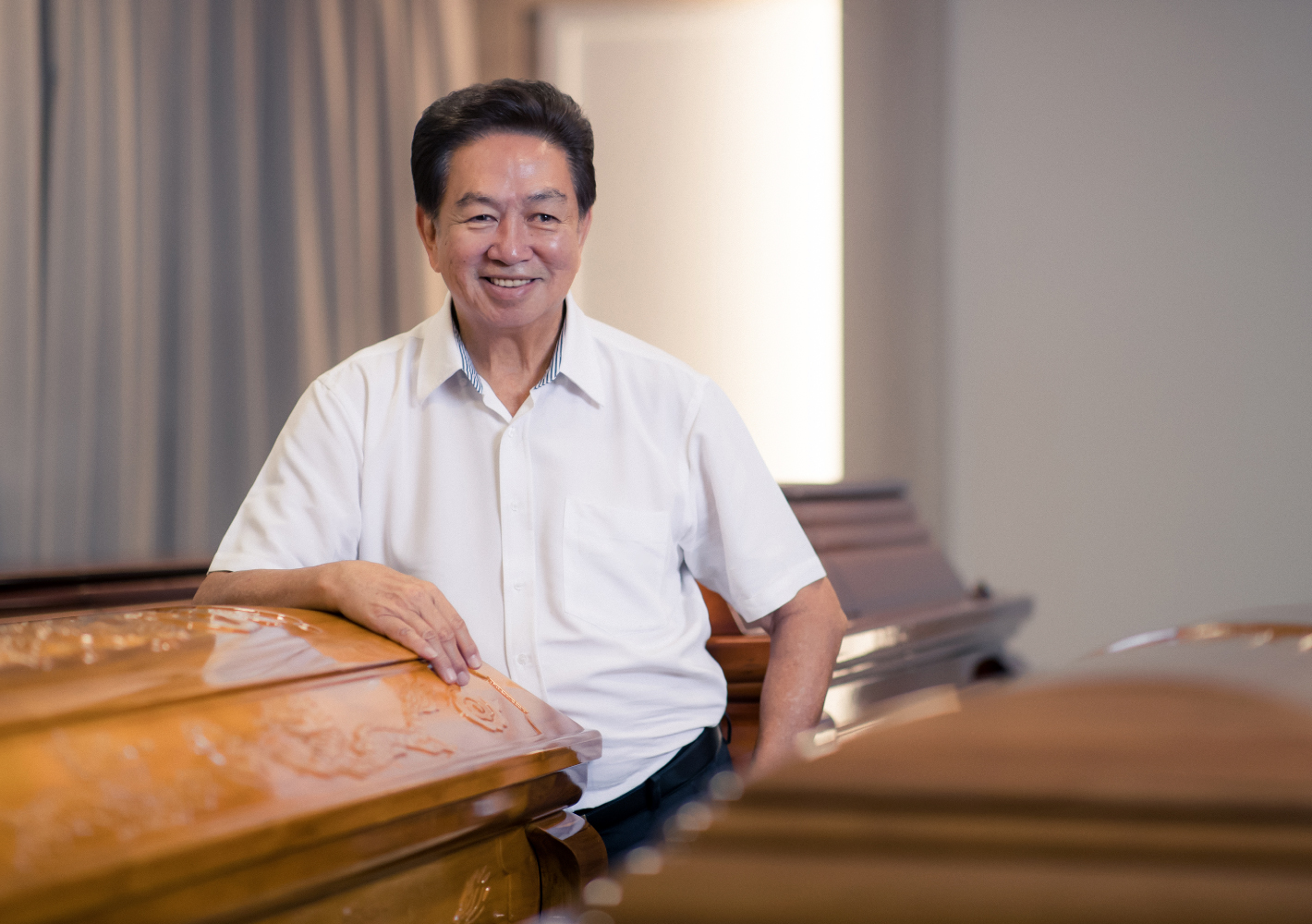
Well known for the philanthropic acts of its founder Roland Tay, Direct Funeral had been amongst the first in Singapore to adopt a modern approach to funeral services – adopting more formal western attire and updating its services and the designs of its ceremonial banners, wreaths and related materials for a younger generation. Competitors soon followed suit and used many of the same talking points, especially about how the industry ‘helps people find closure.’
Brand Discovery Process
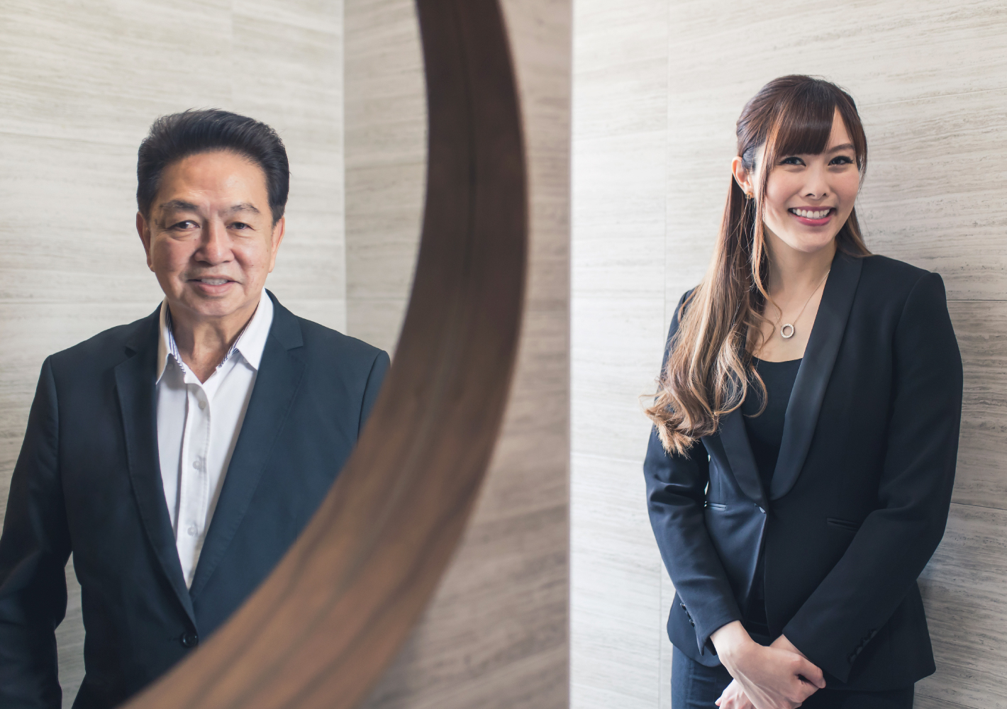
During the brand audit, &Larry conducted in-depth interviews with the founder, management and staff members, and even shadowed the team at work. We also interviewed customers and discovered several key insights. The first was that ‘closure’ was a misnomer; no one could define it properly, nor was it an actual desire of the bereaved. Another was that the name of the company, ‘Direct’, while simple in its origin — Roland had wanted people in need to “come directly to him for help” — had deeper implications when considering the company's principles and values-in-action.
&Larry translated these insights into a new brand story and strategy that not only made sense to the owners, but also clarified the company vision. ‘Direct’ would mean ‘to guide’, in that the company shepherds people in their time of grief, providing guidance as to the proper rites and procedures, which are often unfamiliar to younger people. It was as much about filial piety as it was about seeking a way to continue living with the memory of loved ones who have passed on.
Brand Strategy & Story Development
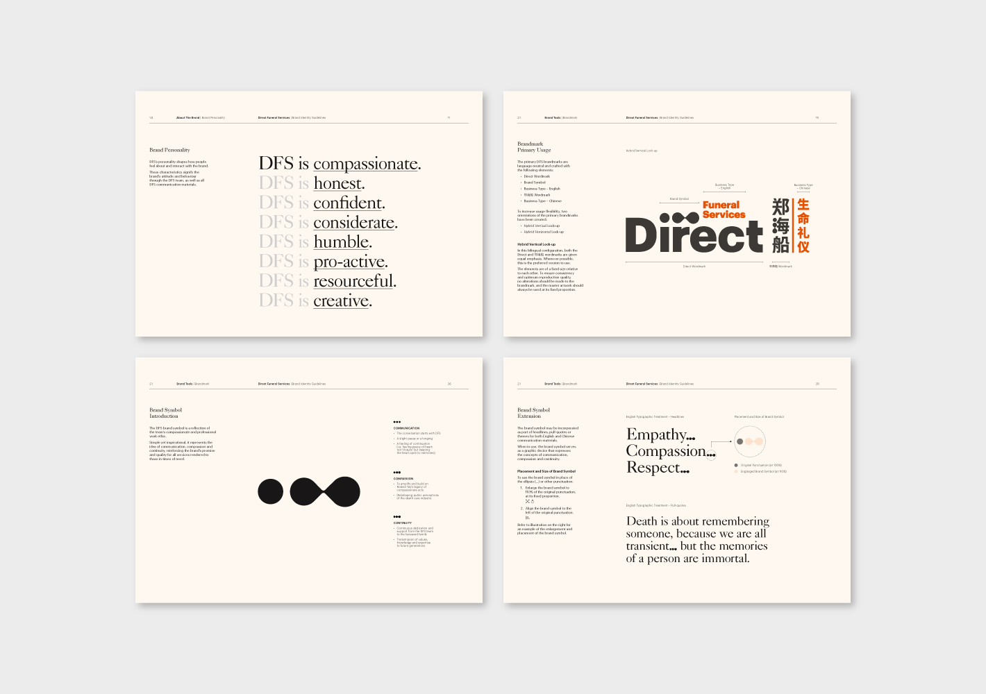
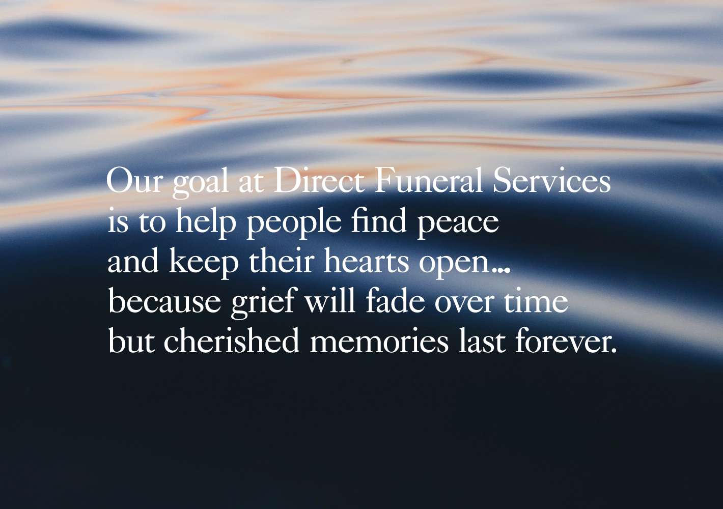
The new brand strategy moved away from the cliche of 'finding closure' to 'finding peace and keeping an open heart'. While 'empathy' is often bandied about as a means to understand customers' needs, in the case of Direct Funeral, it was more about codifying the company's existing philosophy, values and practices as set-out by the founder.
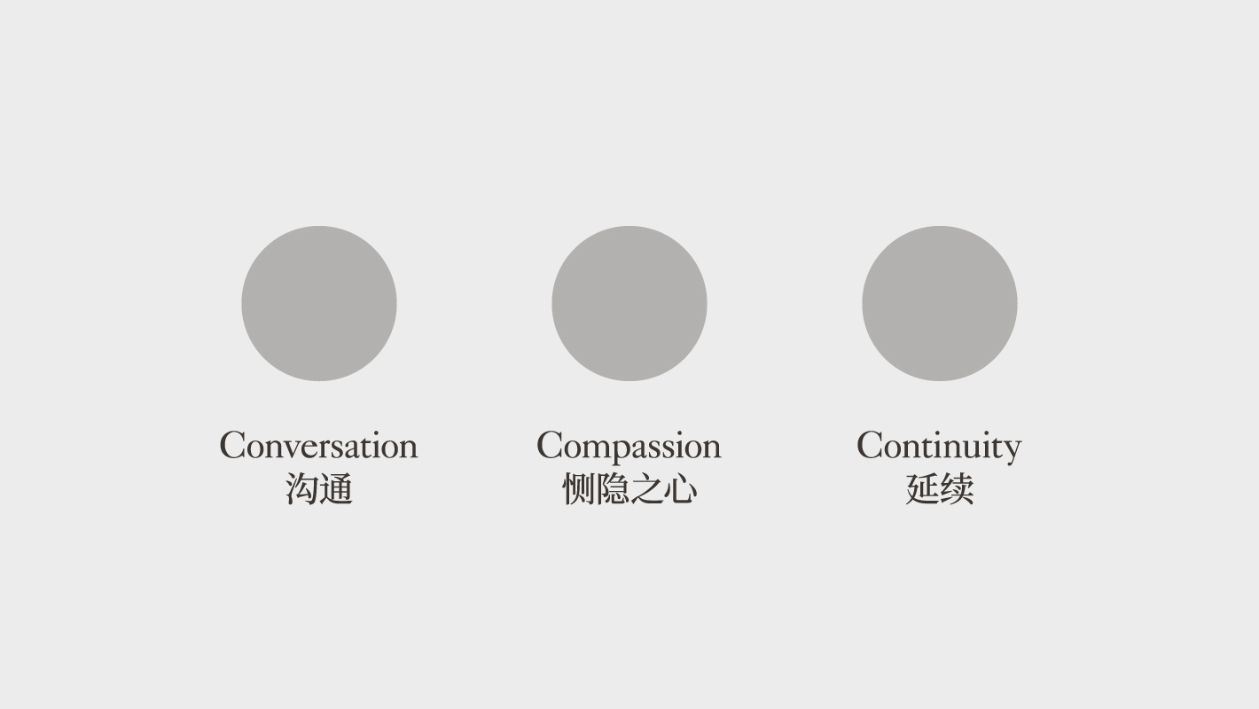
Instead of closure Direct Funeral focuses on continuity, making it their mission to help the living cope with grief, that memories of the deceased may live on.

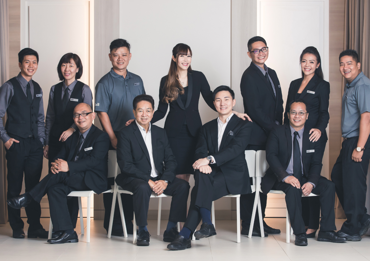
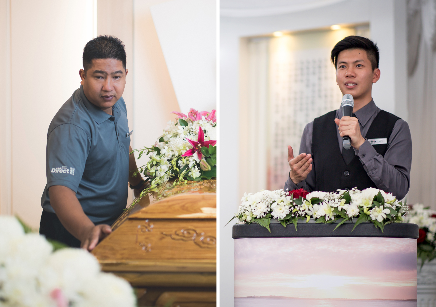
An all-hands alignment session on the new branding and direction was conducted, ensuring that staff members understood their part to play in ensuring the continued success of the company, from its values and brand story to its commitment to sincere and compassionate service.
Corporate Identity System & Collaterals Development
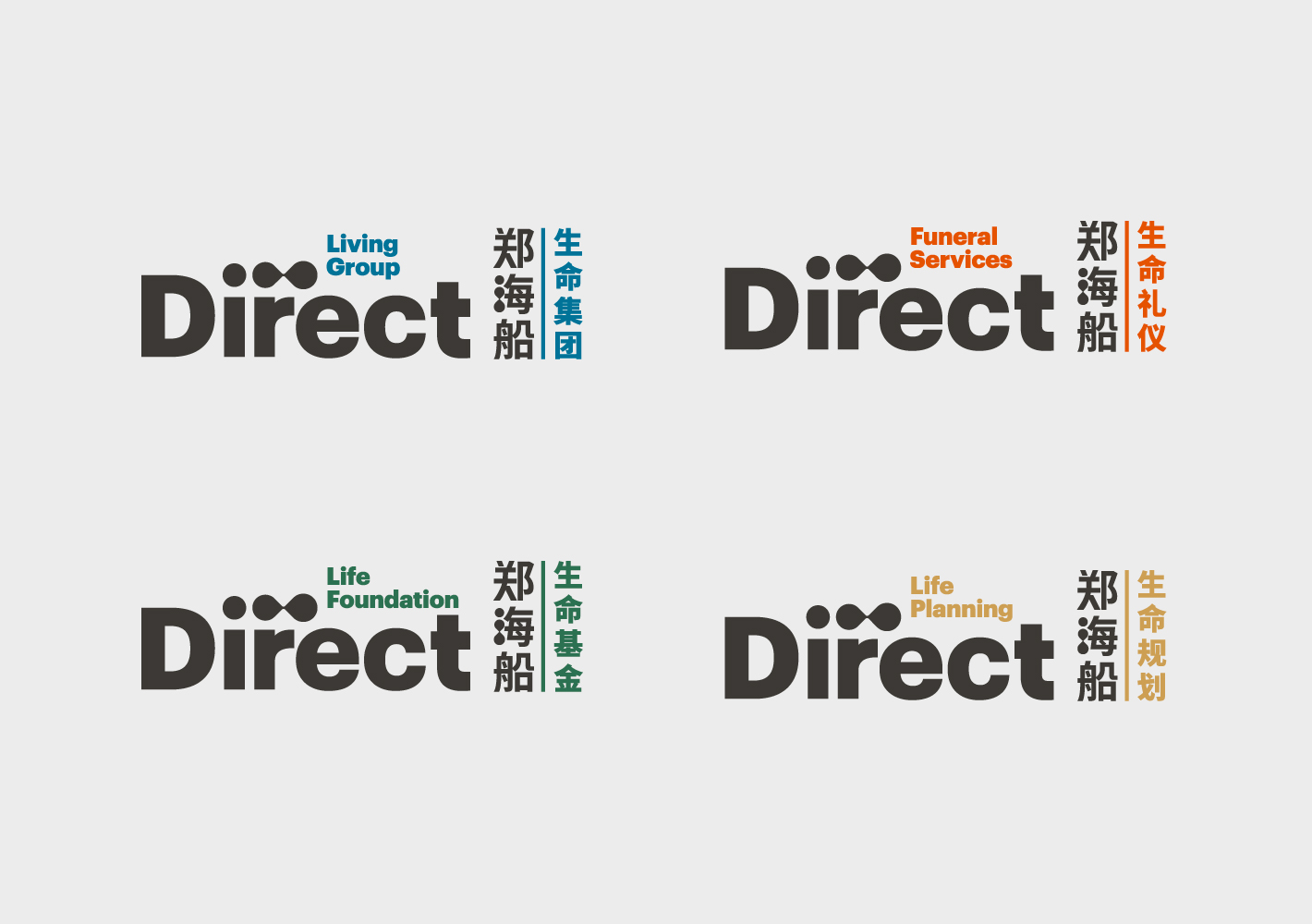
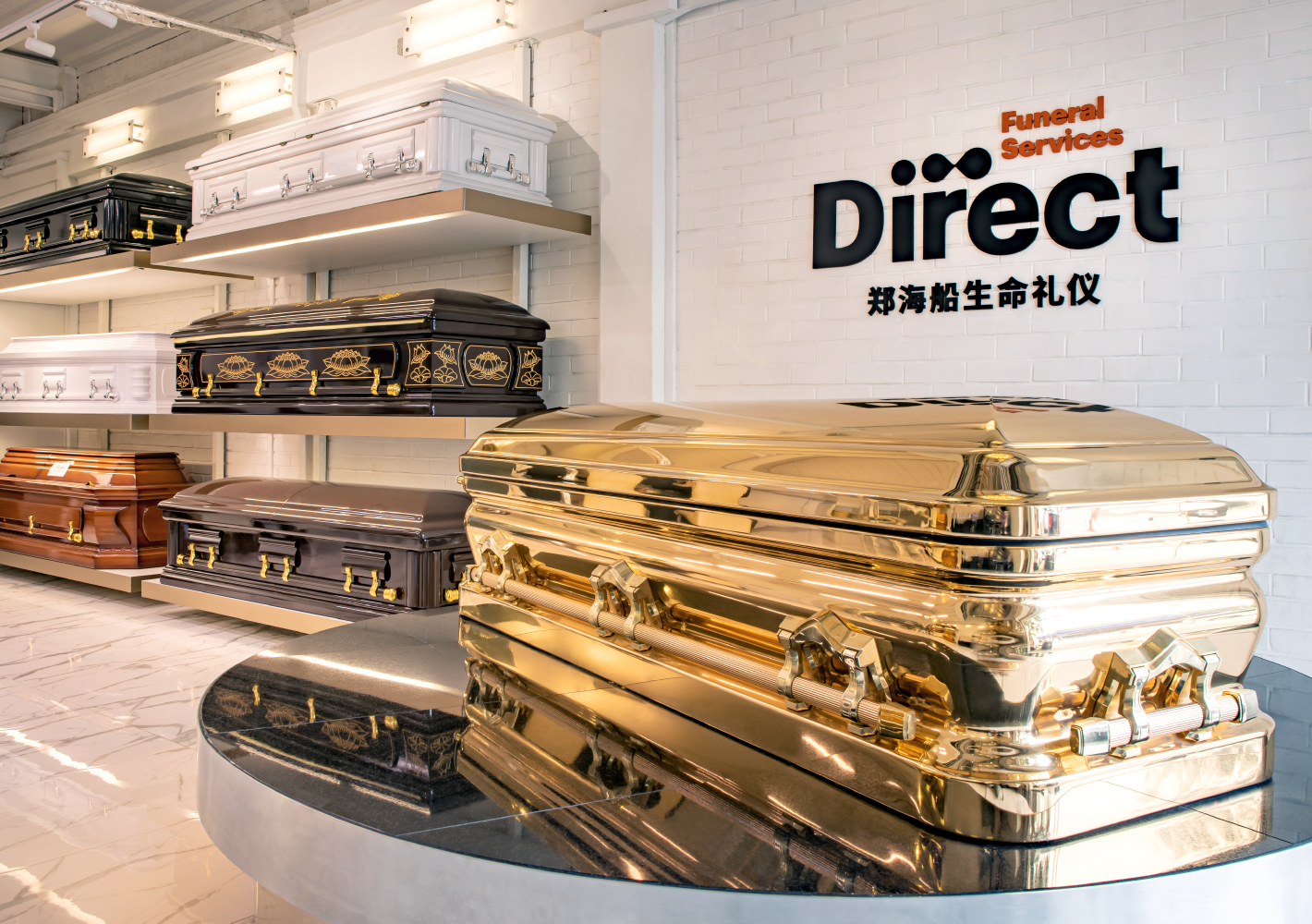
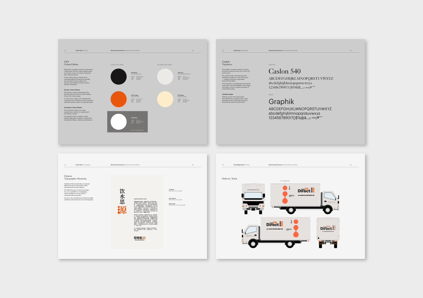
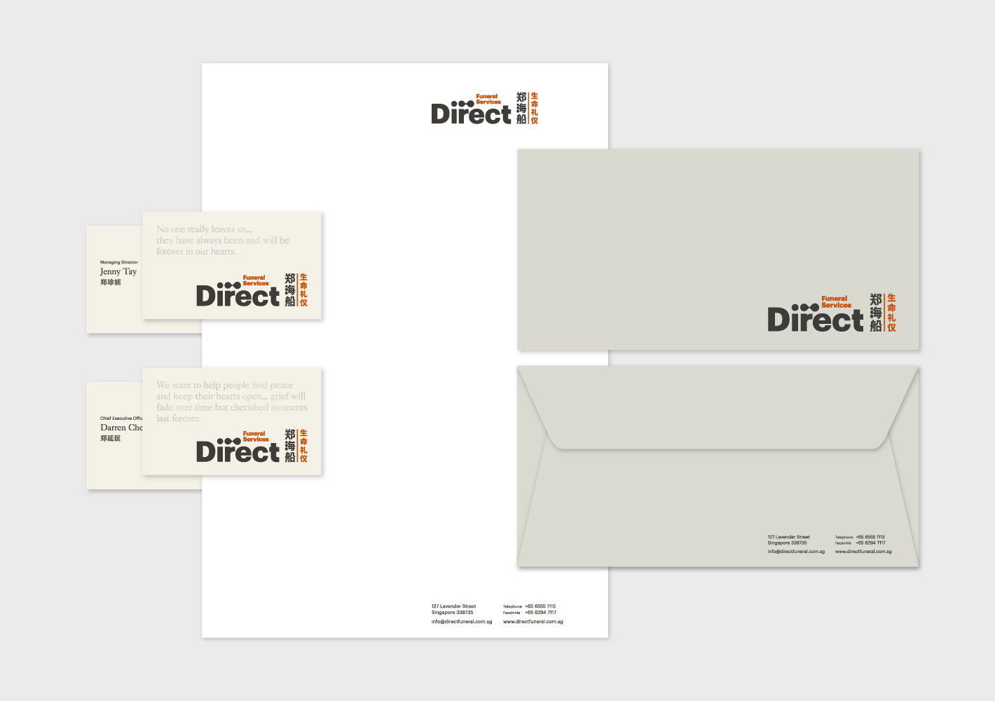
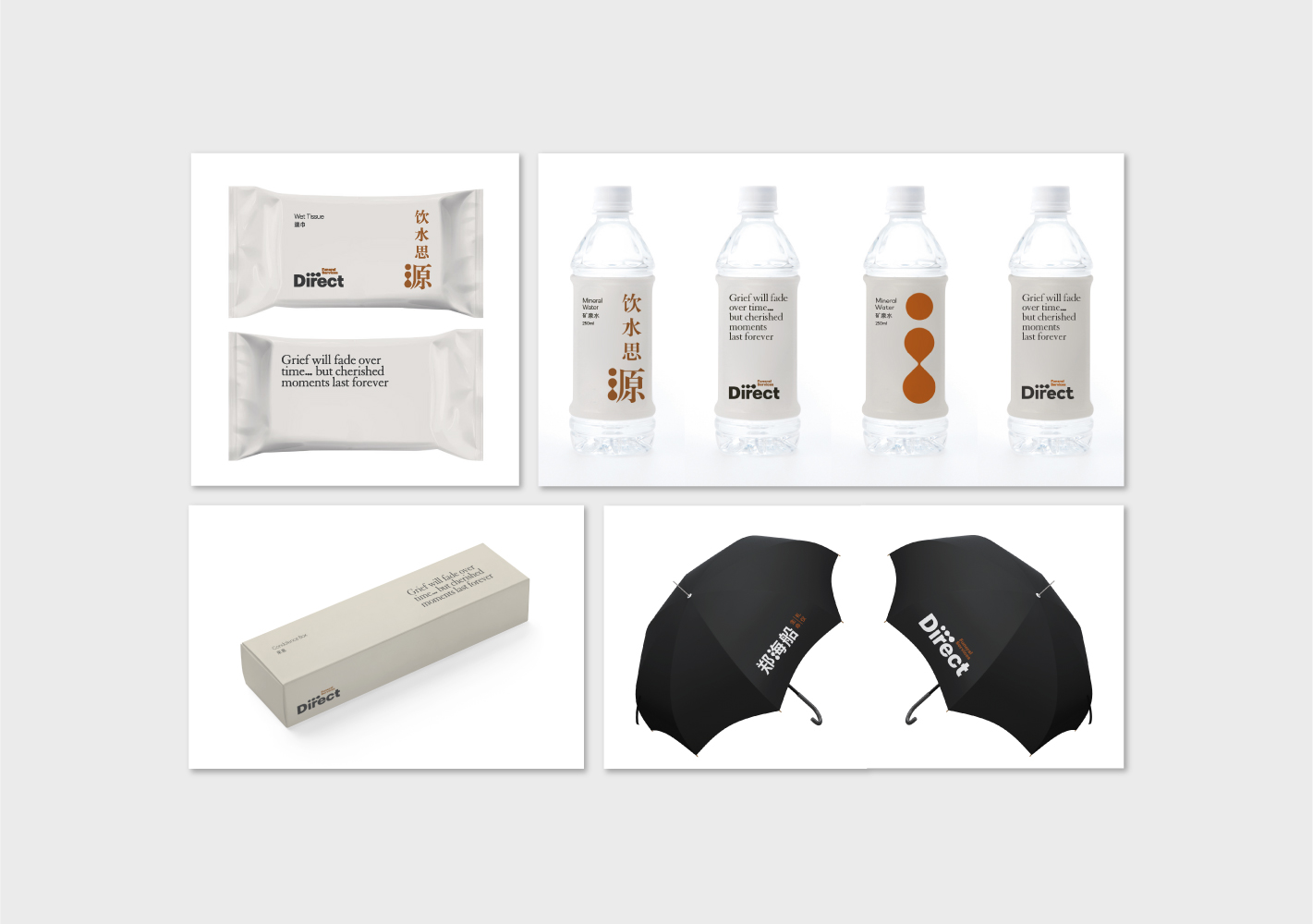
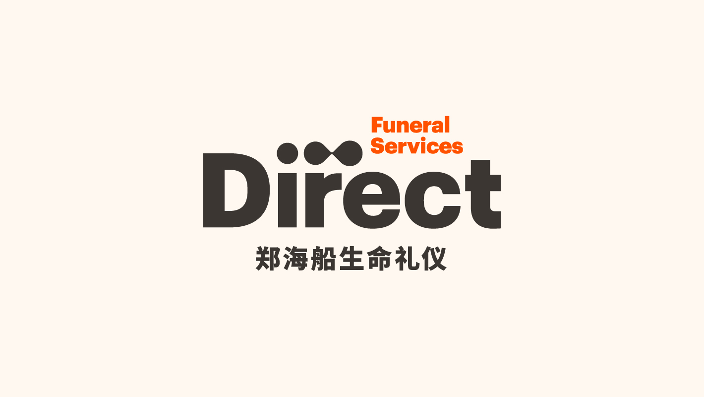
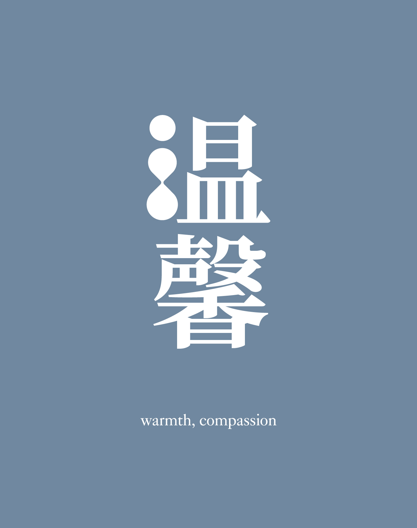
Taking care to consider the bilingual needs of the company, we incorporated an ellipsis in the new logo. The three dots symbolise a continuation of life, and when positioned vertically in Chinese, it takes the form of the radical for ‘water’ – itself symbolic of the source and the continuation of life. Equally important was the design of the colour palette, which eschewed the typical pastel shades of blue and pink for a distinctive shade of orange – the colour of life. The naming in Chinese was revised to emphasise ‘life’ over ‘death’.
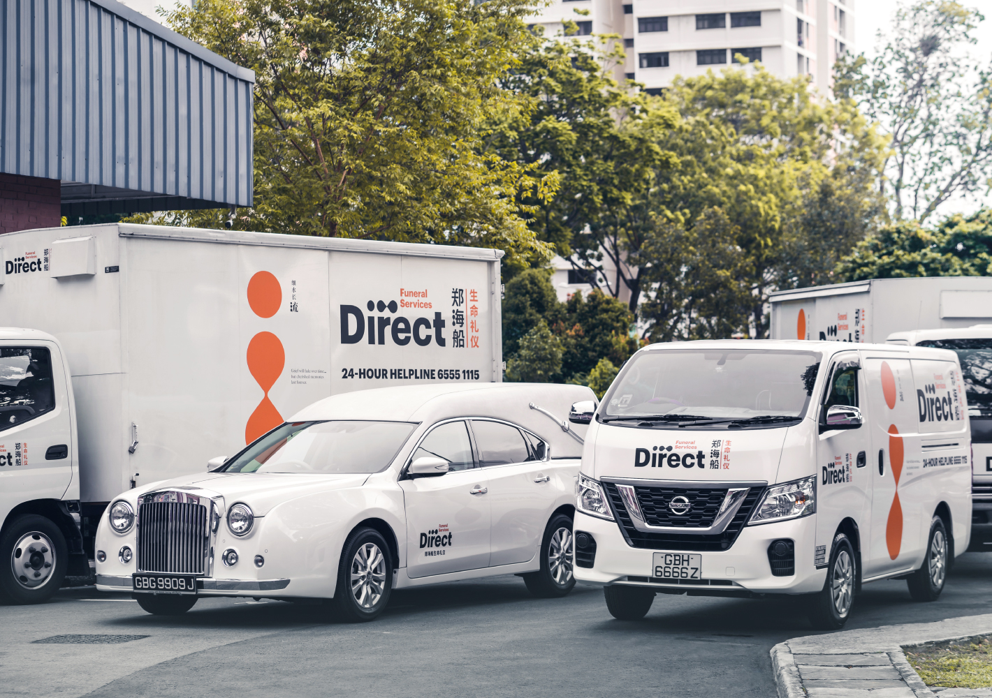
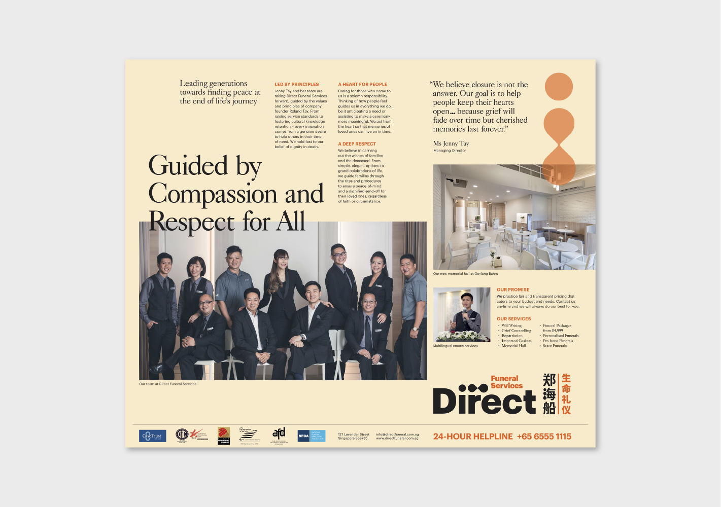
We have also implemented the new identity to the vehicle designs and signages to create a consistent, approachable and instantly recognisable image in the industry.
Brand Architecture
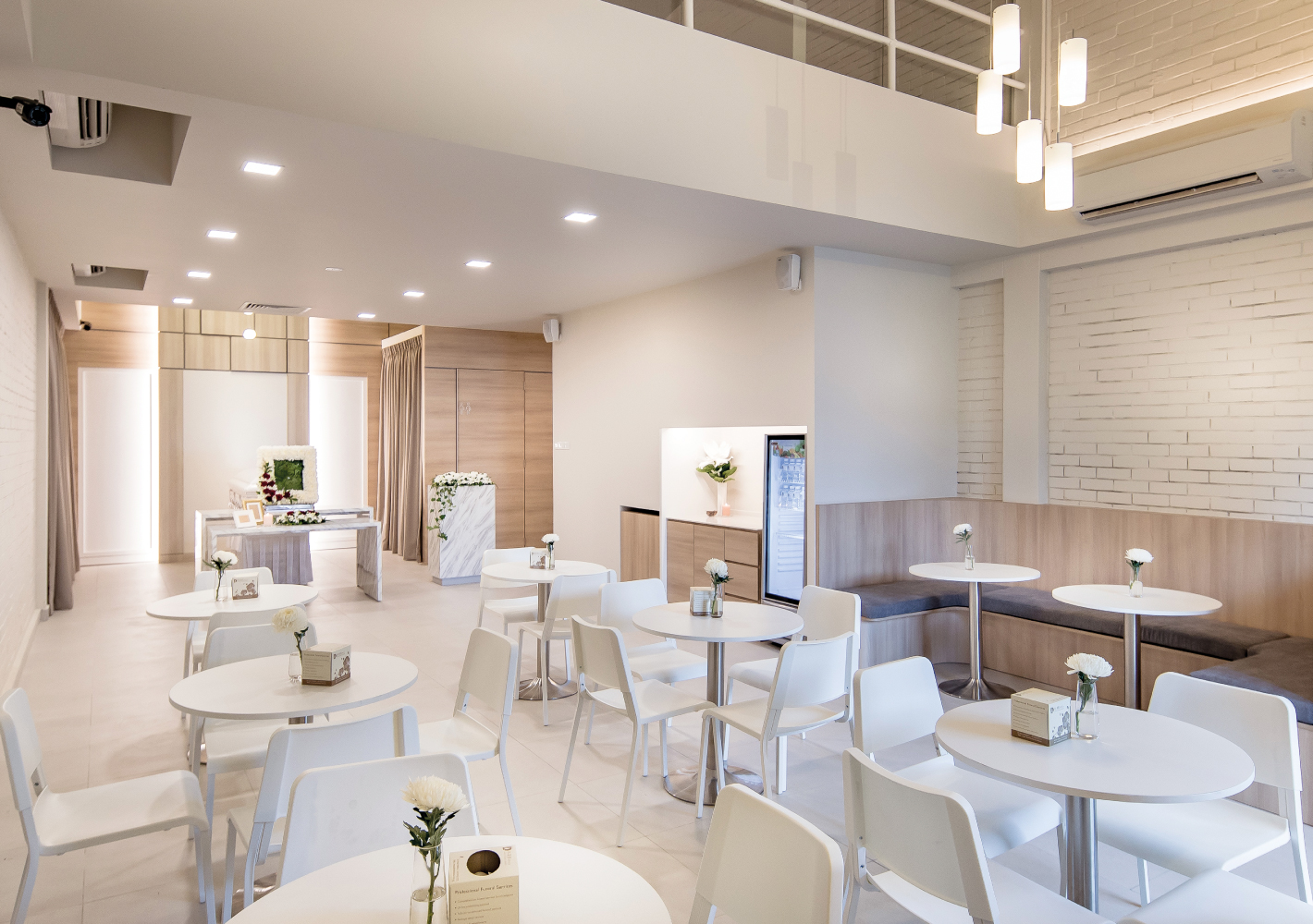
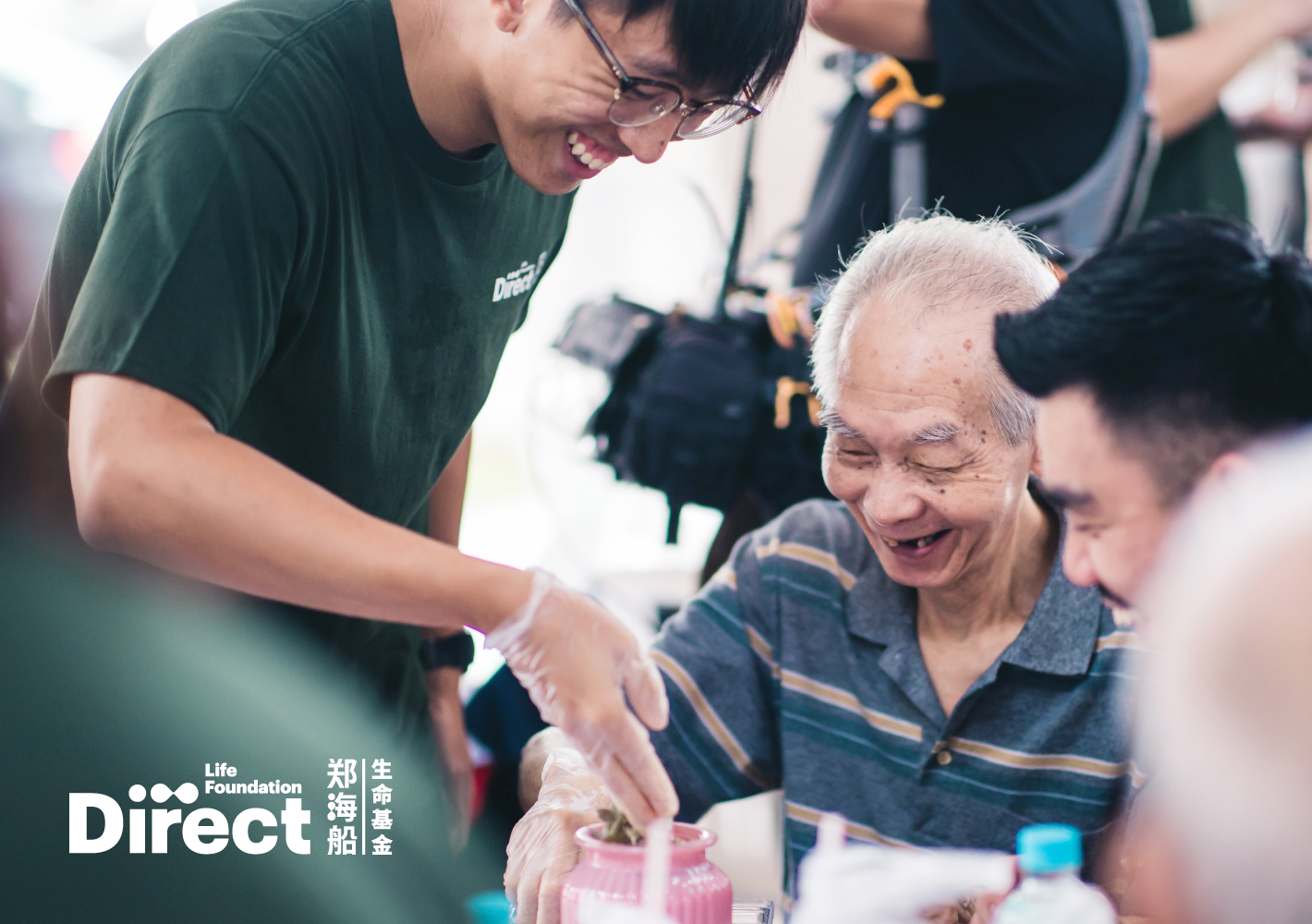
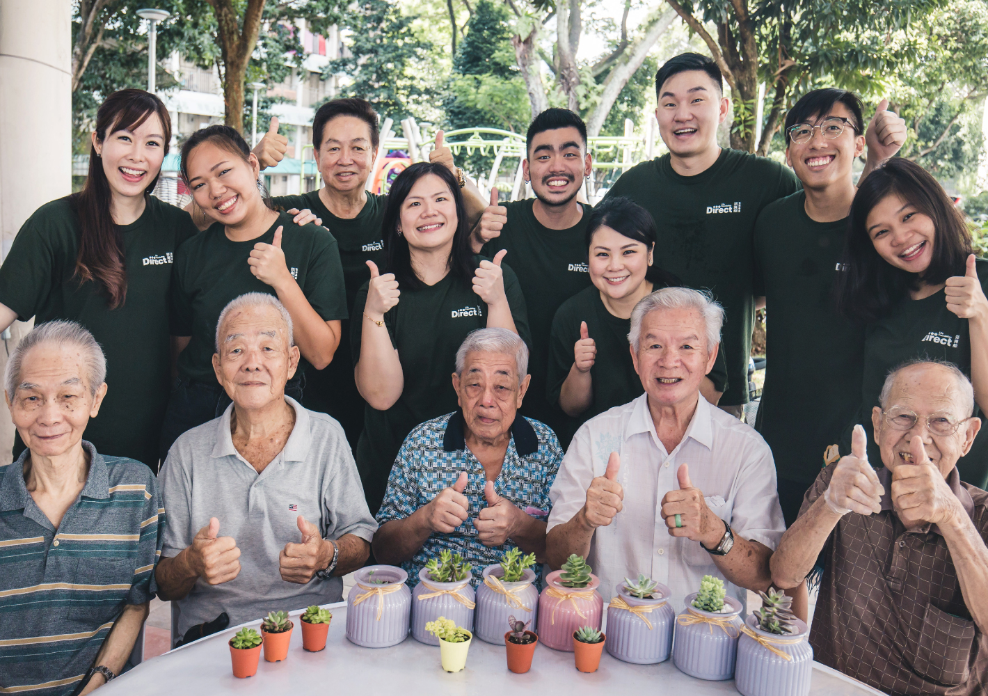
The identity system was developed for scalability, such as when the company seeks to diversify its business, e.g. a foundation to handle philanthropy and good works, and also a new subsidiary to handle life-planning and will-writing services. To round off the project, we also advised on the brand's tone-of-voice and art direction for photographic images.
