It takes two hands to clap. If you like what you see and are interested in working together with us, let’s chat.
GET IN TOUCHMarmalade Toast
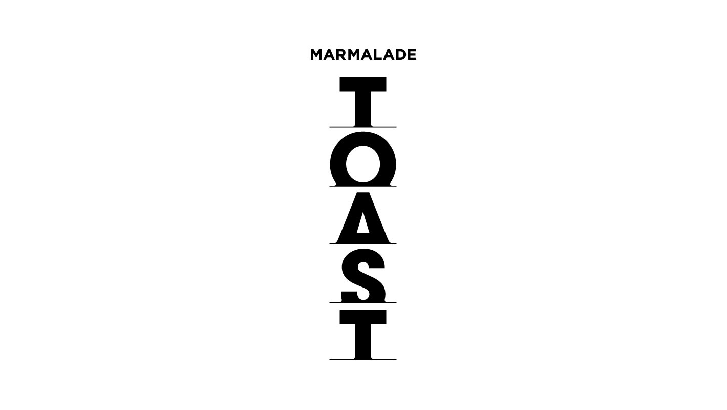
For the upmarket gourmet café previously known as “Toast”, we were tasked to refresh its brandmark to include its parent company’s moniker “Marmalade” as a co-branding element.
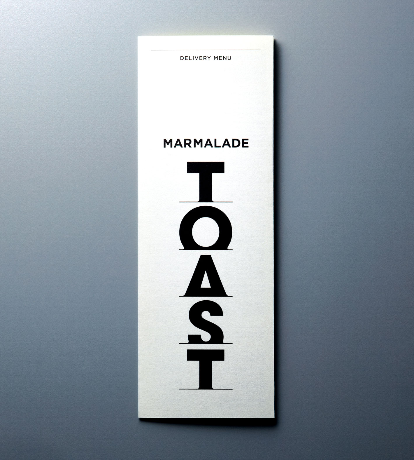
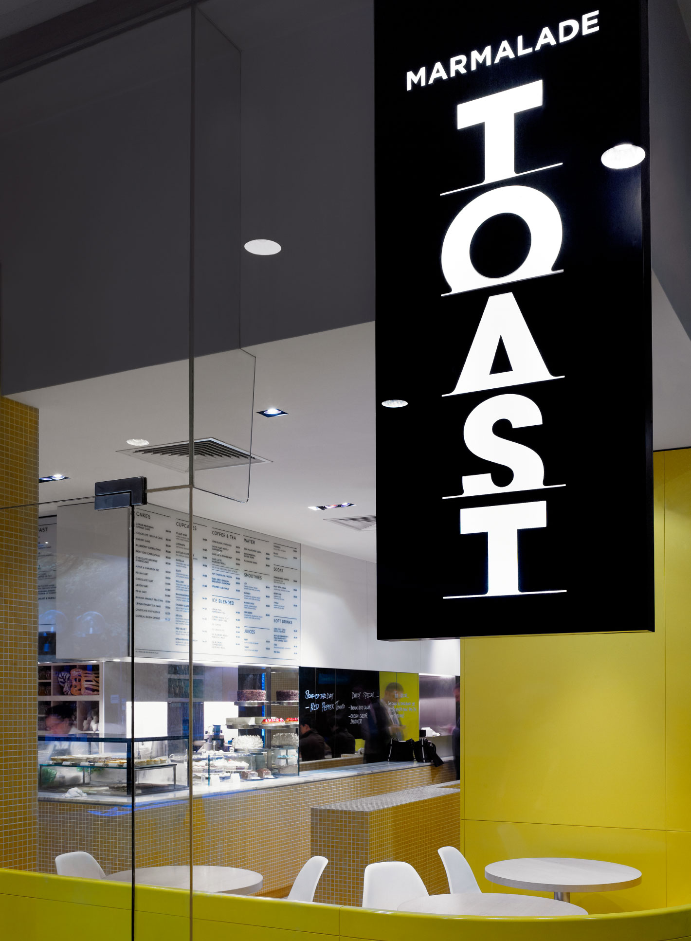
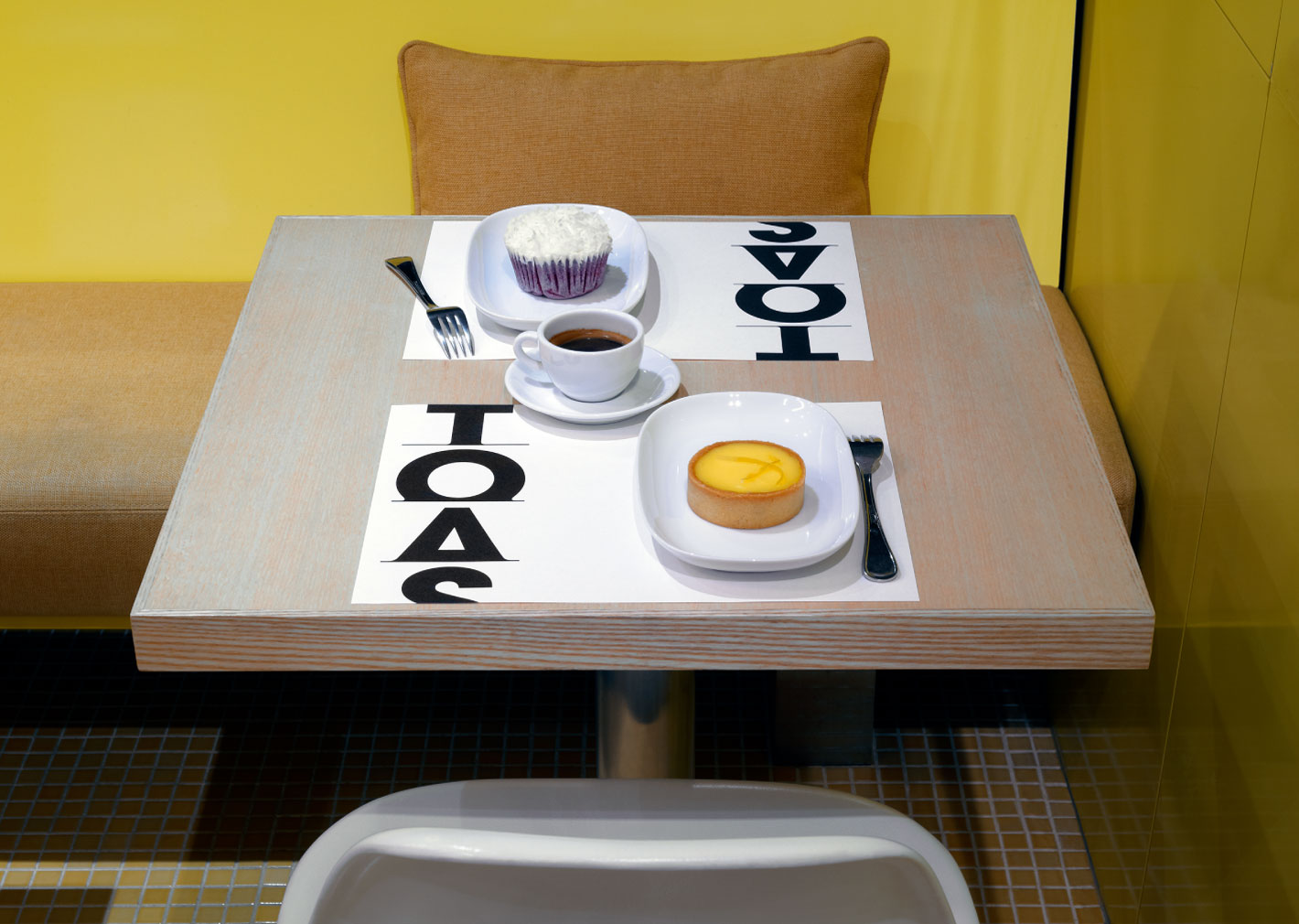
We rendered the letters for “TOAST” vertically in a custom typeface with truncated baselines, reminiscent of bread slices popping out of a toaster. Slightly rounded corners at the bottom of the letters evoke images of melted cheese on toast.
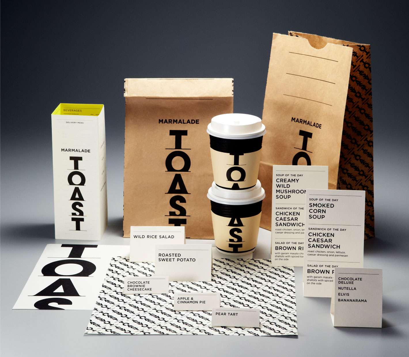
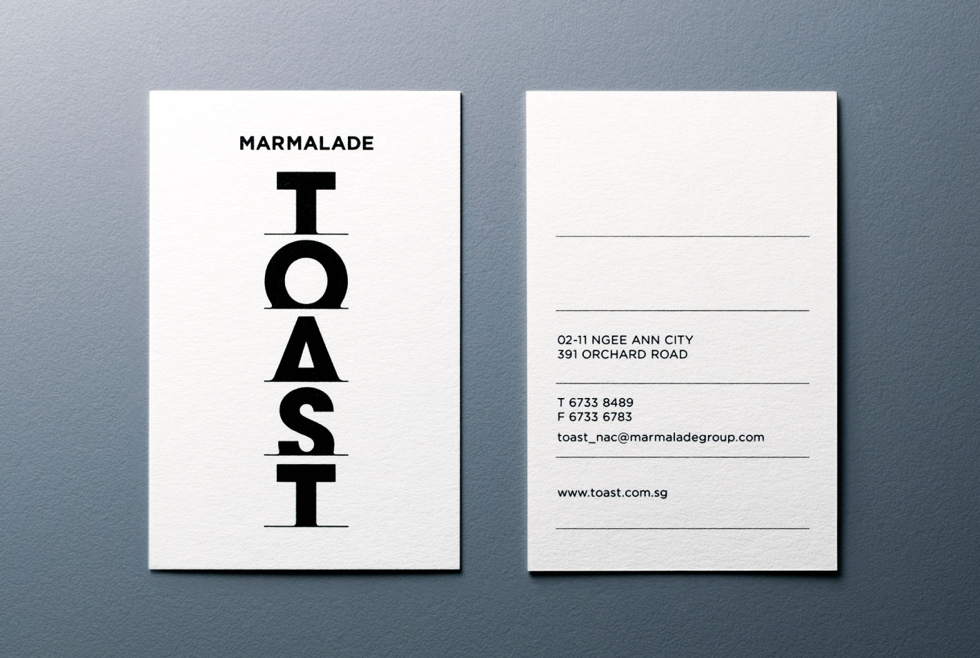
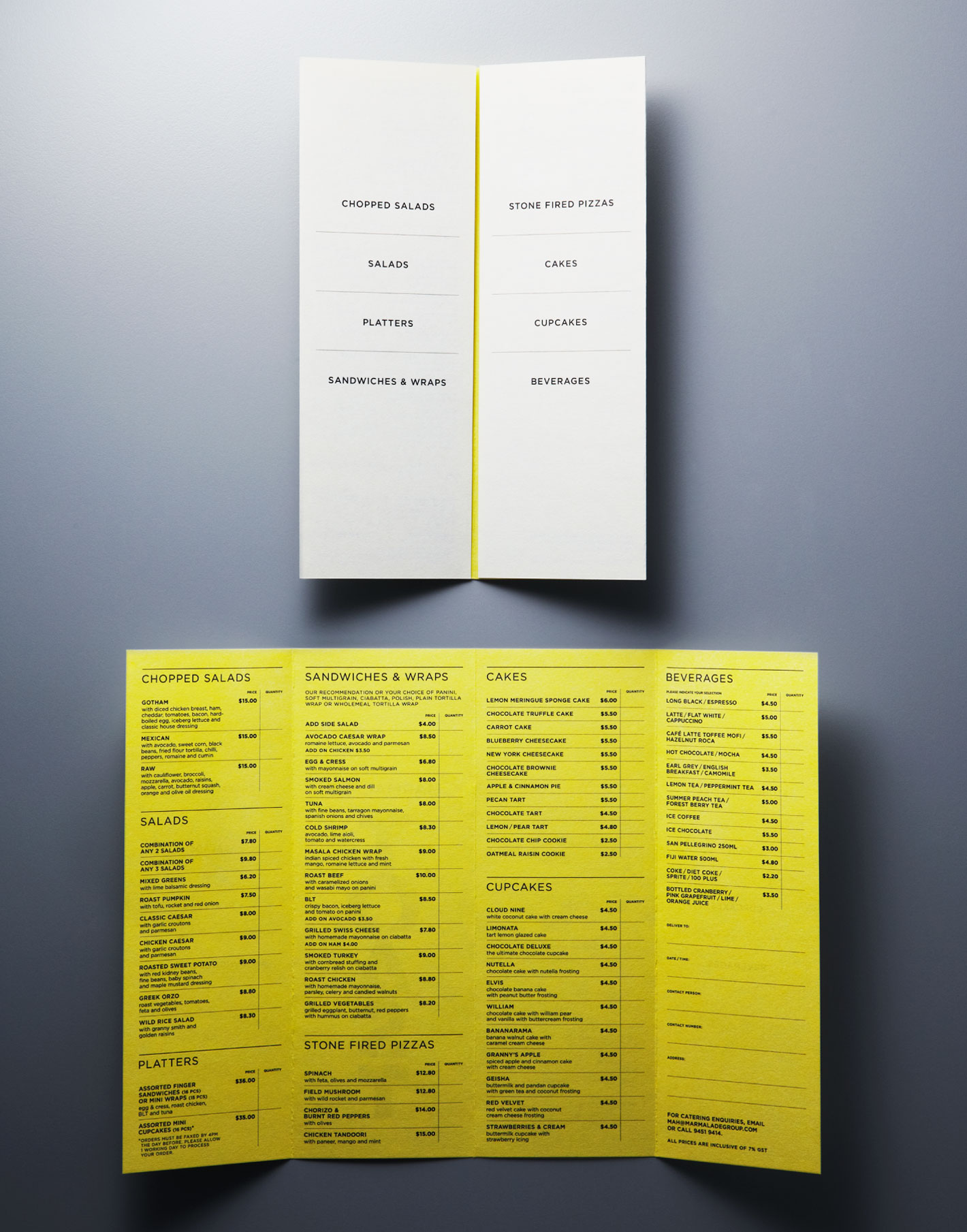
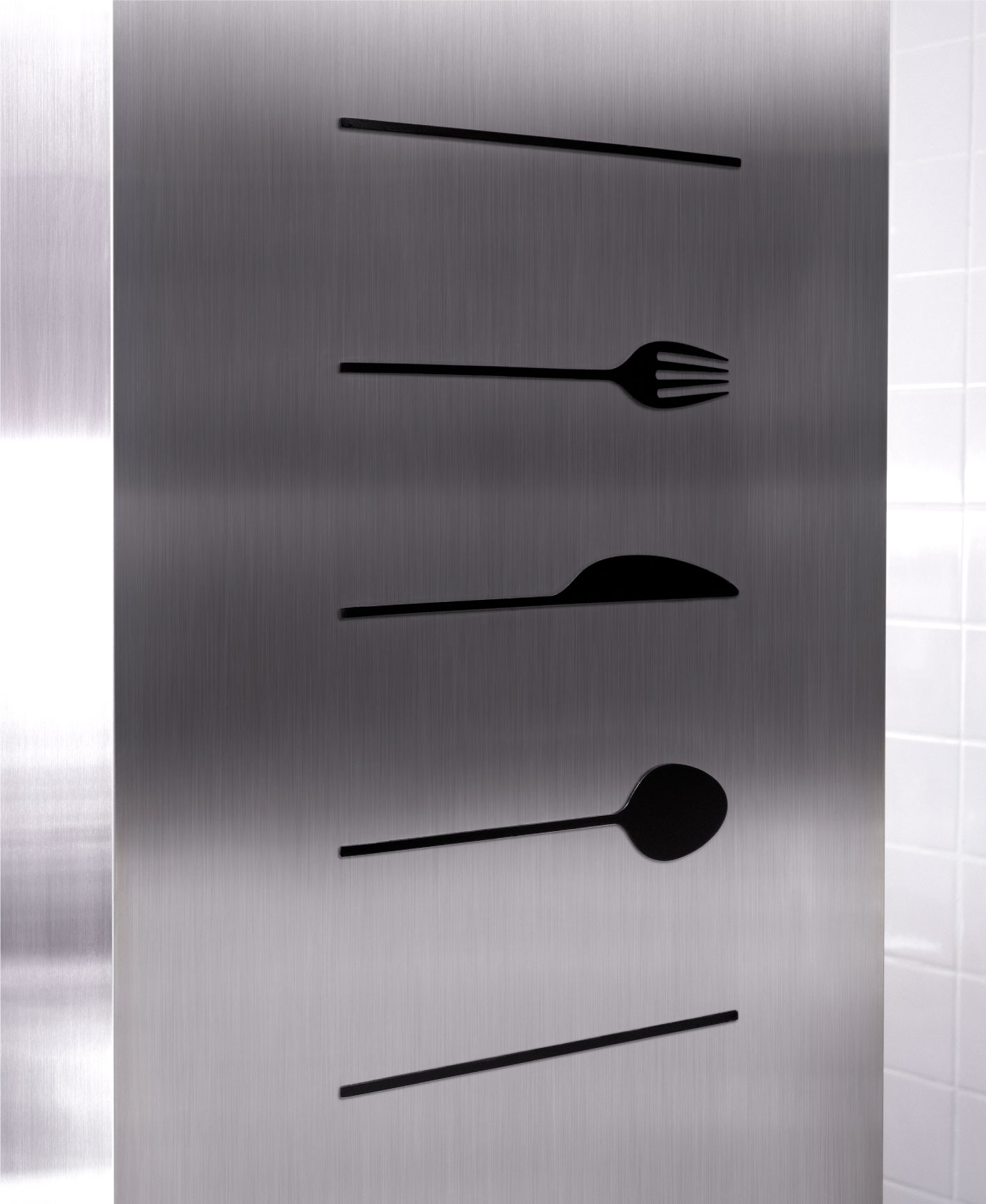
All in all, a simple and evocative design that is elegant, informal and full of visual flavour when applied across store signage, cups, bags, menu, wrappers and food tags. Bright yellow features selectively as a secondary colour to complement the décor.
