It takes two hands to clap. If you like what you see and are interested in working together with us, let’s chat.
GET IN TOUCHXTRA
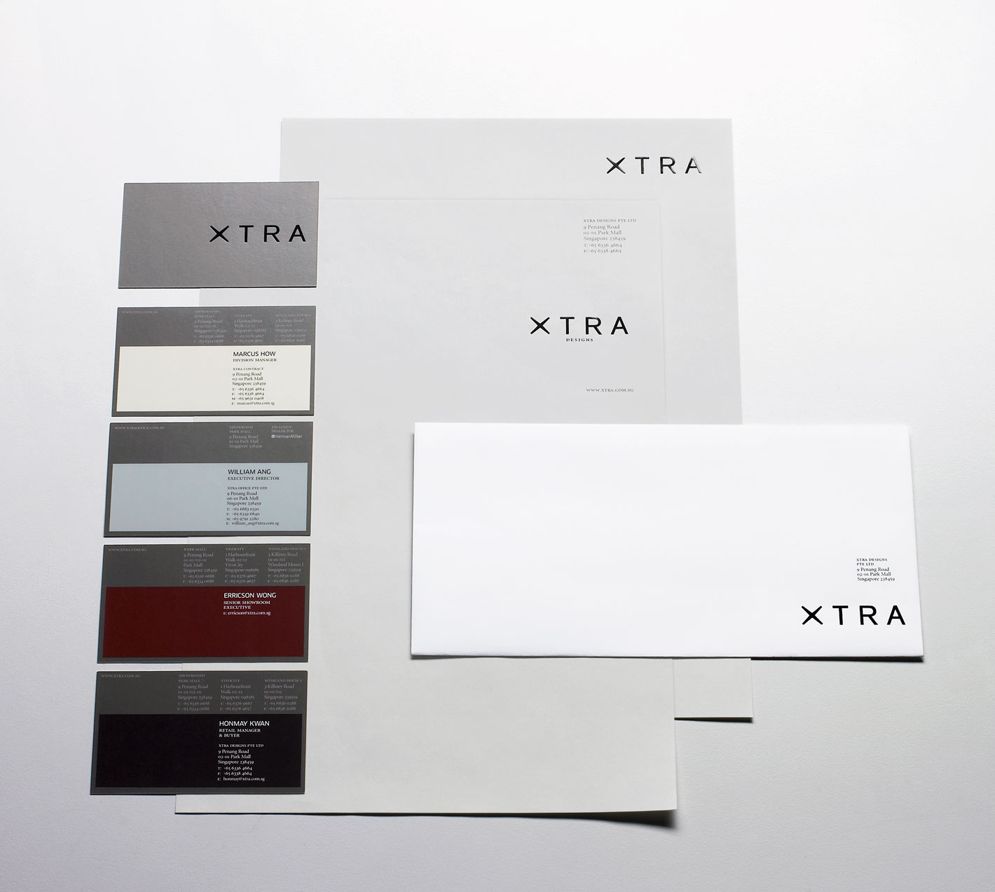
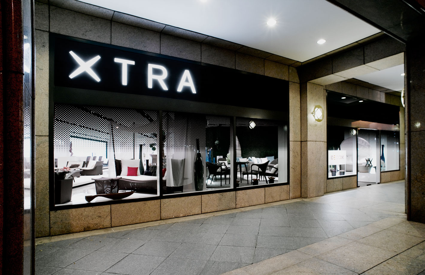
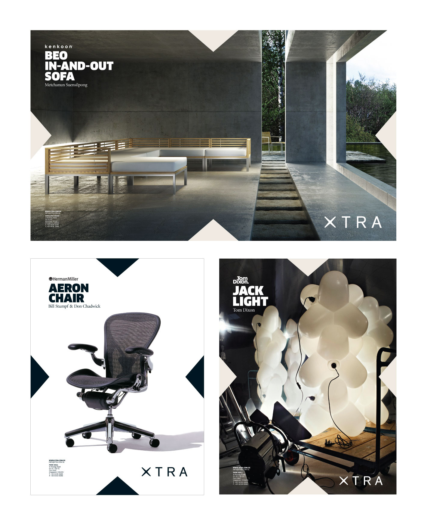
Undertaking the rebranding exercise for one of Singapore’s leading designer furnishing retailers, we began by simplifying the old arrangement that was “X•tra” to achieve a clean and timeless presentation.
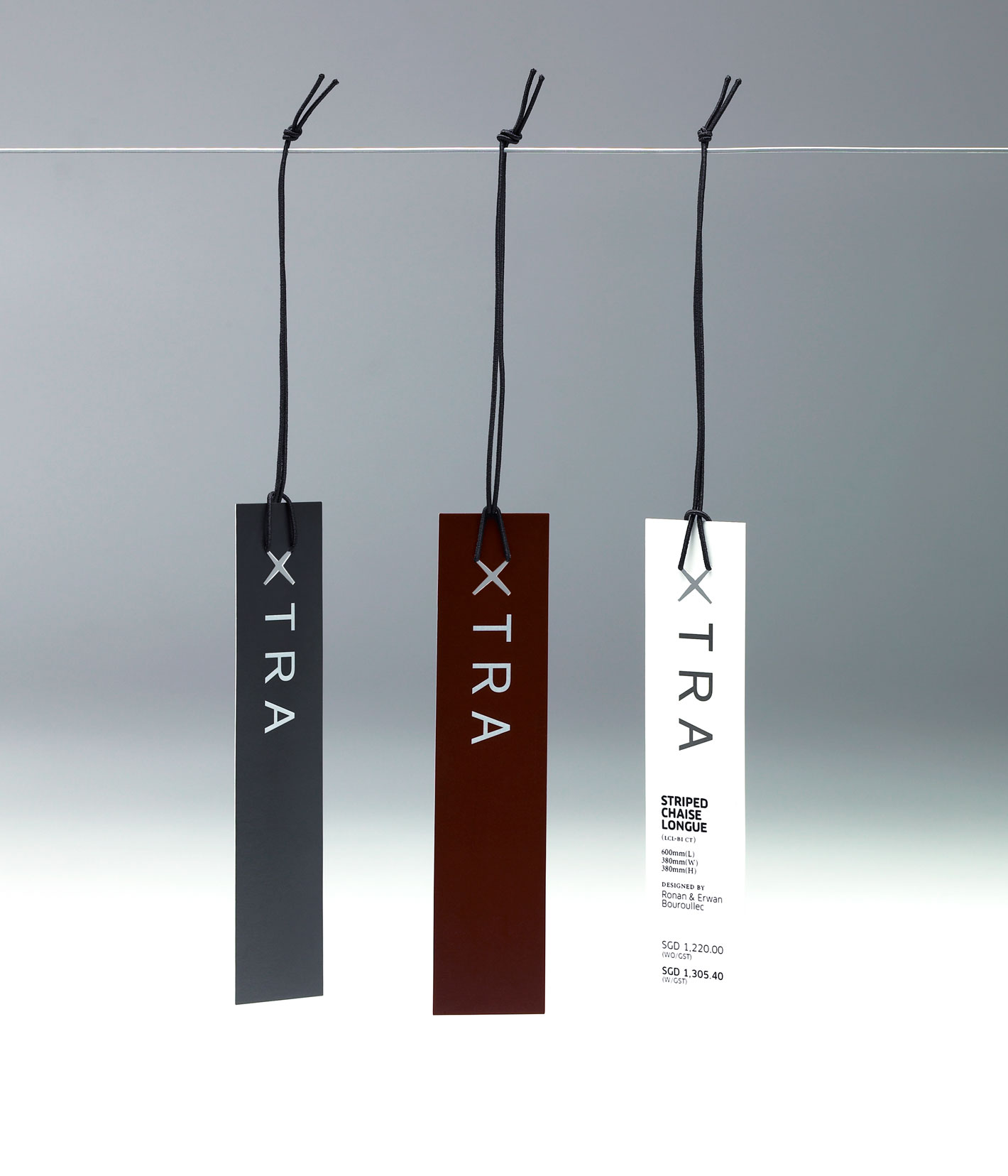
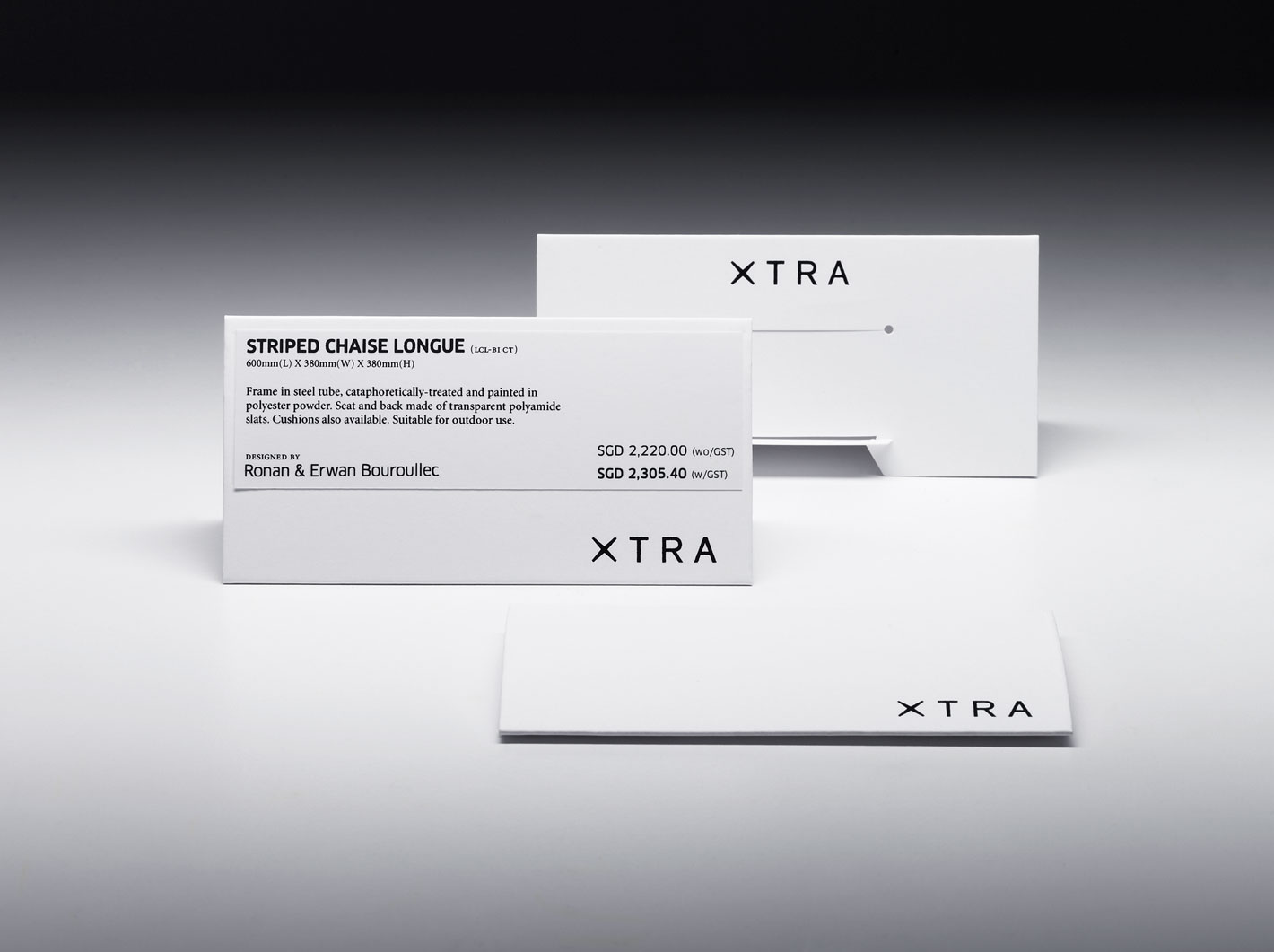
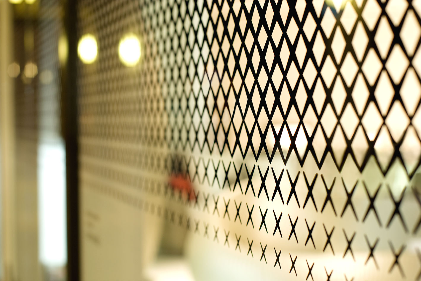
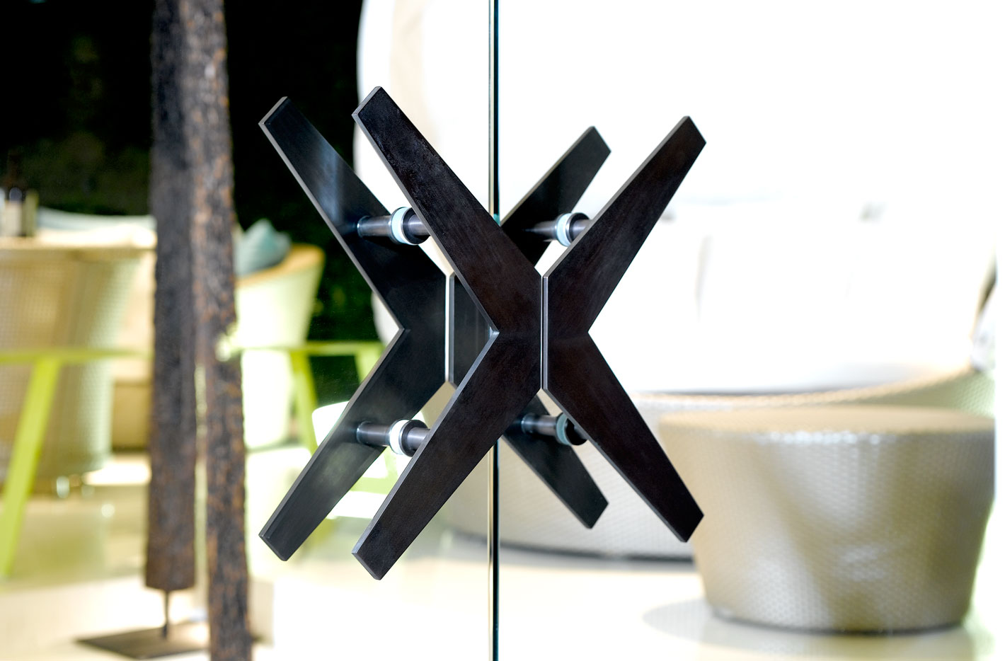
The distinctive “X” draws its strength and inspiration from cross-sections found in classic designs like the Eames La Chaise. Thicker at the centre and tapered at the ends, it appears strong yet elegant as a focal point and differentiates itself from modern typefaces.
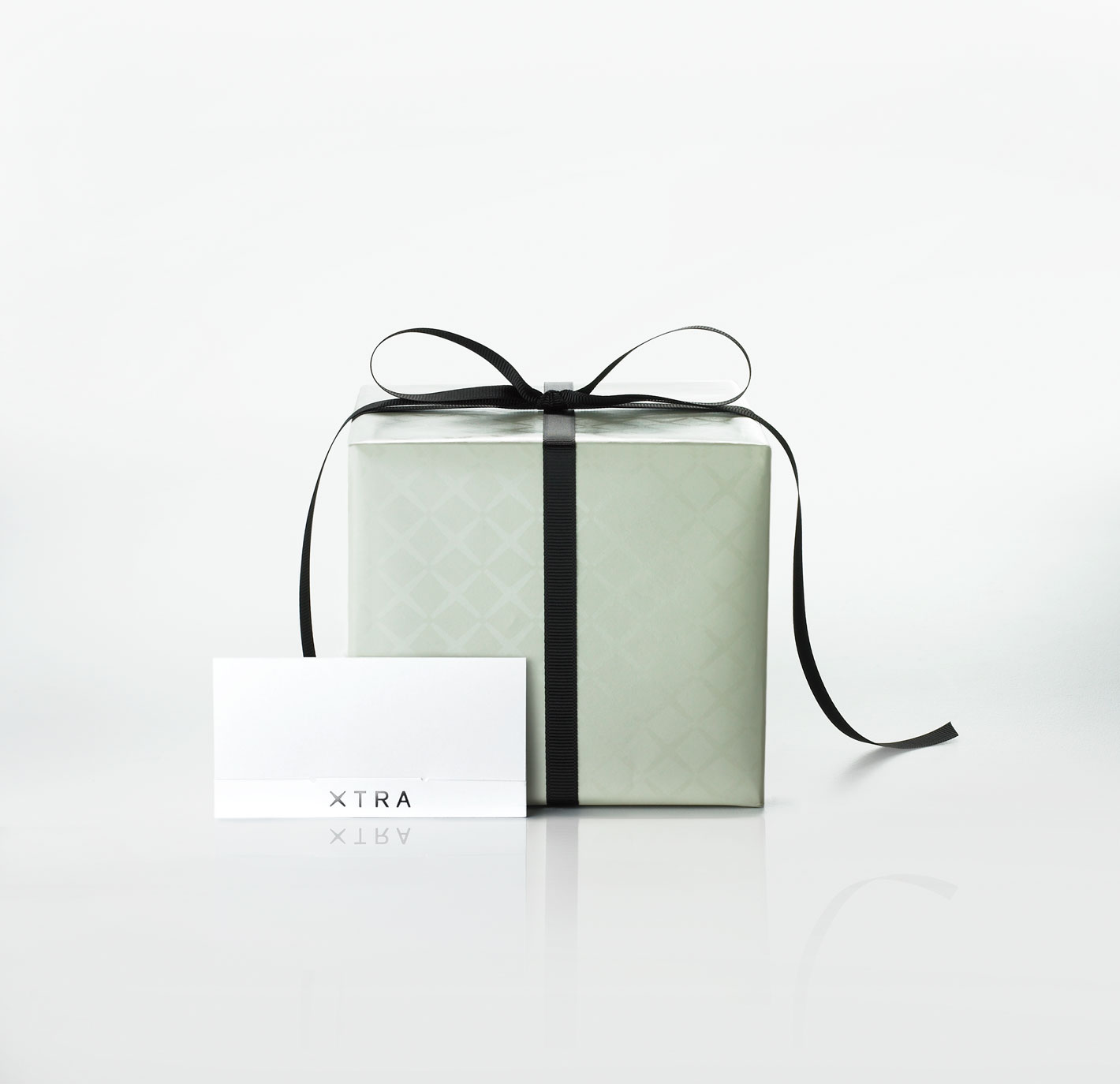
A palette based on dark metallic black and rich earthy tones was defined to reflect the brand’s character of confident sophistication.
Equally important was XTRA’s decision to adopt our recommendation of a monolithic brand architecture. All retail groups now come under a single XTRA brand while non-retail groups became brand extensions such as XTRA OFFICE and XTRA CONTRACT.
