It takes two hands to clap. If you like what you see and are interested in working together with us, let’s chat.
GET IN TOUCHUnscripted
Unscripted is both a design philosophy and a forward thinking architectural and design practice consisting of Roger Charnley, Benjamin Smestad and Alicia Worthington.
When &Larry was approached to design the identity for thier new practice, we were intrigued by their story and way of thinking. The founders had banded together out of a shared belief that too many projects tended to be exercises in ‘scripted’ outcomes, that the design of a building or a space was locked into preconceived notions from the moment a brief is put out. Instead, they cherished the rare opportunities when a project owner desired fresh and inspired thinking that explored possibilities beyond the usual considerations.
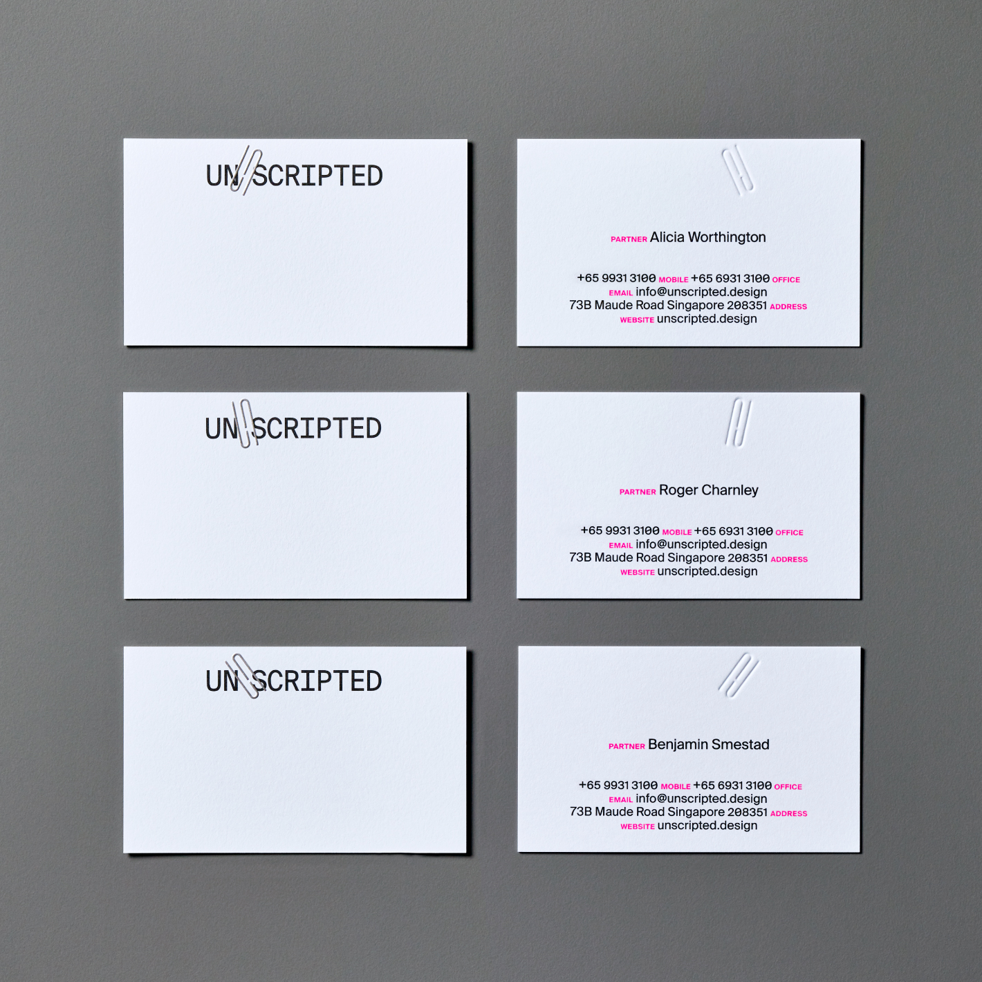
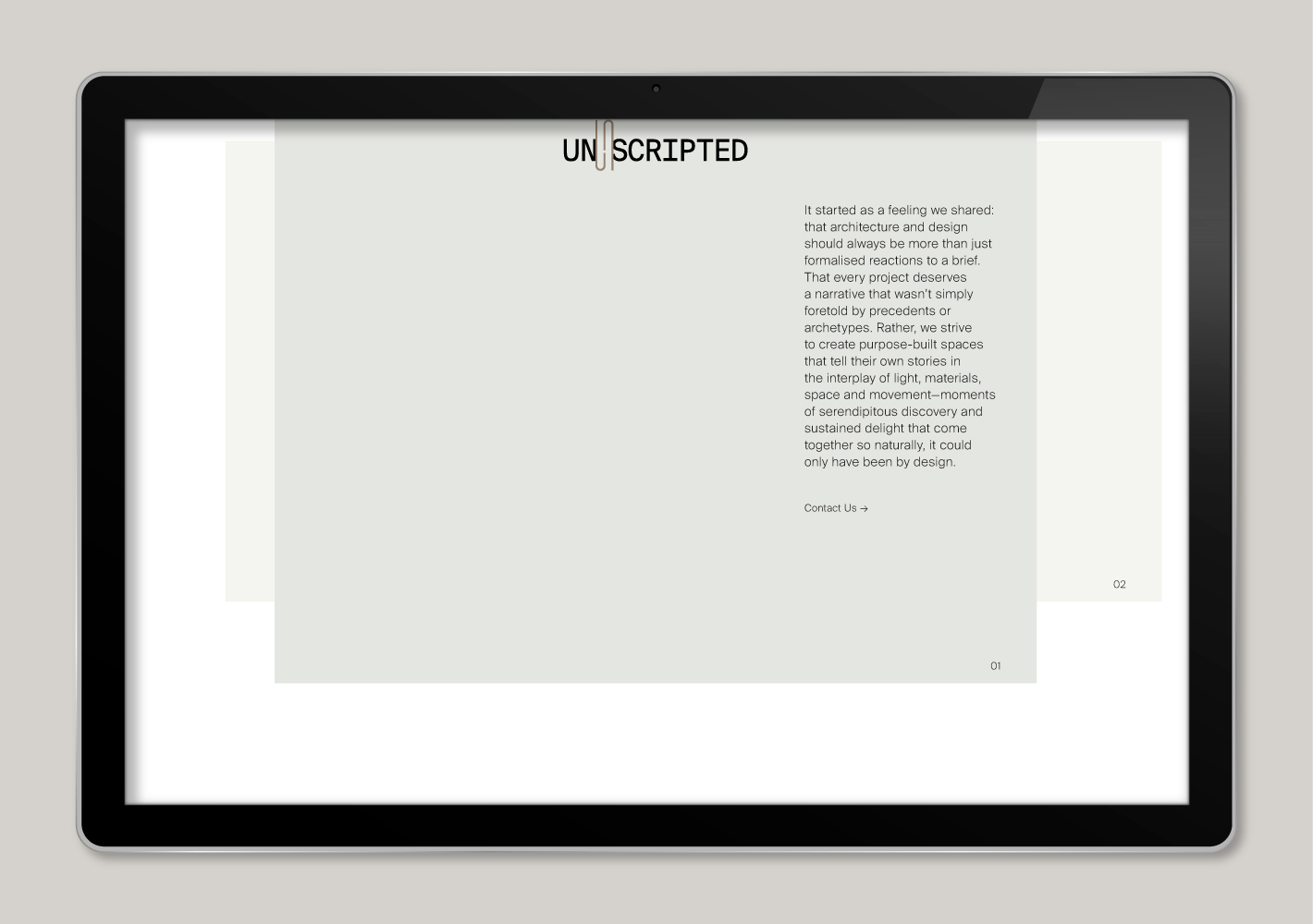
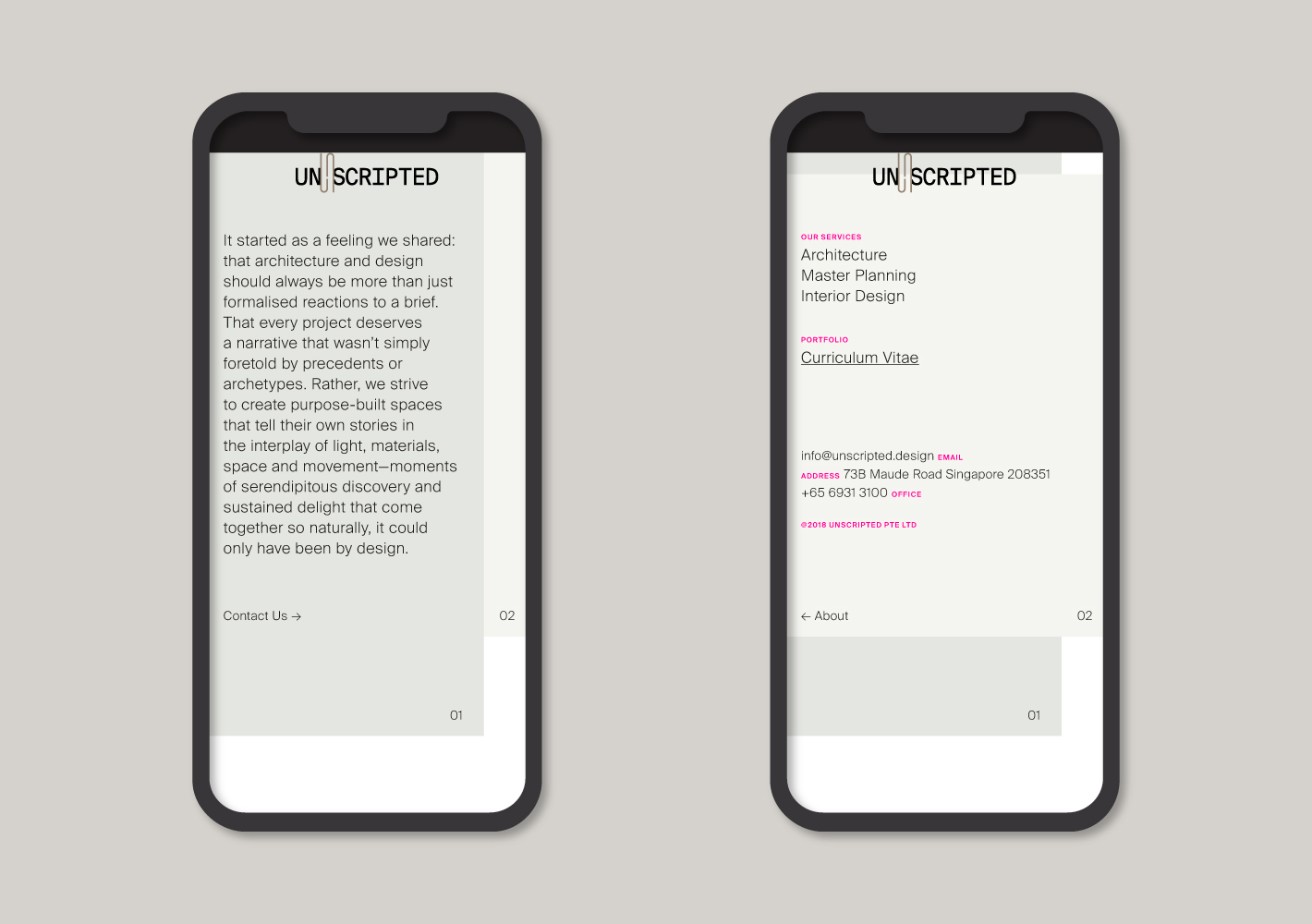
From this, &Larry crafted a purposeful and uncontrived design that not only encapsulated the ethos of the company, but also incorporated an element of freedom to allow team members to express their individuality. We began with the selection of a monospaced font, for the type’s careful consideration to each letter’s form and functionality within a commonly defined space.


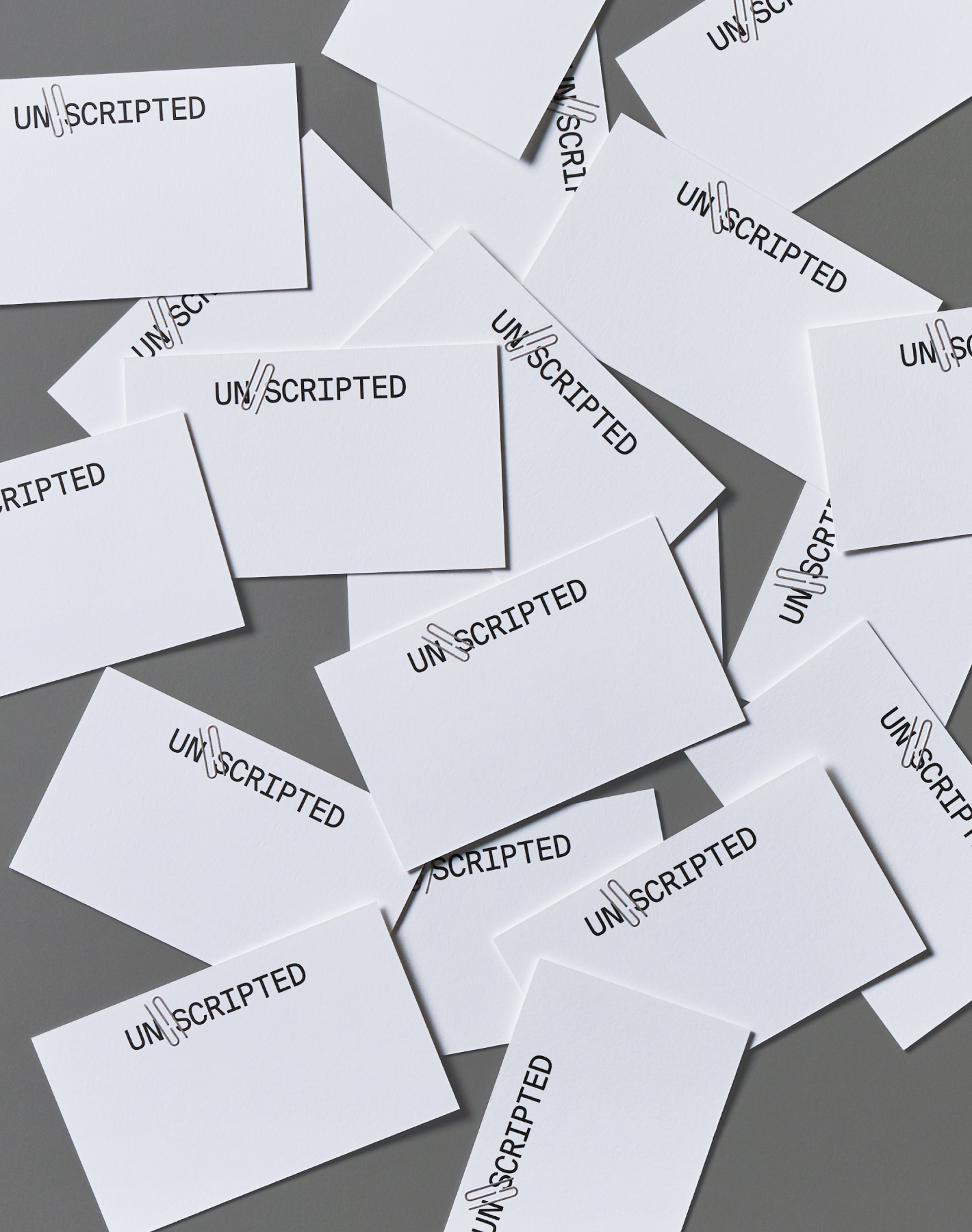
We created a symbol inspired by the letters ‘U’, ‘N’ and ‘S’ – rendered as a clip that holds together the rest of the wordmark. This symbol can be personalized by rotating it at fixed intervals of six degrees, an allegory to ‘six degrees of separation’ – the way everyone and everything in our world is somehow connected by way of intermediate acquaintances and random relationships. The use of a striking magenta hue as an accent was inspired by its association on CAD renders and the sheer unthinkability of it being used by a ‘serious profession’. Initially rejected for that exact reason, it was soon embraced wholeheartedly in the spirit of the company’s genesis.


