It takes two hands to clap. If you like what you see and are interested in working together with us, let’s chat.
GET IN TOUCHTrans Instruments
We were commissioned to design the packaging for a new range of filter papers by Trans Instruments.
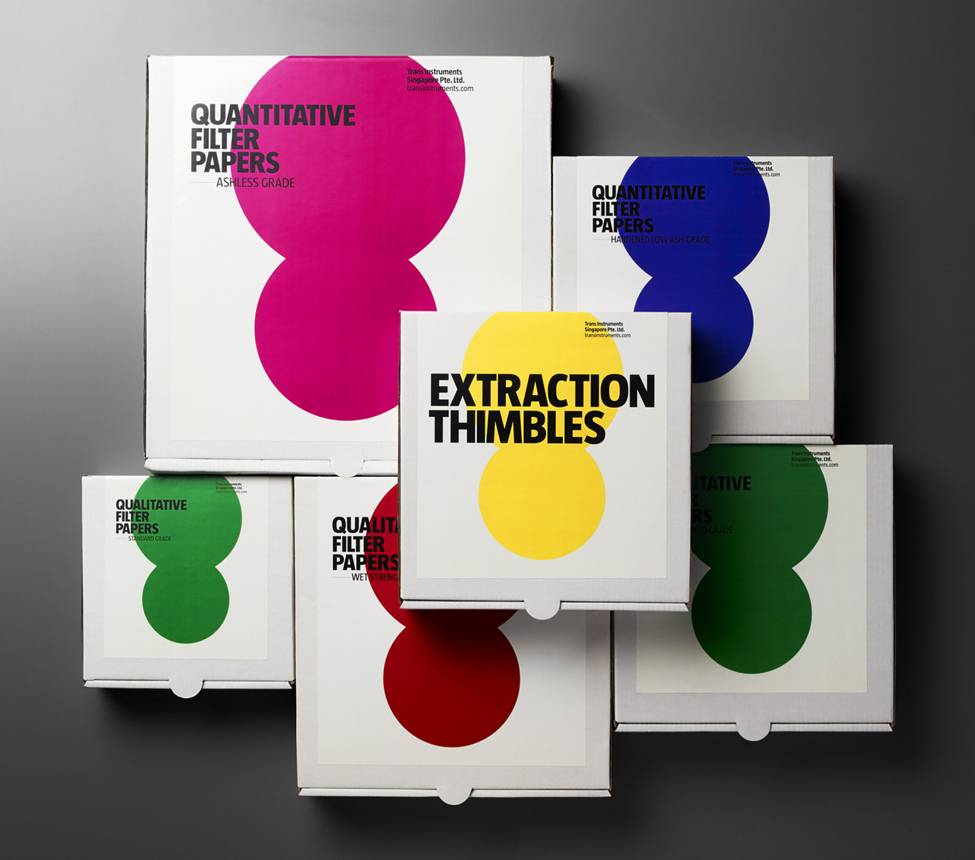
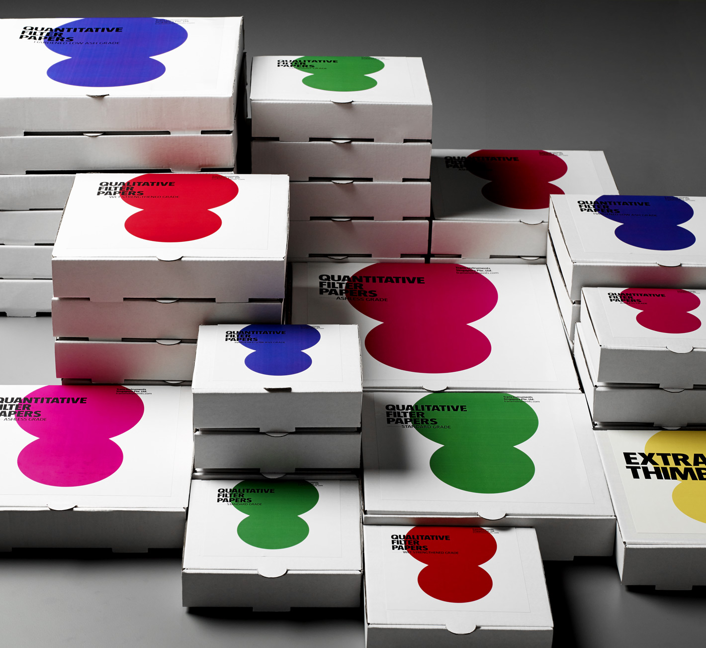
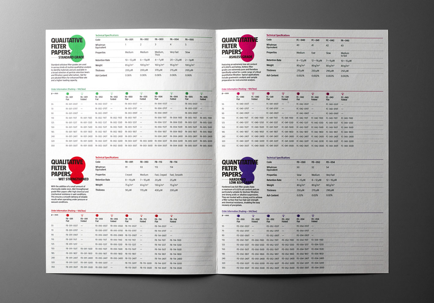
To differentiate and manage the extensive number of products, we devised a system using colours and sizes.
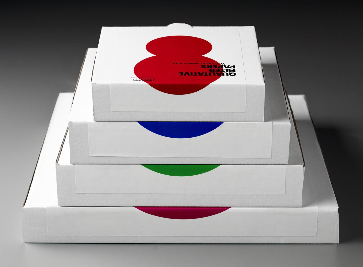
An abstract graphic was designed to represent the filtration process, whereby larger particles are retained in a filter while smaller particles pass through. The boxes were designed such that they formed a colour coding system when stacked in the warehouse for easy identification.
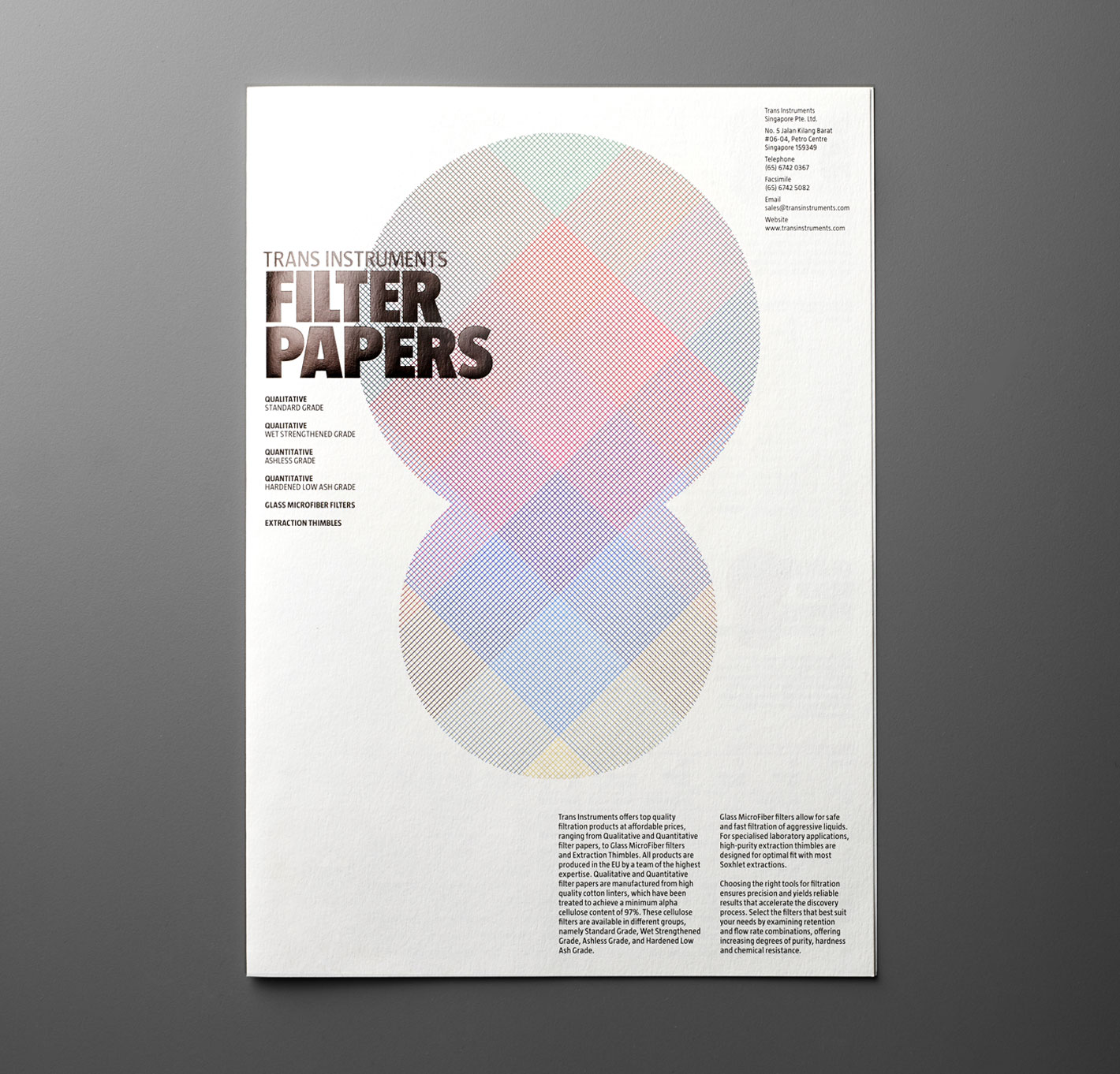
A brochure featuring the same colour system was designed for users. It was printed on paper similar in texture to the product (filter paper) to strengthen the concept.
