It takes two hands to clap. If you like what you see and are interested in working together with us, let’s chat.
GET IN TOUCHTong Heng Brand Identity & Packaging
A Singapore pioneer in traditional Cantonese pastries since 1935, Tong Heng faced the familiar challenge of brand relevancy in an increasingly fast-paced world. When &Larry was approached by the 4th generation owner to help revitalise the brand, we discovered challenges in the form of an ageing customer base, over-abundance of choice from recent market entrants (both locally and foreign-owned) all competing for mindshare of a younger audience.
Together with the owners and employees of Tong Heng, we undertook an extensive multi-phase rebranding exercise, culminating in a clarified and authentic branding and digital strategy, a modern identity, redesigned packaging and a revamped store design.

Brand Elements
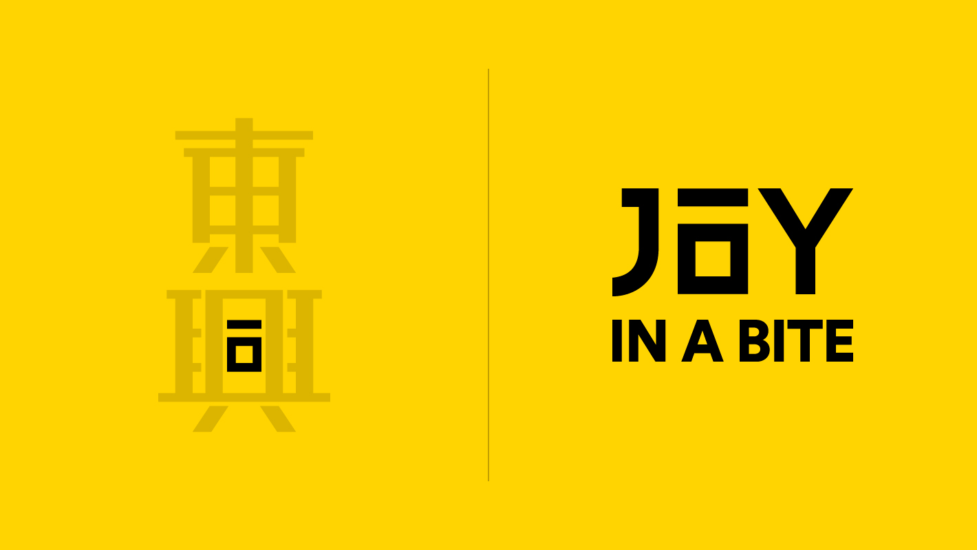
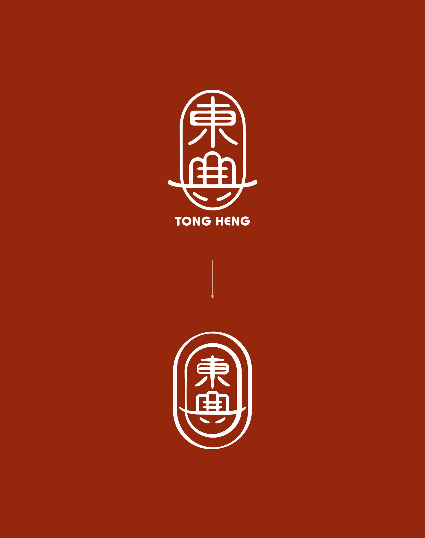
The new brandmark and identity system pay respect to the original design while being thoroughly optimised for modern day requirements. The brand essence for Tong Heng, summed up as "Joy in a Bite", is incorporated into the Chinese character for 'joy' (興) as the radicals for 'a bite' (一口).
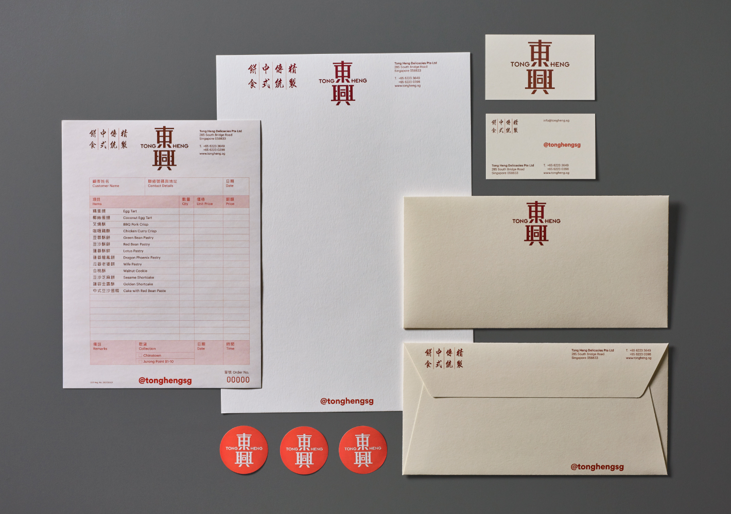
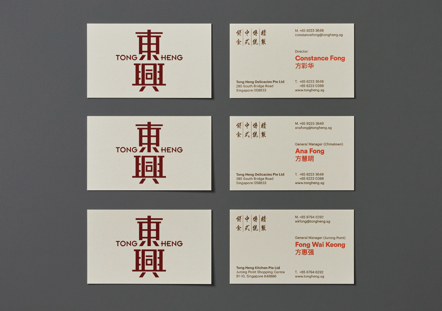
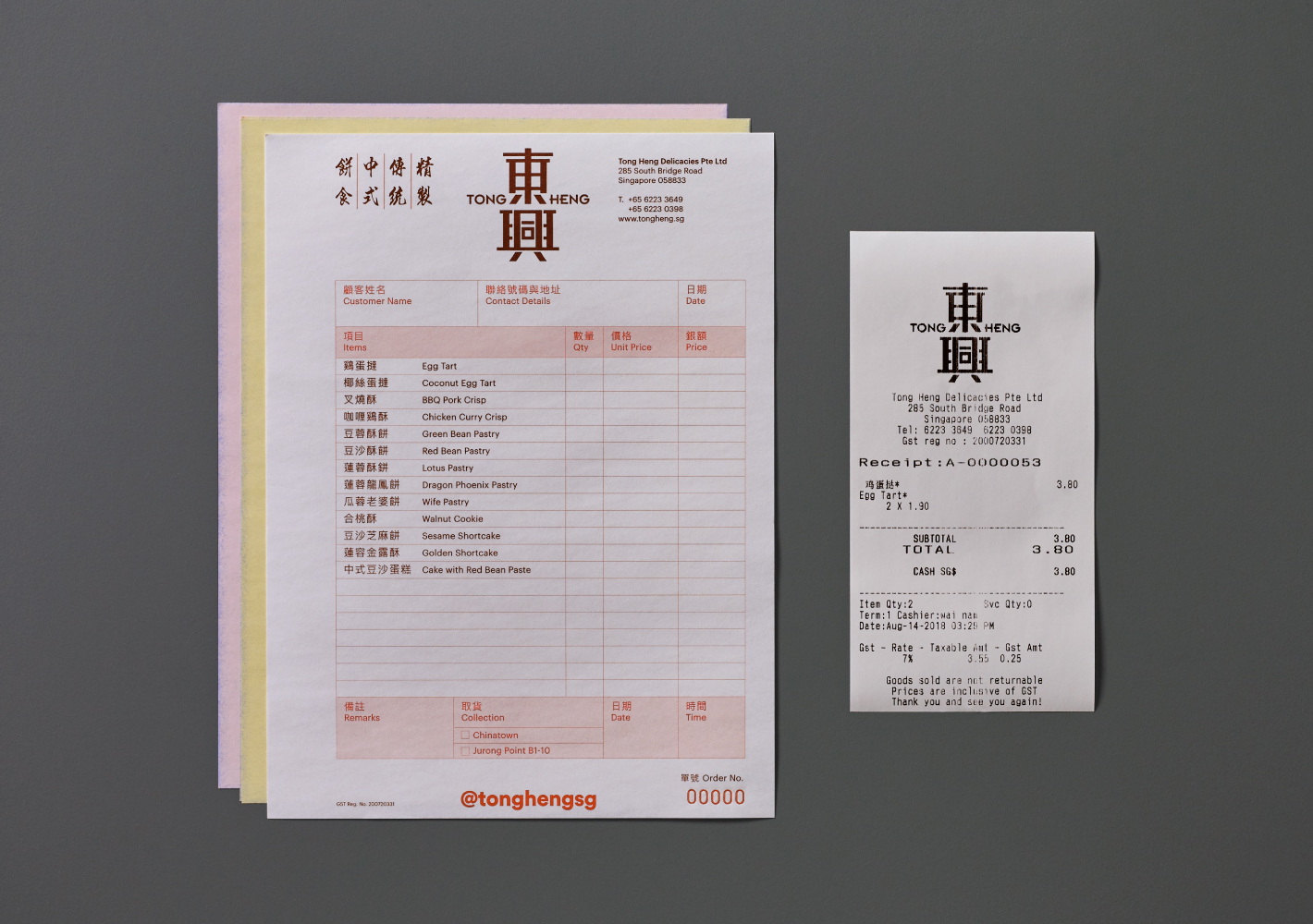
Corporate Stationery
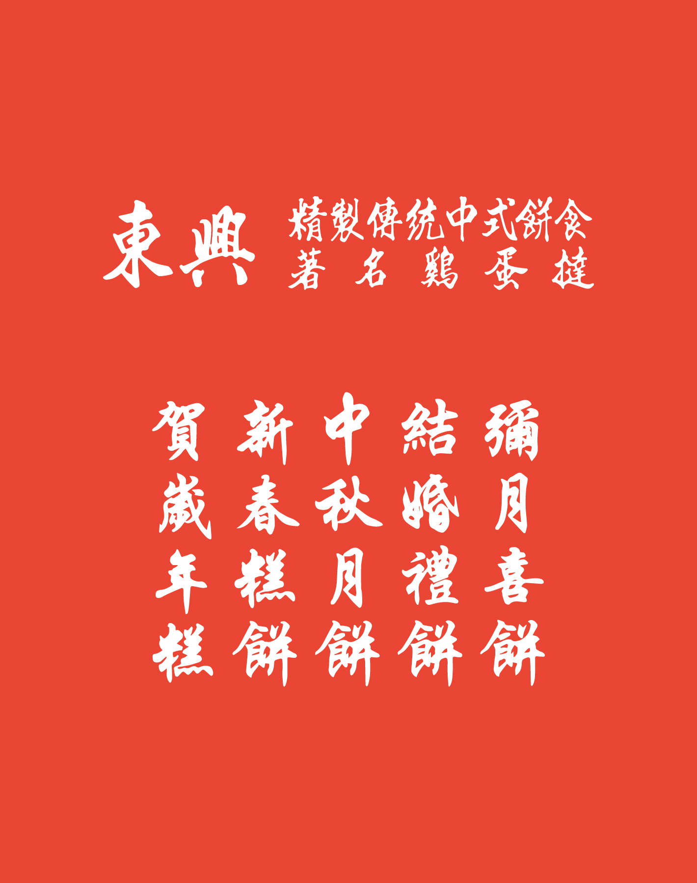
When designing Tong Heng's corporate stationery, we were conscious in exercising restraint with the colour palette, focusing on functional aspects of information and typographic hierarchy. The owners were pleased to see that we retained their original handwritten calligraphy on the brand collaterals.
Illustration Bank & Packaging
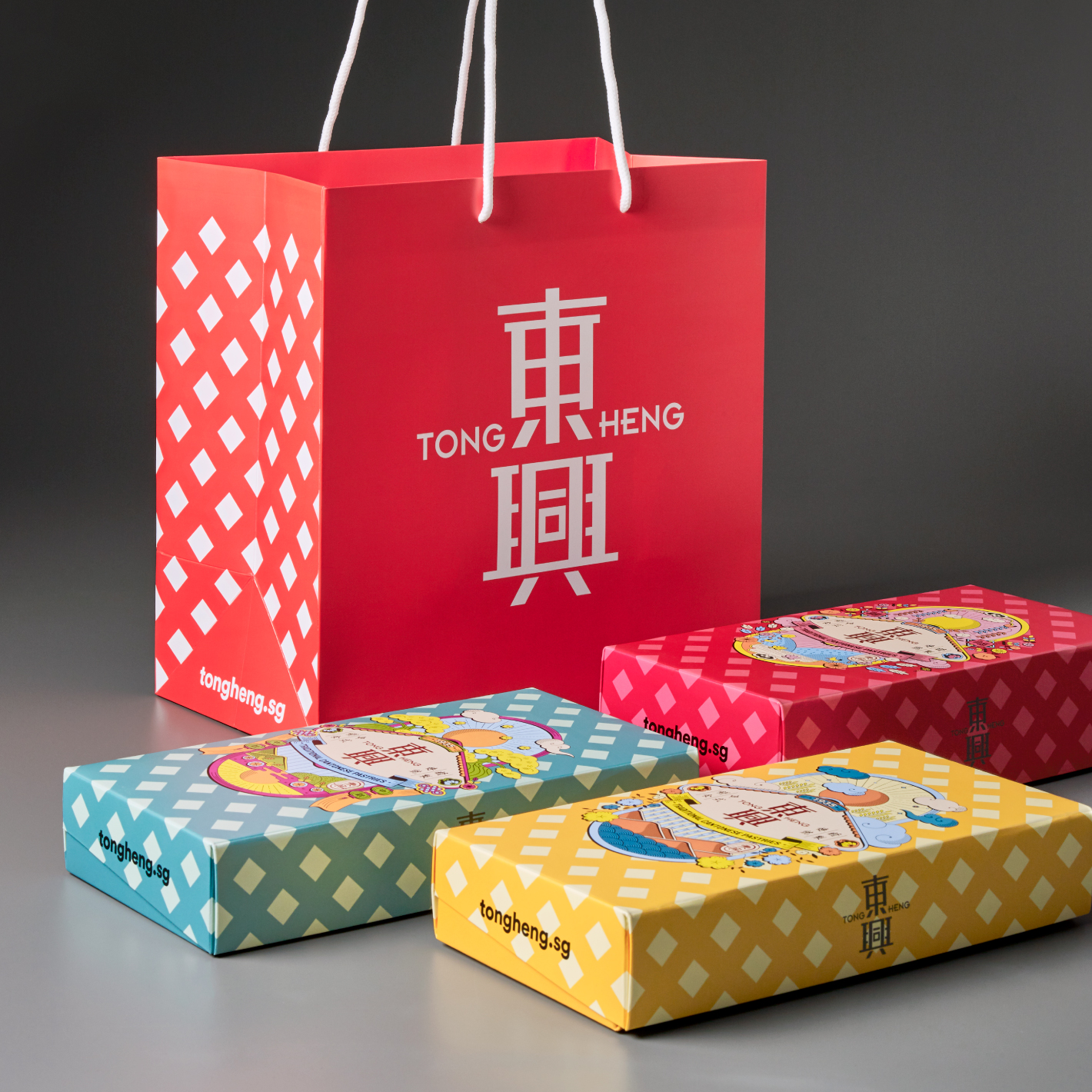
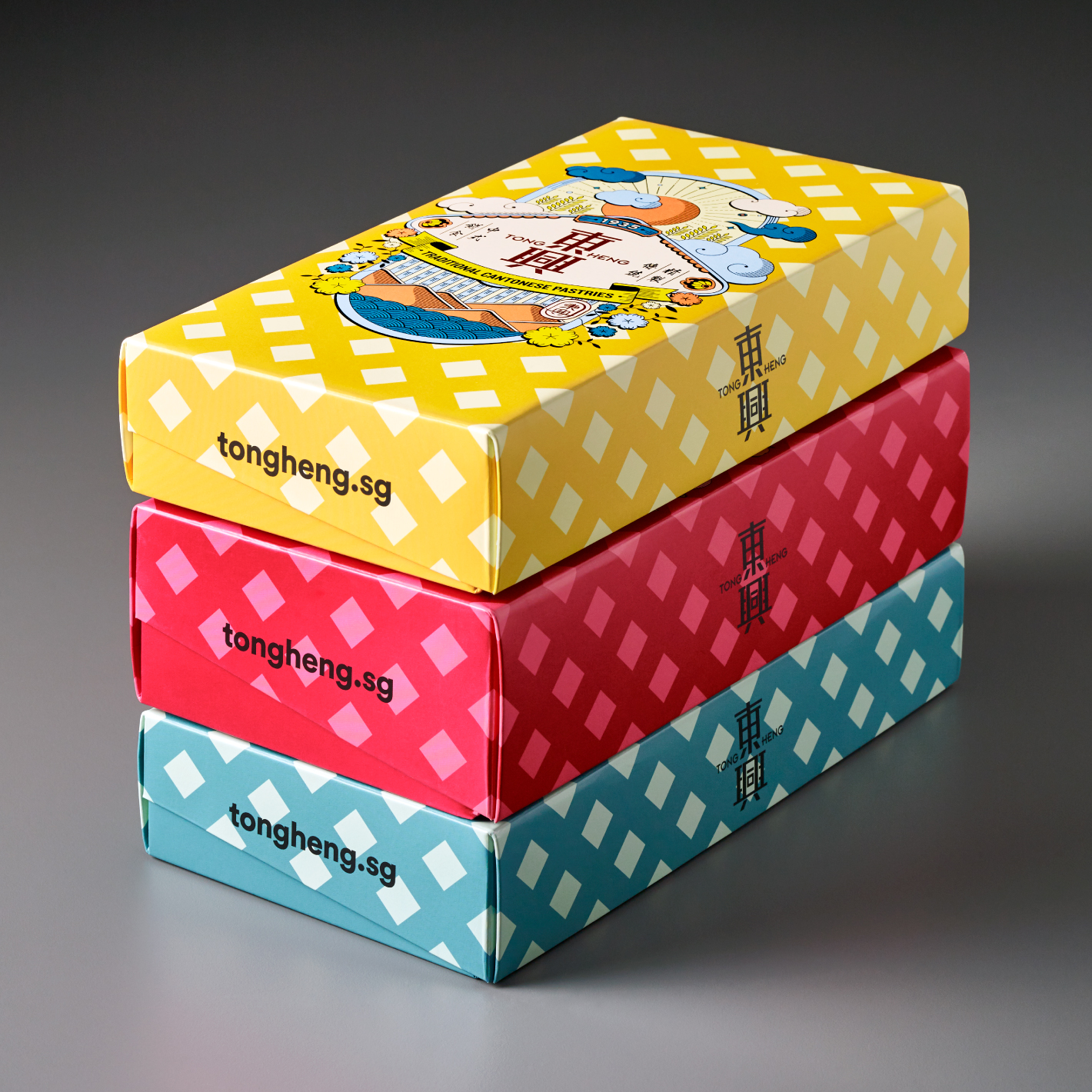
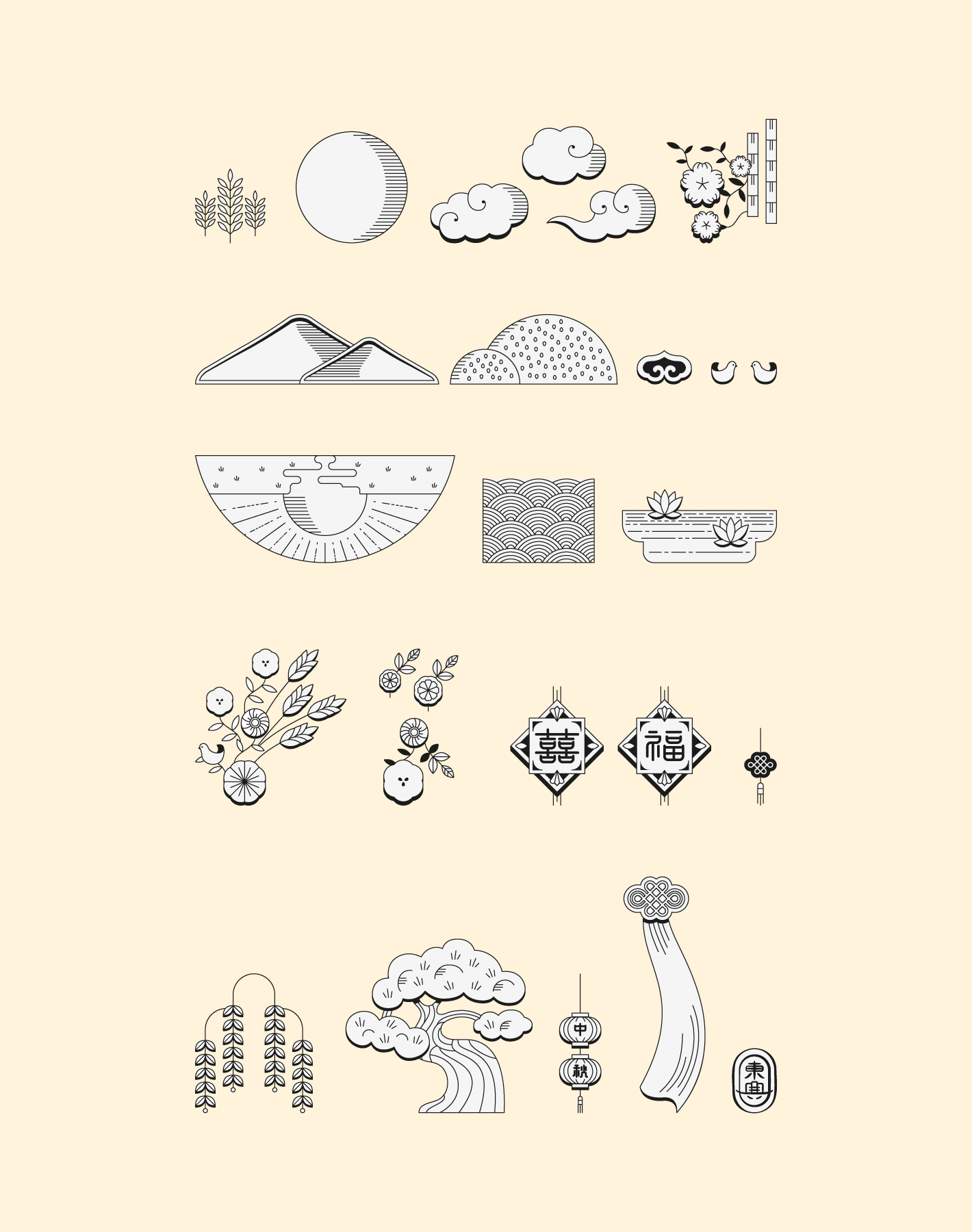
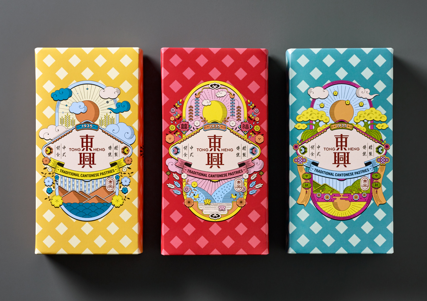
The packaging for Tong Heng is a focal point for brand engagement and differentiation. In discussing what 'heritage' meant to Tong Heng, when so many brands claimed some form of 'heritage', the answer fell back on the name and the tradition: bringing joy to people in every pastry Tong Heng makes.
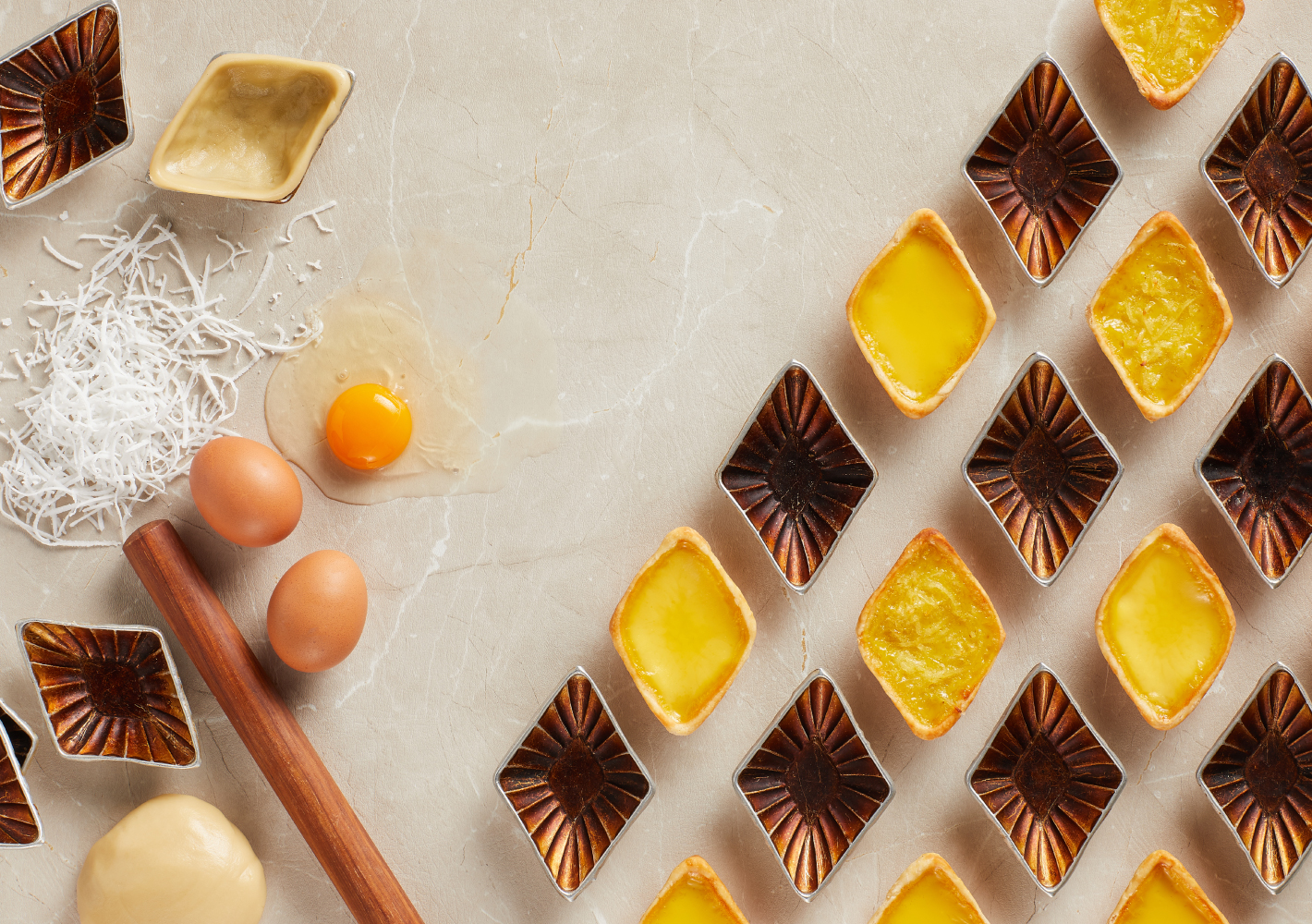
Designing with this in mind, what emerged was a vibrant portrayal of the essential elements of the brand: the diamond shape of Tong Heng's signature egg tarts, 'lucky clouds' and other Chinese symbology for auspicious days, various shapes of pastries and ingredients, etc. We also re-introduced the old logo as a seal of quality.
The colours are both aesthetic and functional – yellow for everyday orders; red for anniversaries, baby showers, betrothals and Chinese New Year; turquoise for Mid-Autumn Festival. The bright colours add cheer to the store and help staff to quickly discern and pack respective purchases. Inside, we designed a modular insert that is adaptable to holding differently shaped pastries in a secure manner.
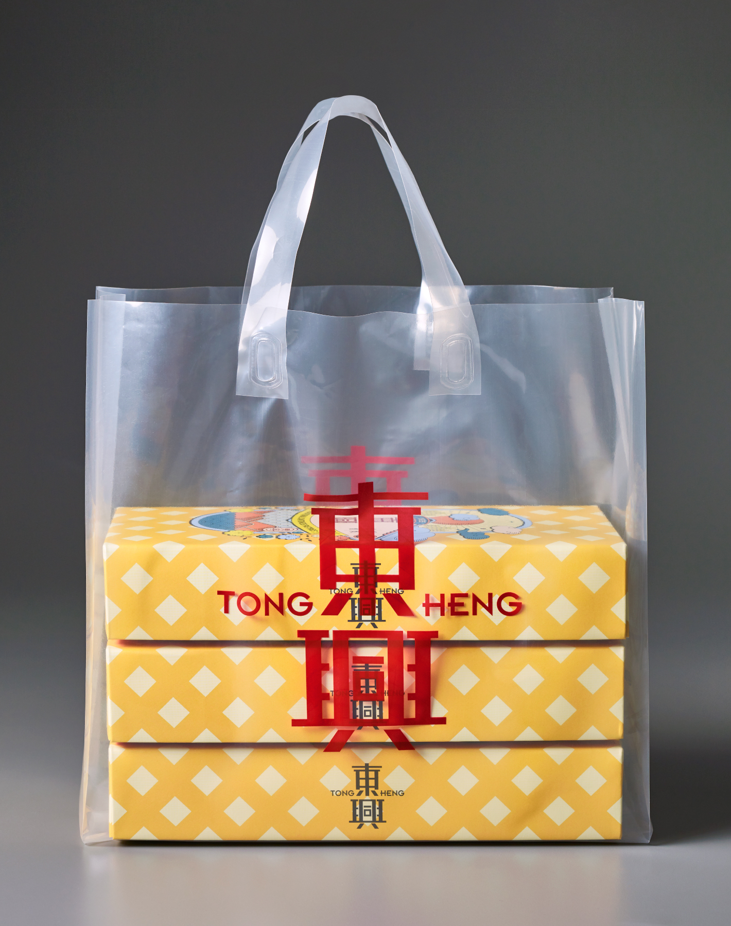
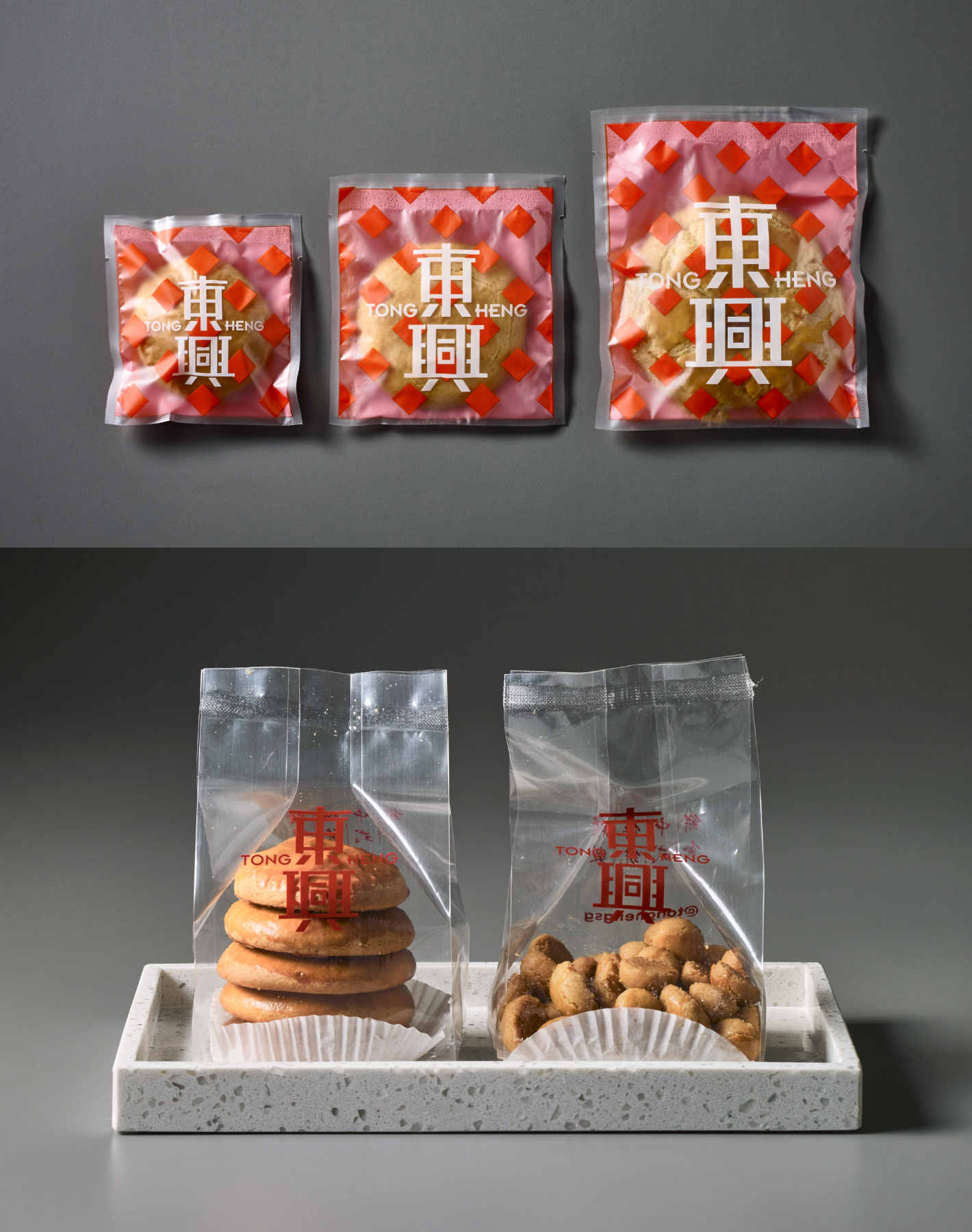
Items include carrier bags, individual sleeves, gusset bags and kaya bottle labels.

Team Uniform
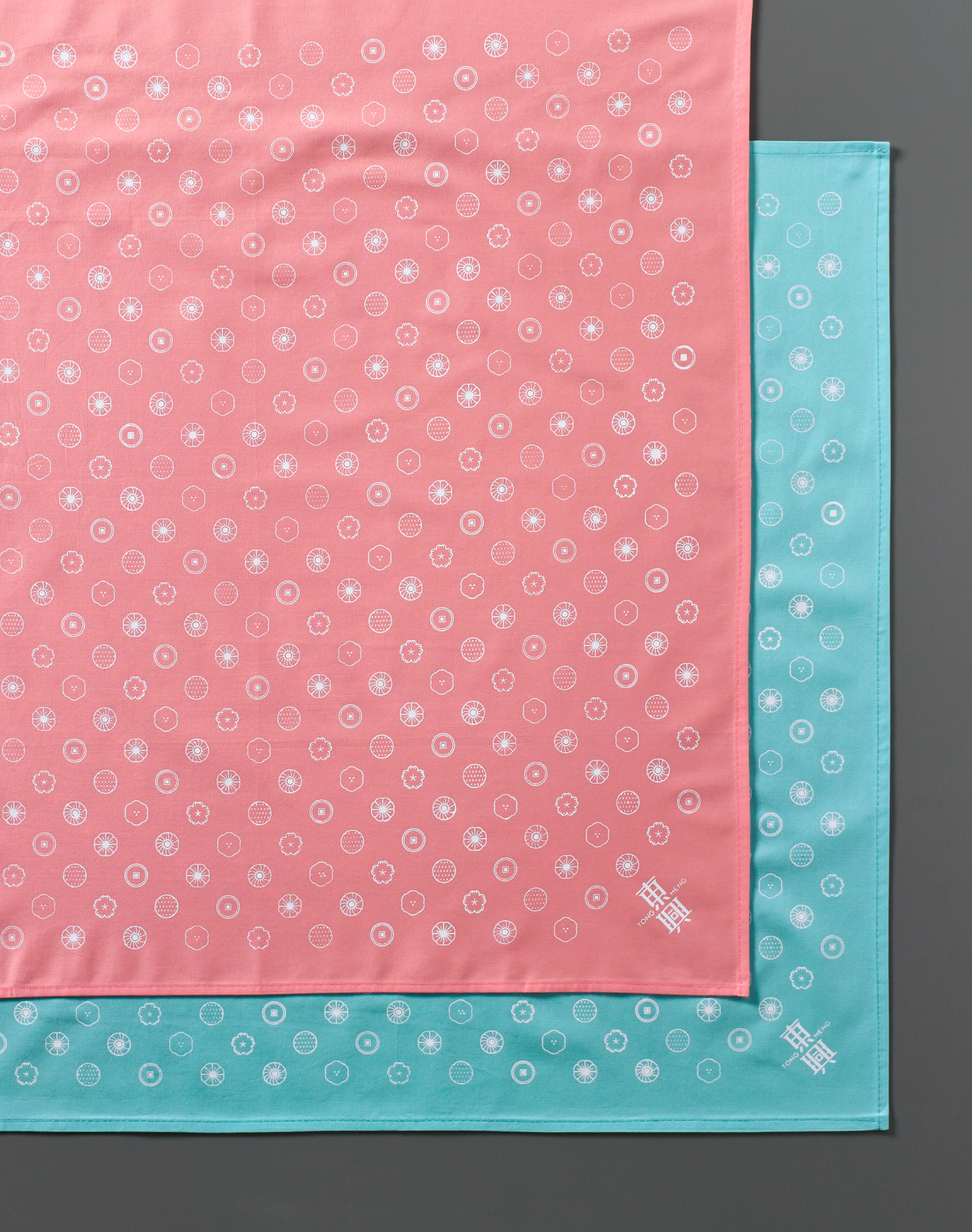
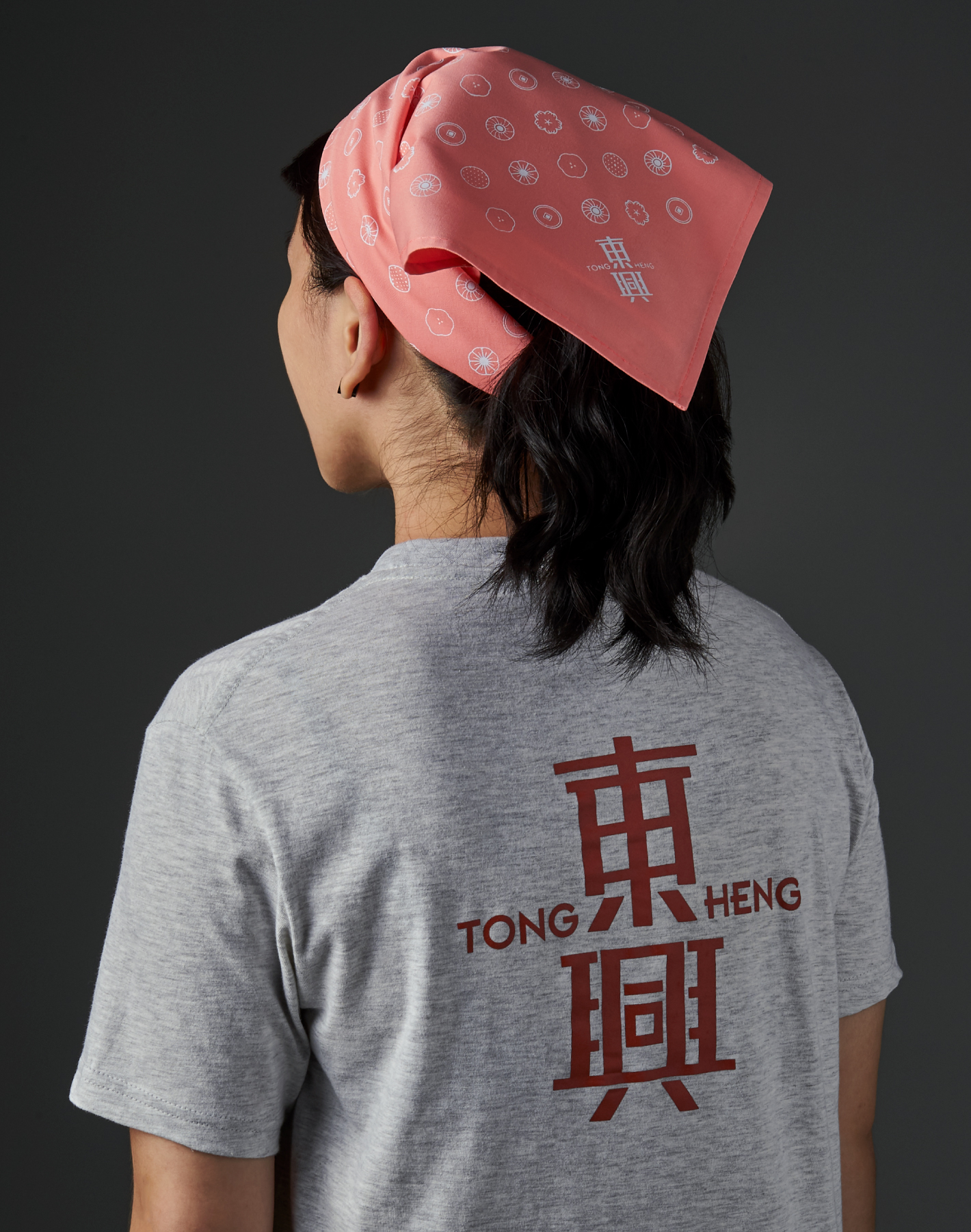
Tong Heng sought to attract not just younger customers but also younger team. &Larry supported this effort with a fresh take on the team's attire. Referencing the popular 'Hello my name is' stickers, employees were encouraged to express themselves through their
personalised name tags and unique ways of wearing the new bandana.
Food Photography
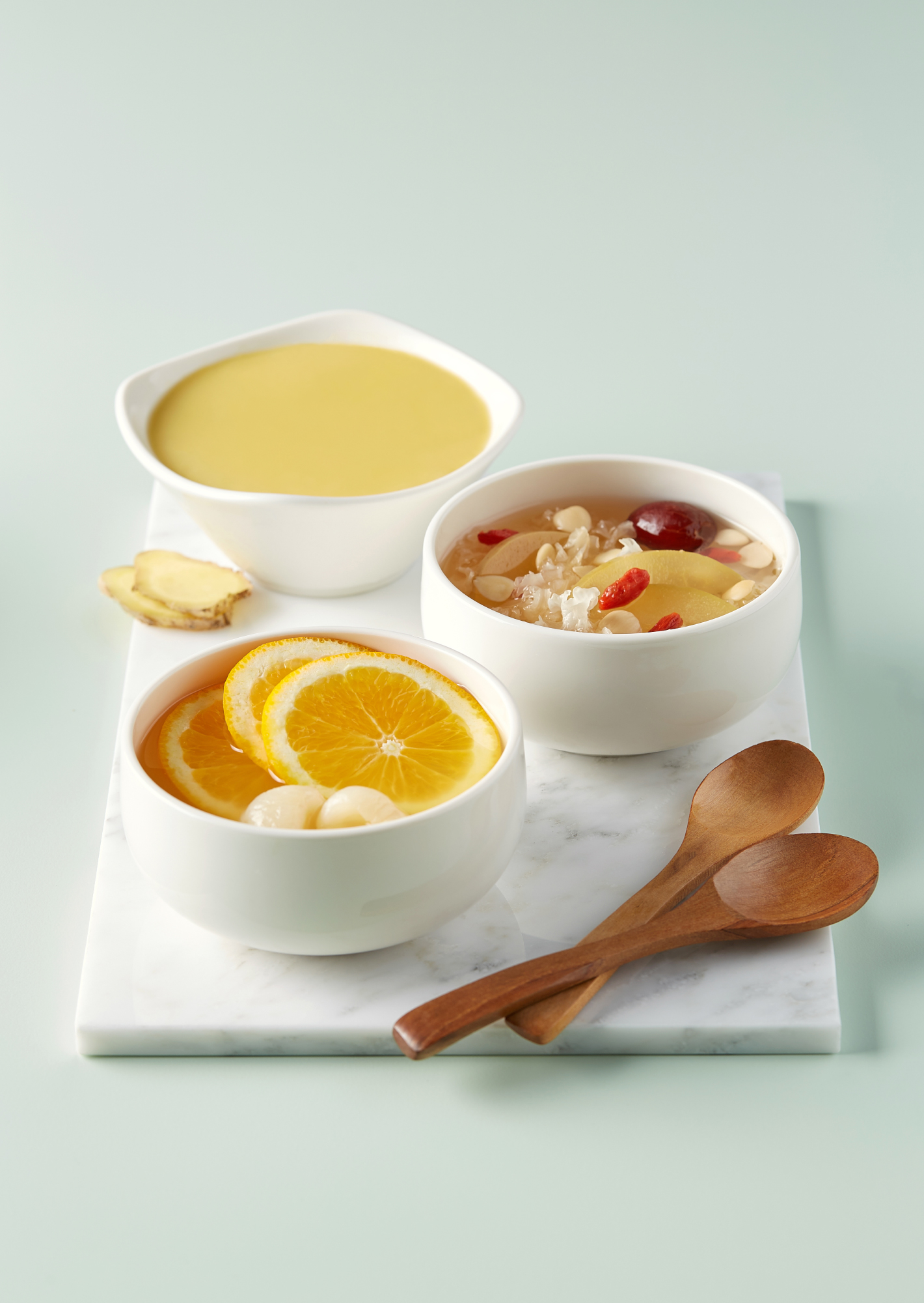
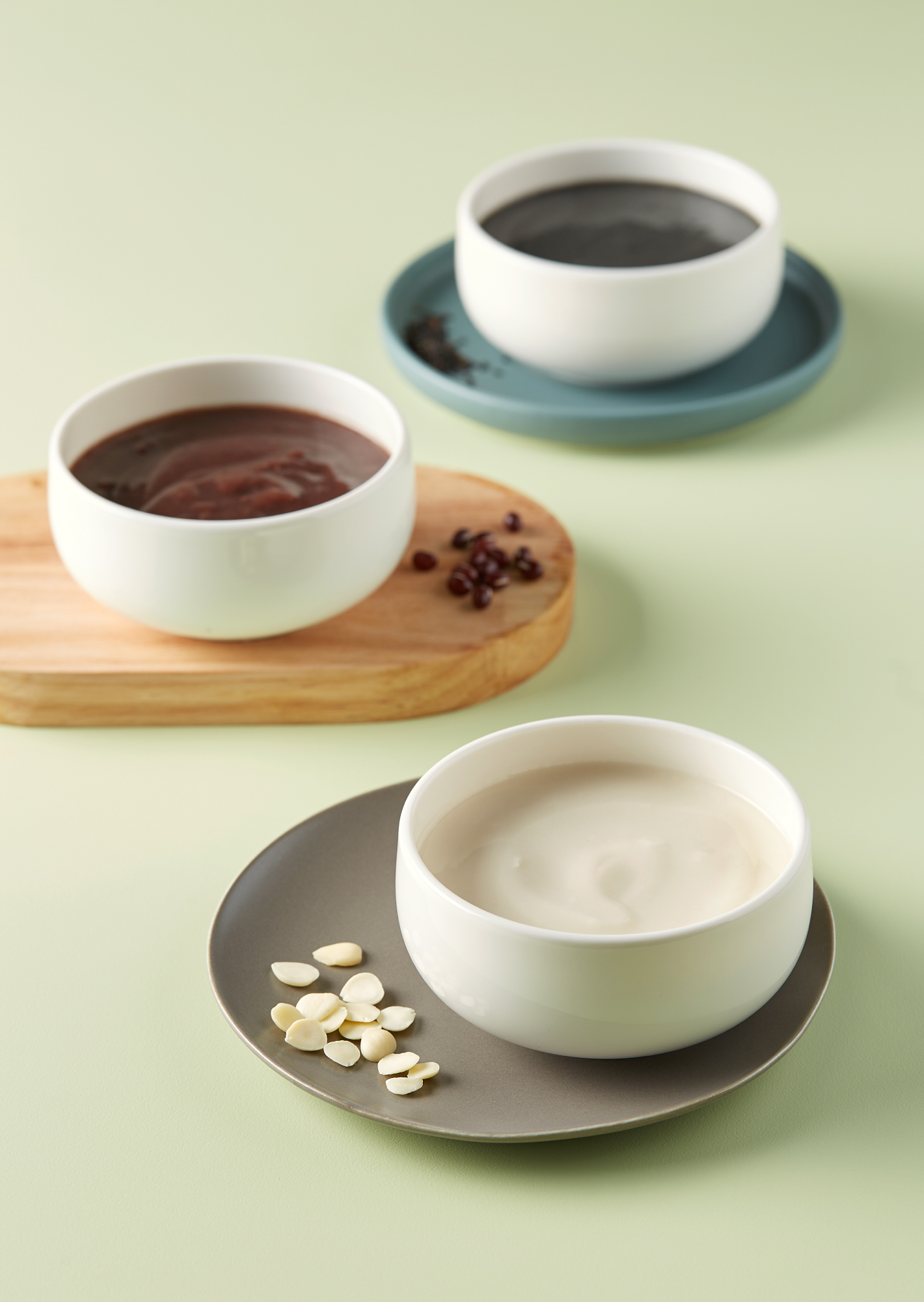
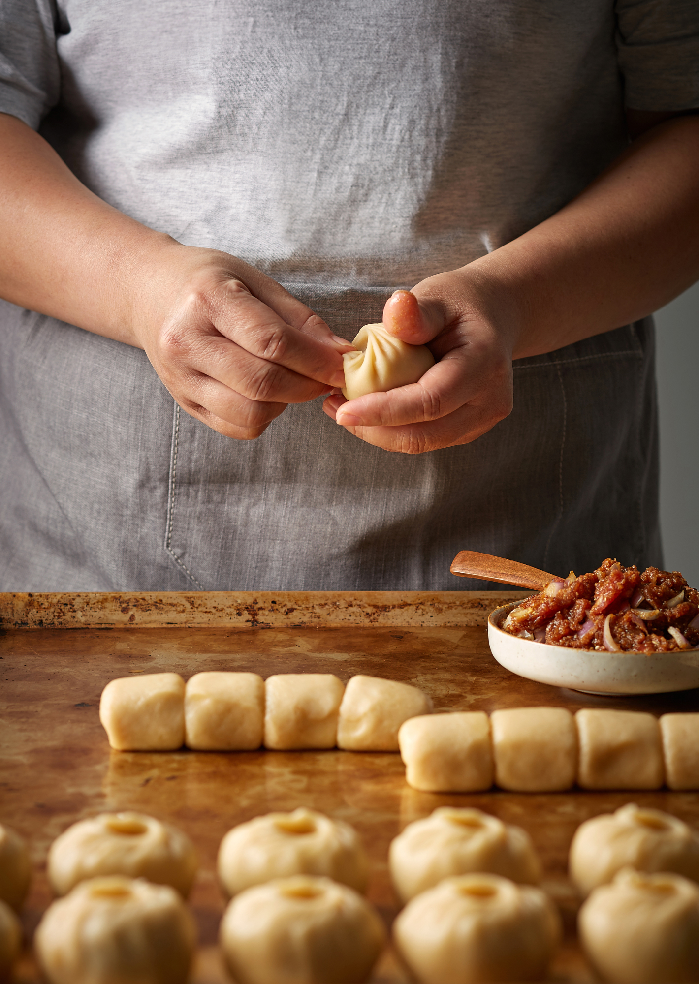
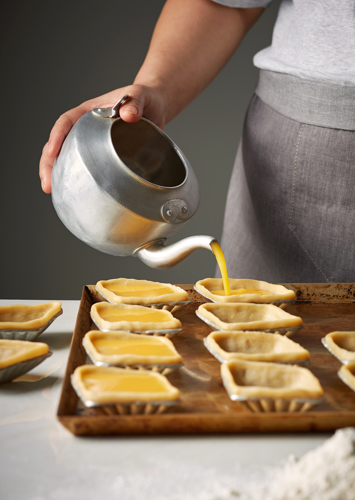
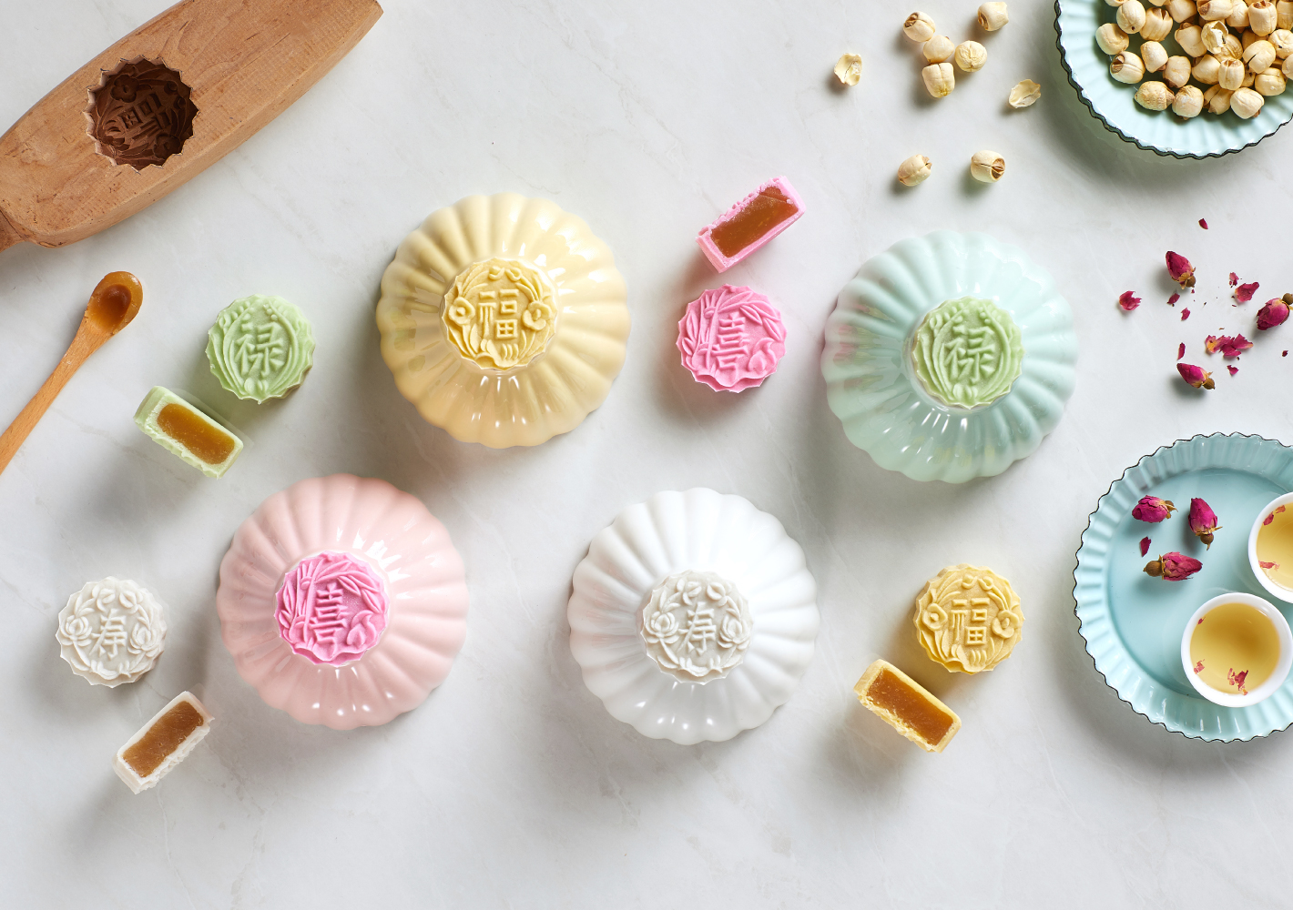
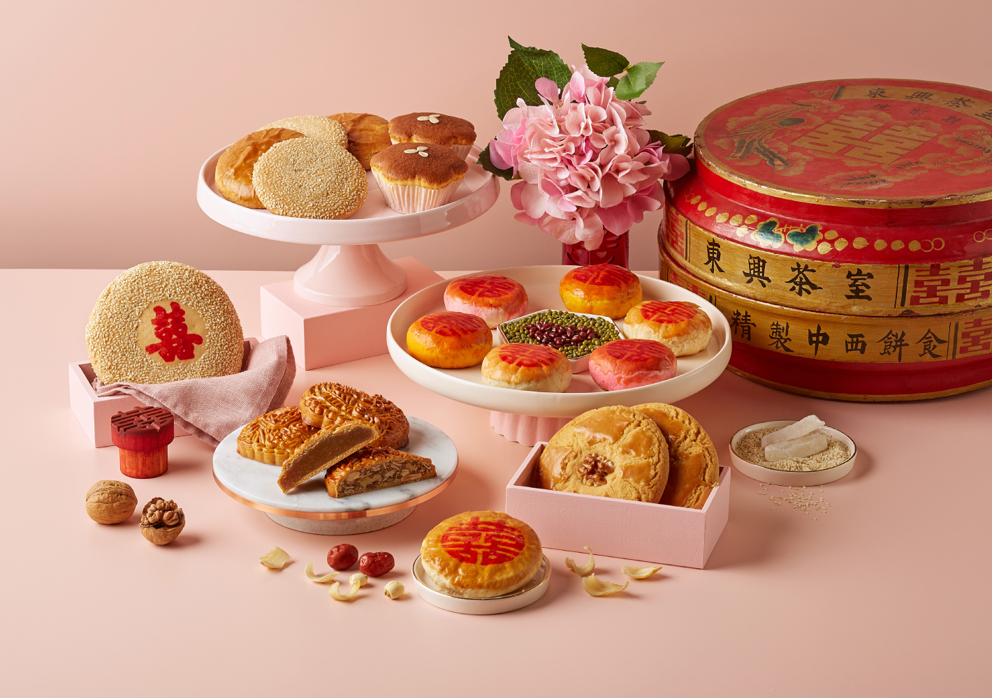
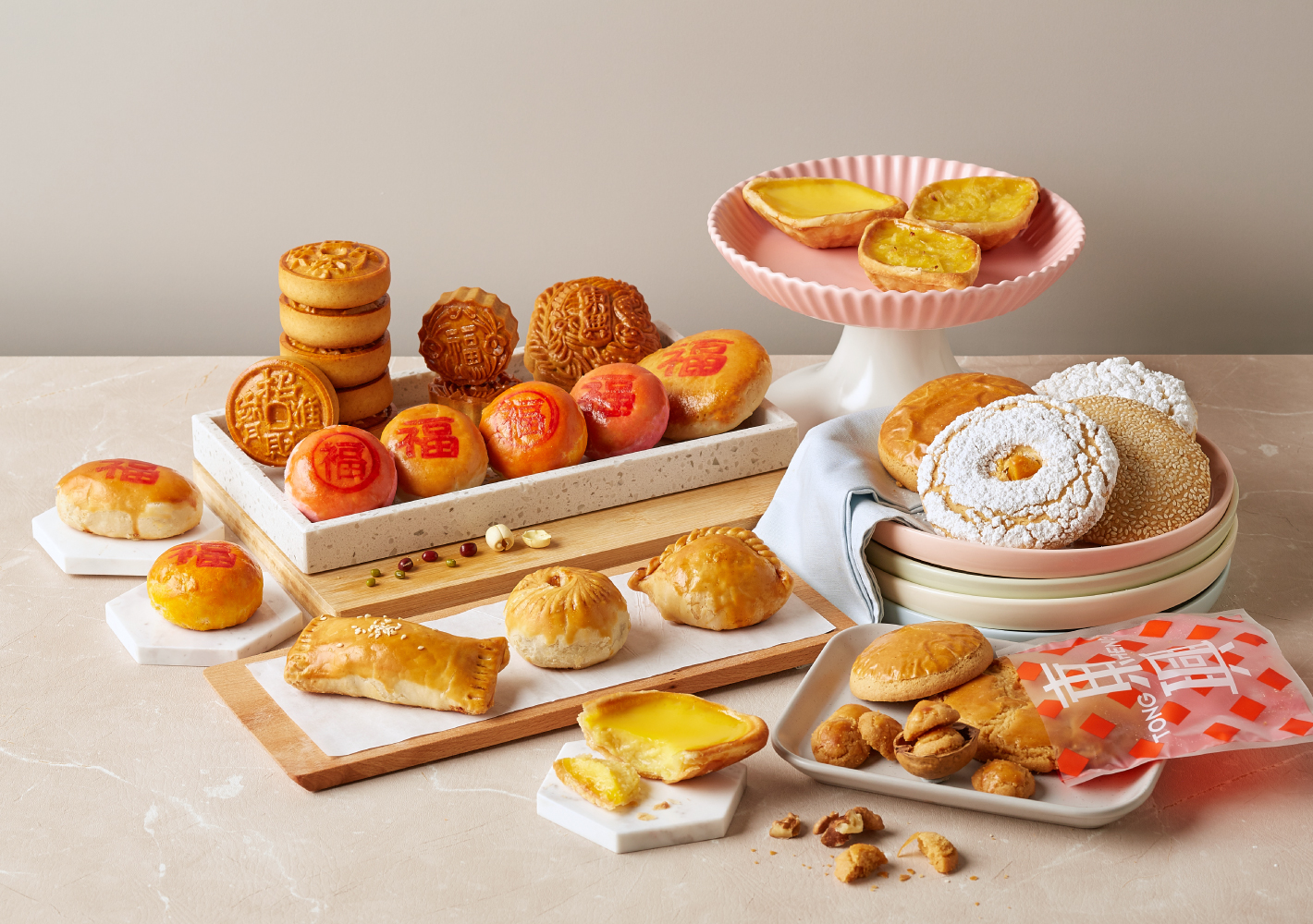
As part of the overall brand language, &Larry art directed the food styling and product photography, emphasising clean, airy visuals with vibrant pops of colour, playing with the natural shapes and geometry of Tong Heng's various pastries. The result is a tasteful presentation tailored for modern sensibilities.
