It takes two hands to clap. If you like what you see and are interested in working together with us, let’s chat.
GET IN TOUCHSWITCH
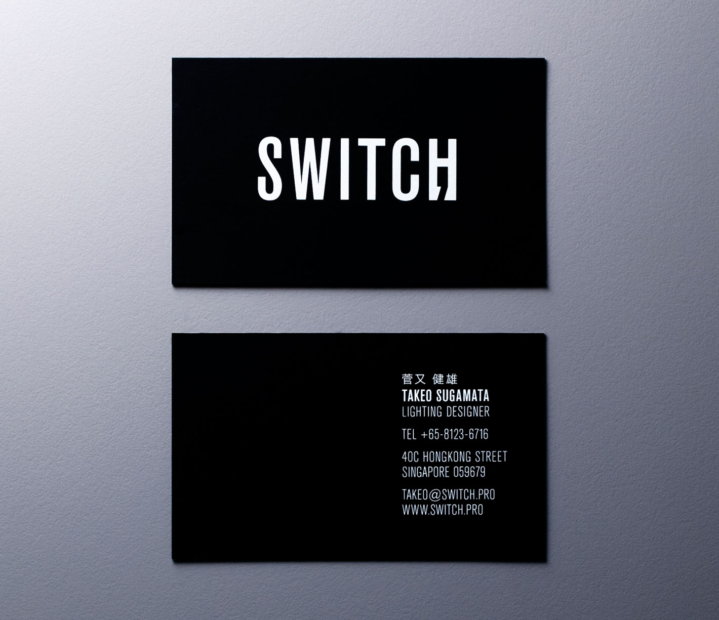
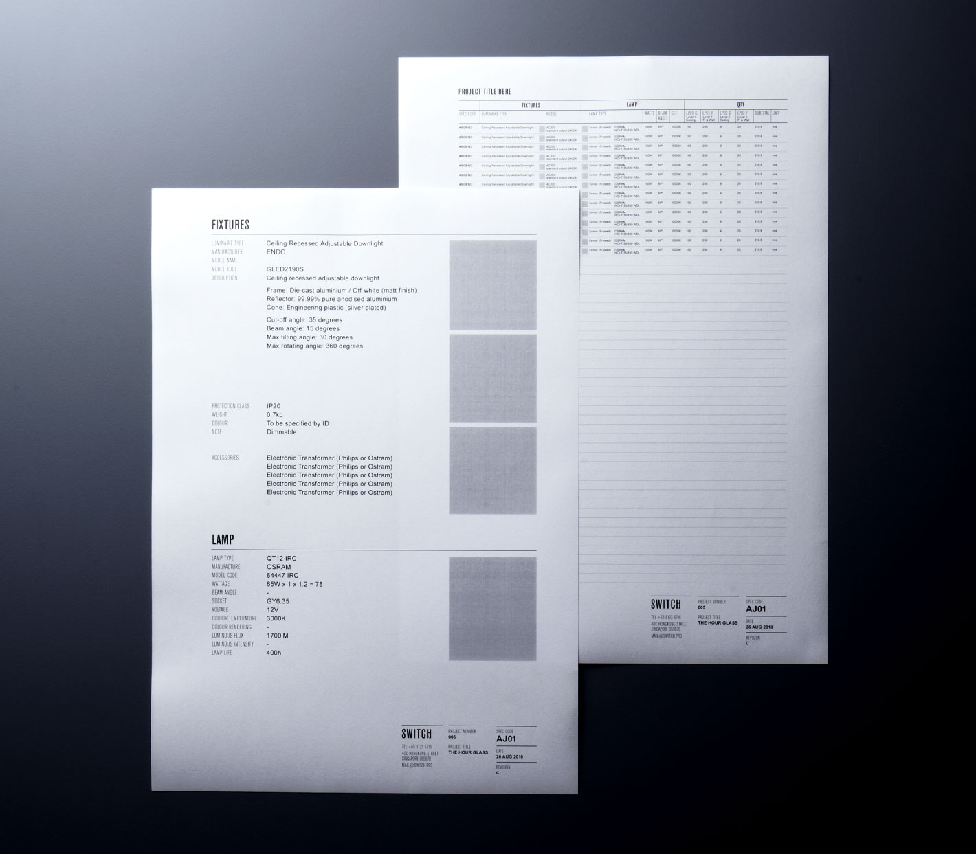
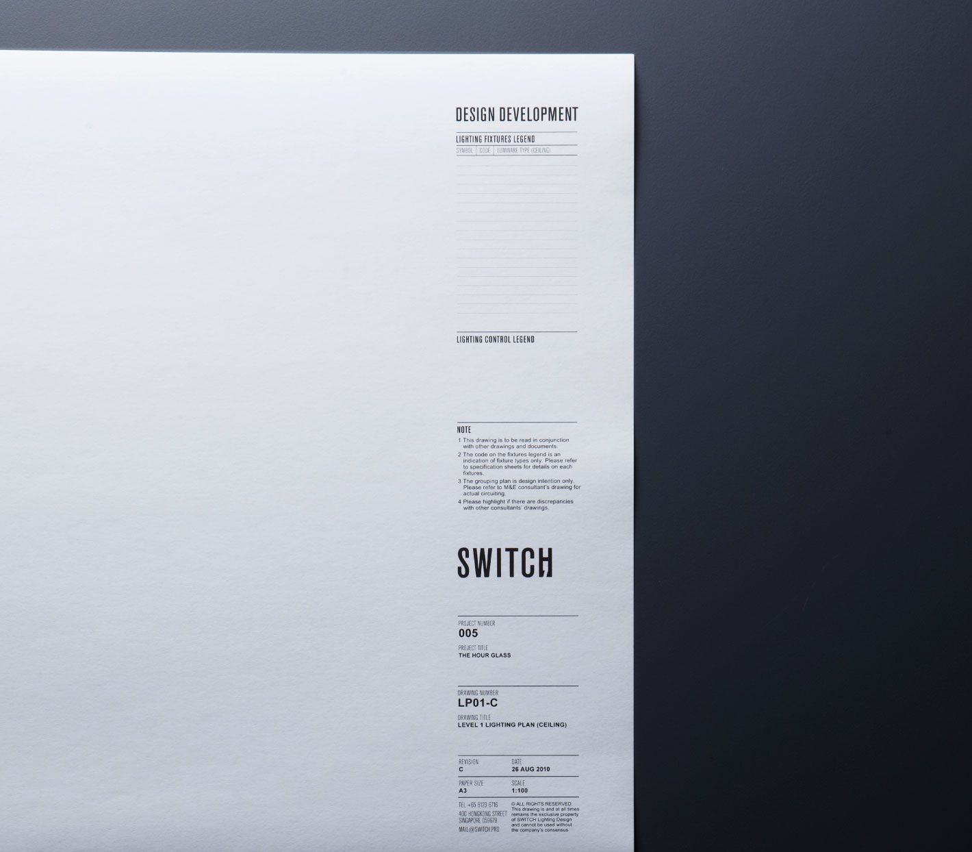
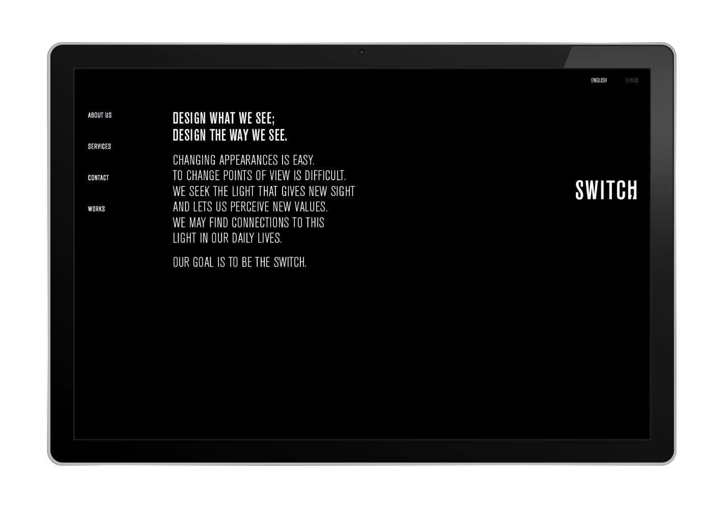
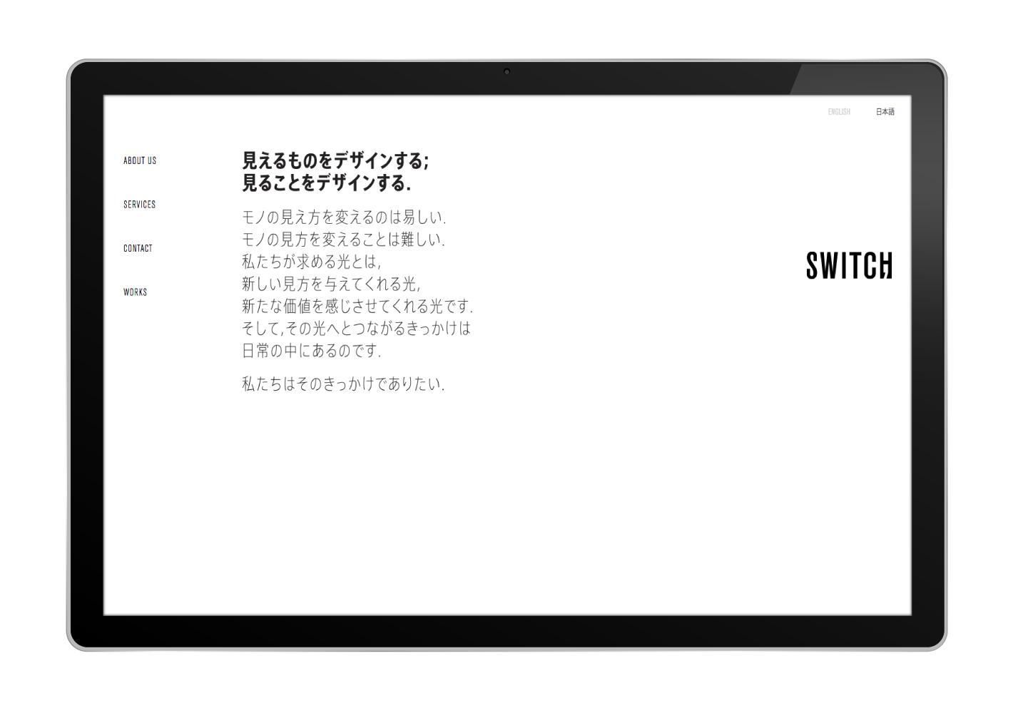
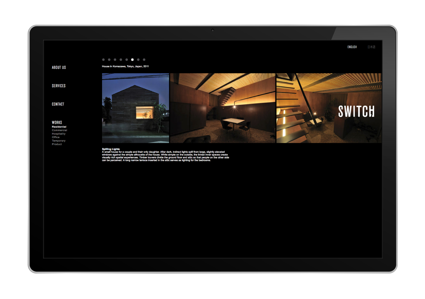
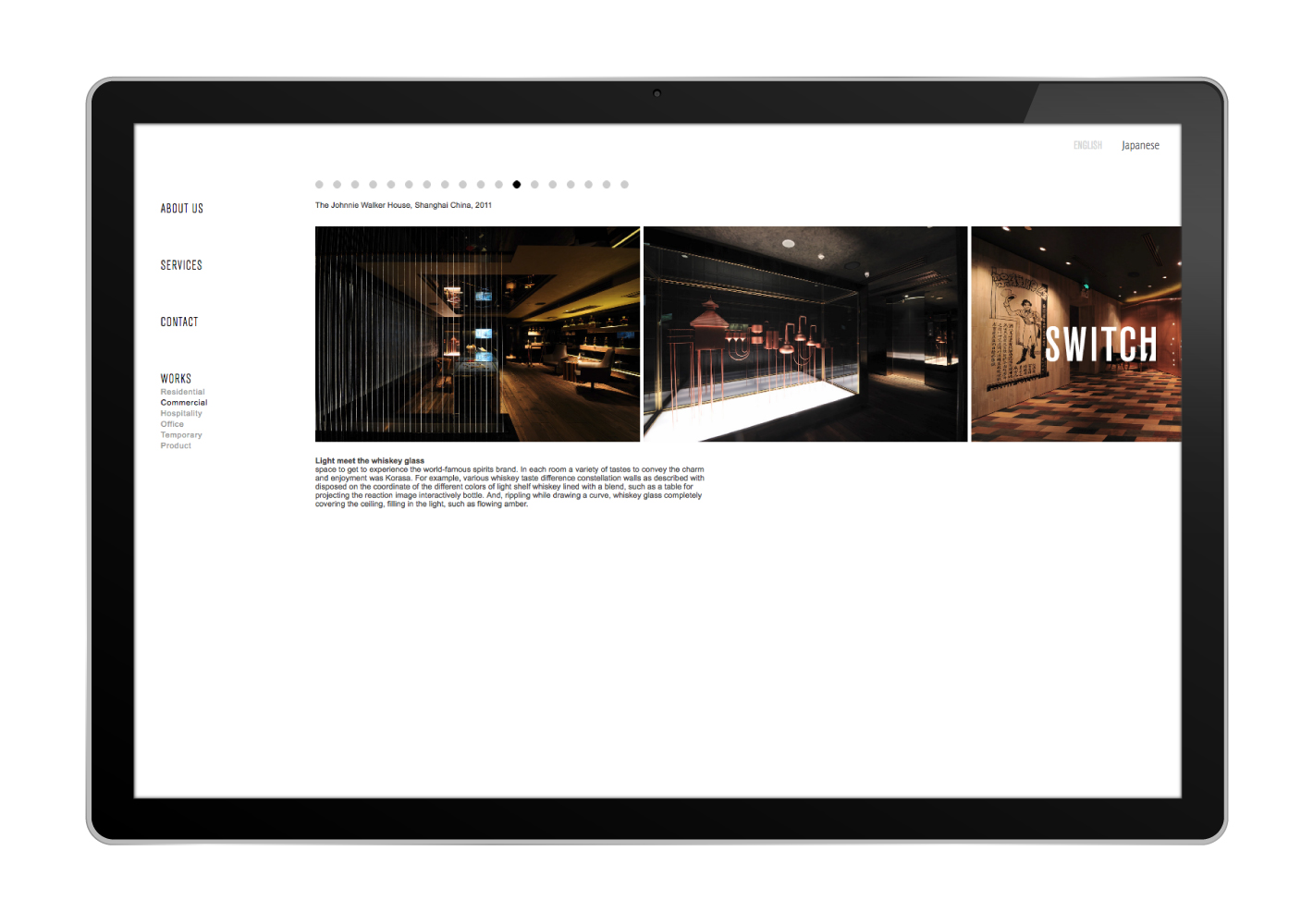
We were asked to create the identity for a lighting design and consultancy firm.
Avoiding overtly mechanical connotations, we focused on the designer’s thinking process. A semi-colon mark is incorporated into the letter “H” to denote a “deliberate pause” in considering all aspects of a project before a solution is proposed.
One can also interpret the lower part of the semi-colon as an actual switch, or as a doorway to possibilities.
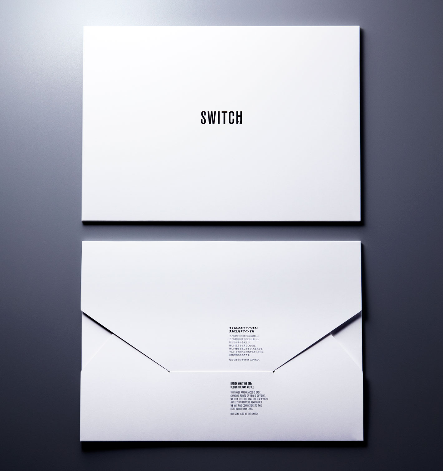
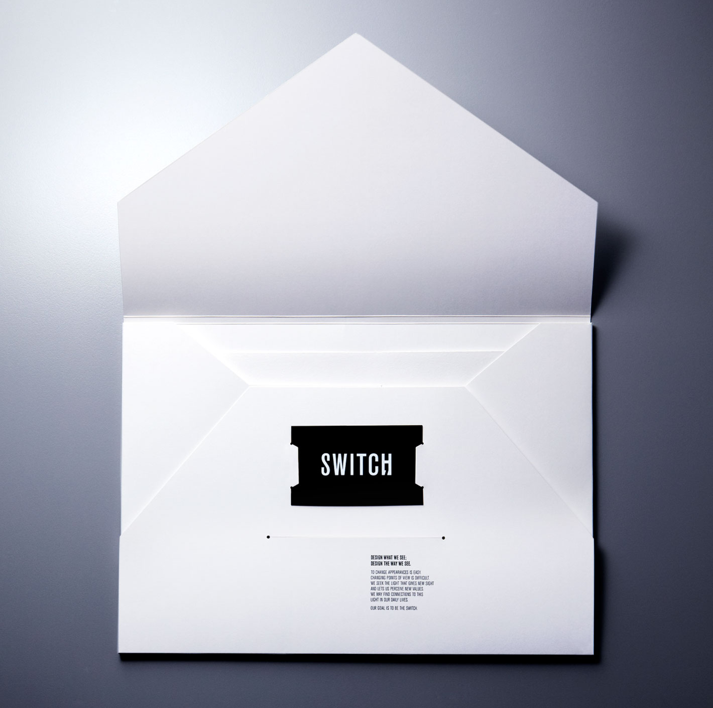
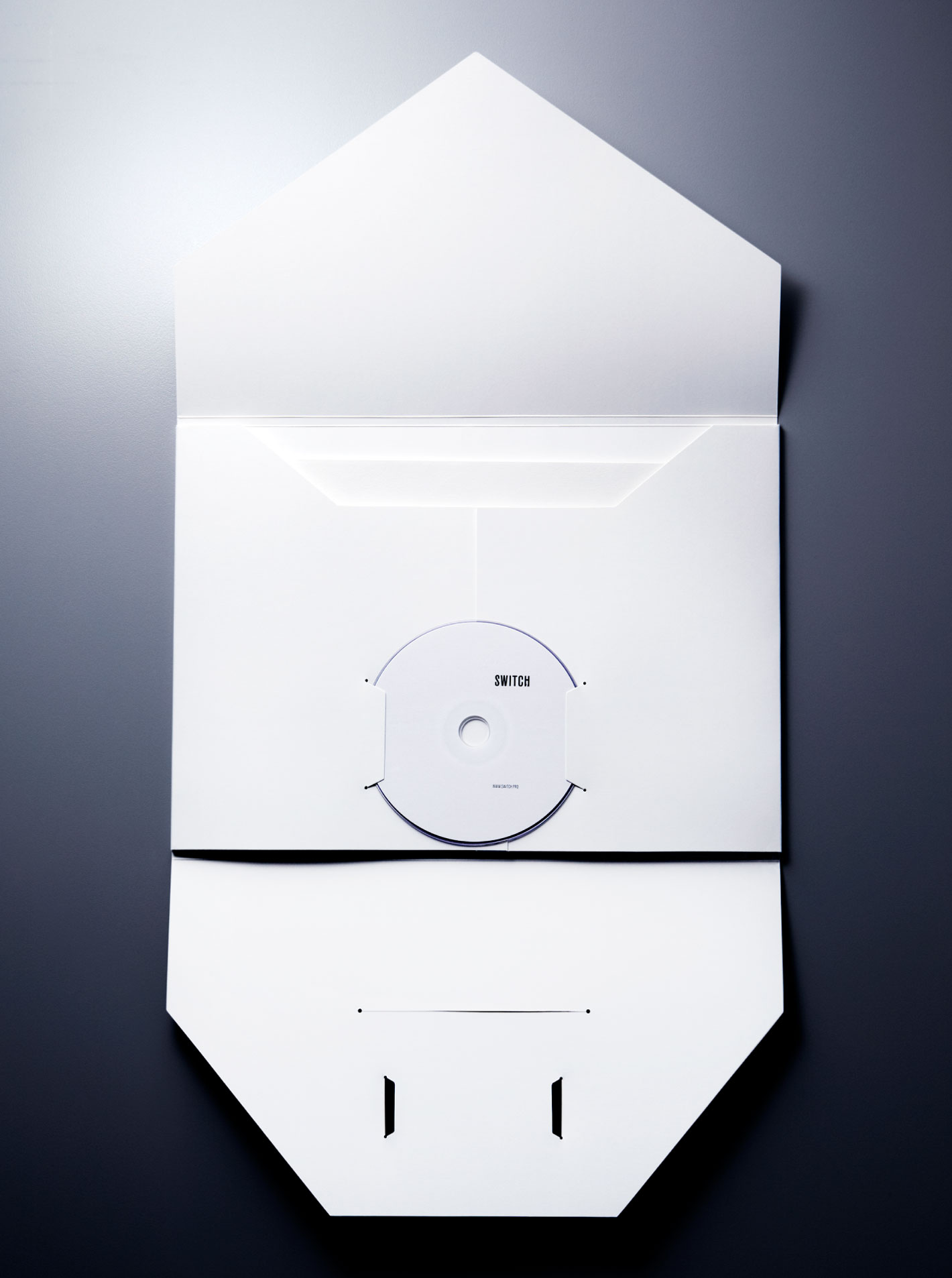
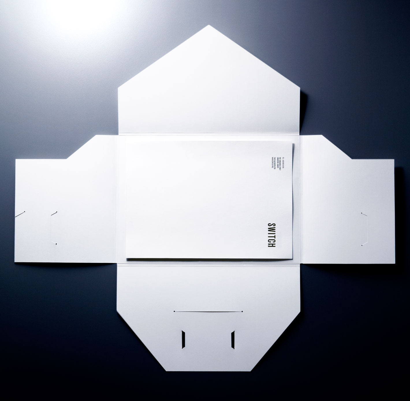
The folder is designed to be self-contained and formed from a single scored sheet of heavy white card. Slots were pre-cut to allow the inclusion of a name card and CD-ROM along with standard documents.

