It takes two hands to clap. If you like what you see and are interested in working together with us, let’s chat.
GET IN TOUCHHOP
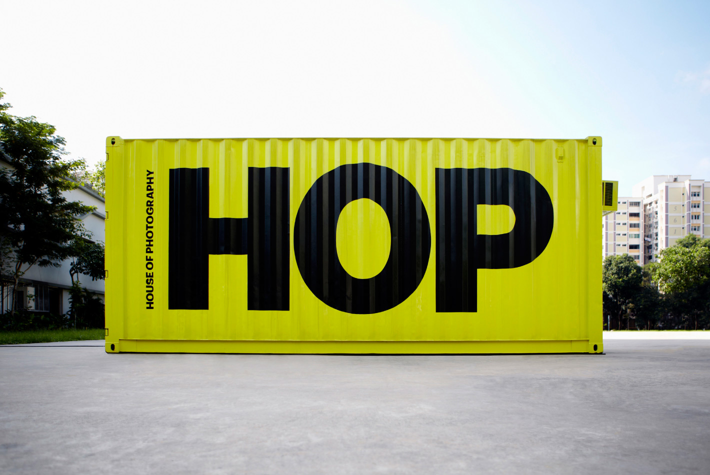
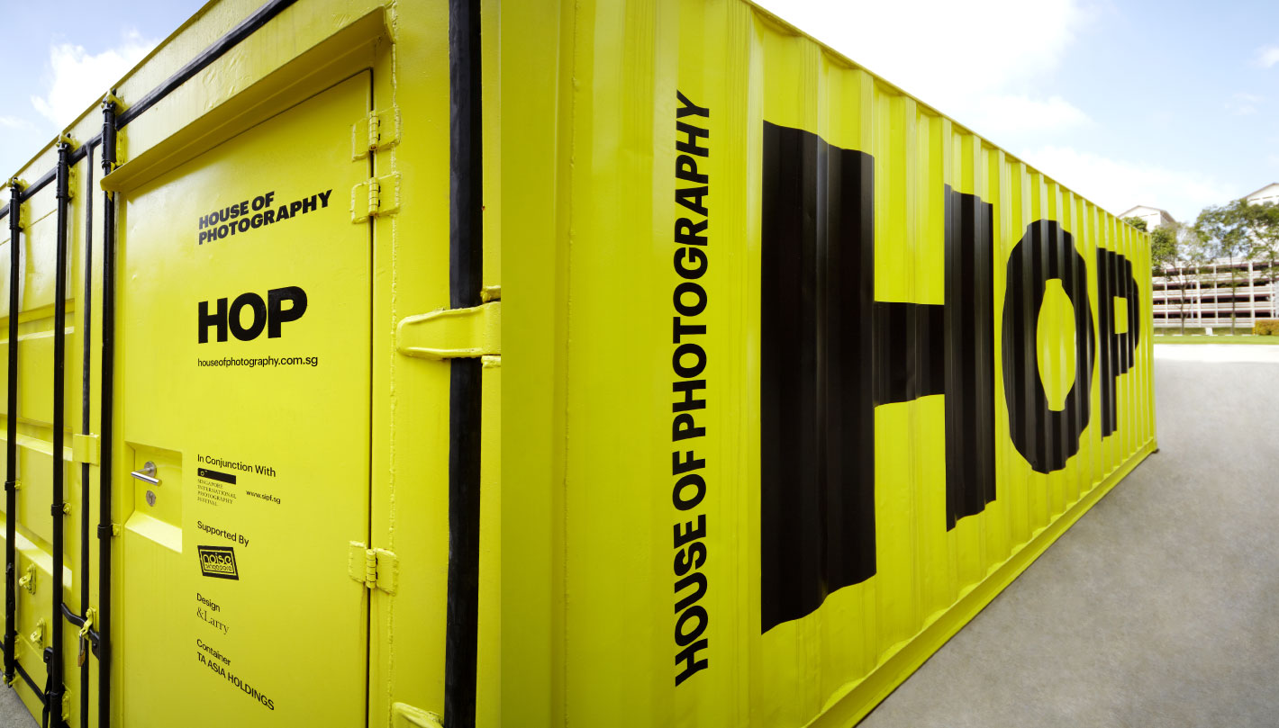
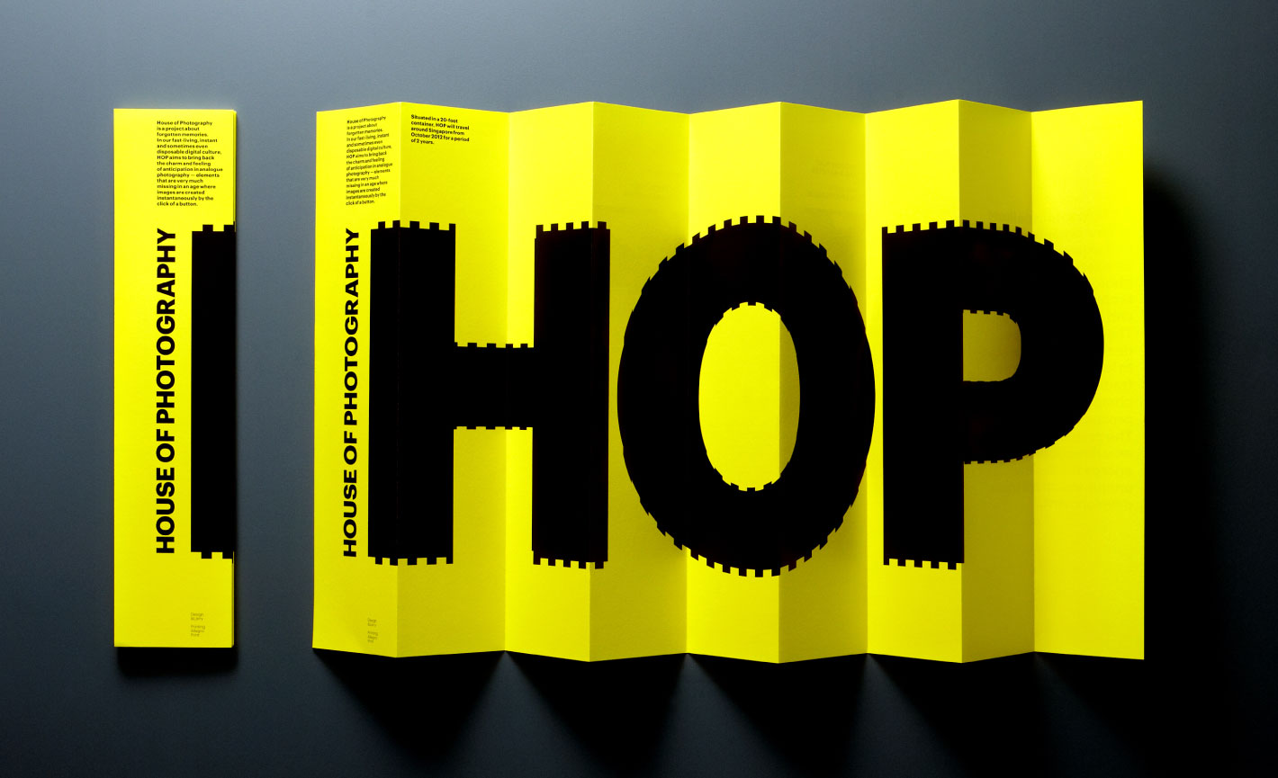
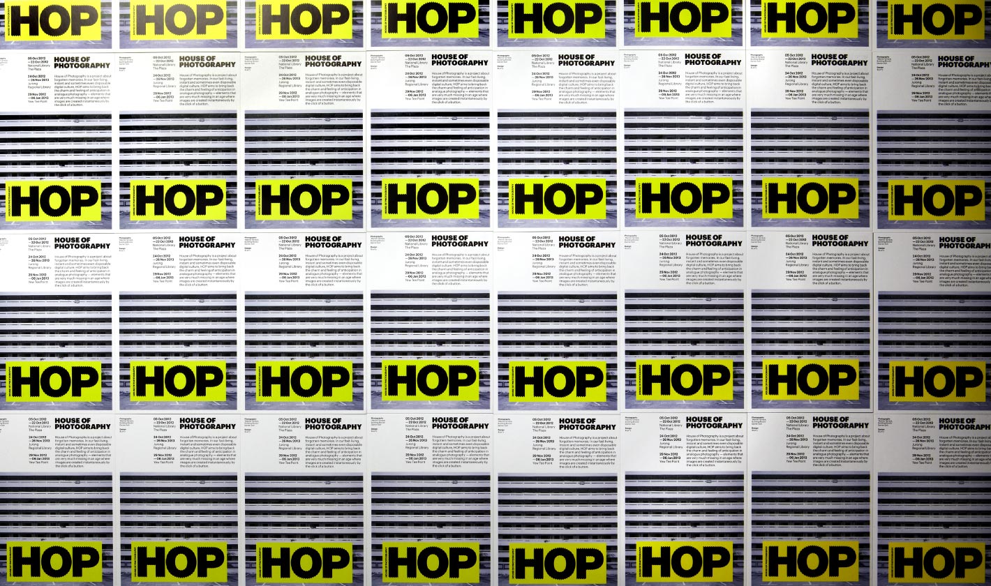
The House Of Photography marque was inspired when the initials “HOP” were painted across the ridges of a shipping container, resulting in the graphically distorted effect. The design is also reminiscent of sprocket holes found on 35mm film rolls, strengthening the graphic association with photography.
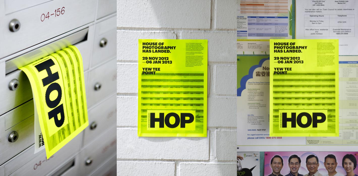
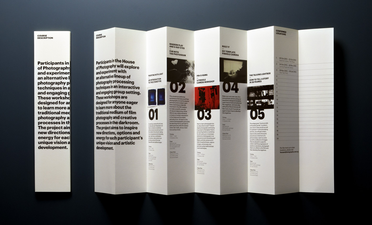
The colour of the HOP container was deliberately chosen to set it apart from other commercial containers and make it stand out in any environment. Drawing on the logo concept, the brochure takes on the form of a container. Flyers and postcards were printed using cost effective methods, enabling high production quantity. All collaterals were distributed in the neighbourhood where the container was next due to pop-up at.
