It takes two hands to clap. If you like what you see and are interested in working together with us, let’s chat.
GET IN TOUCHDECK
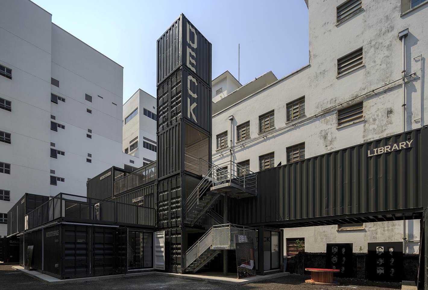
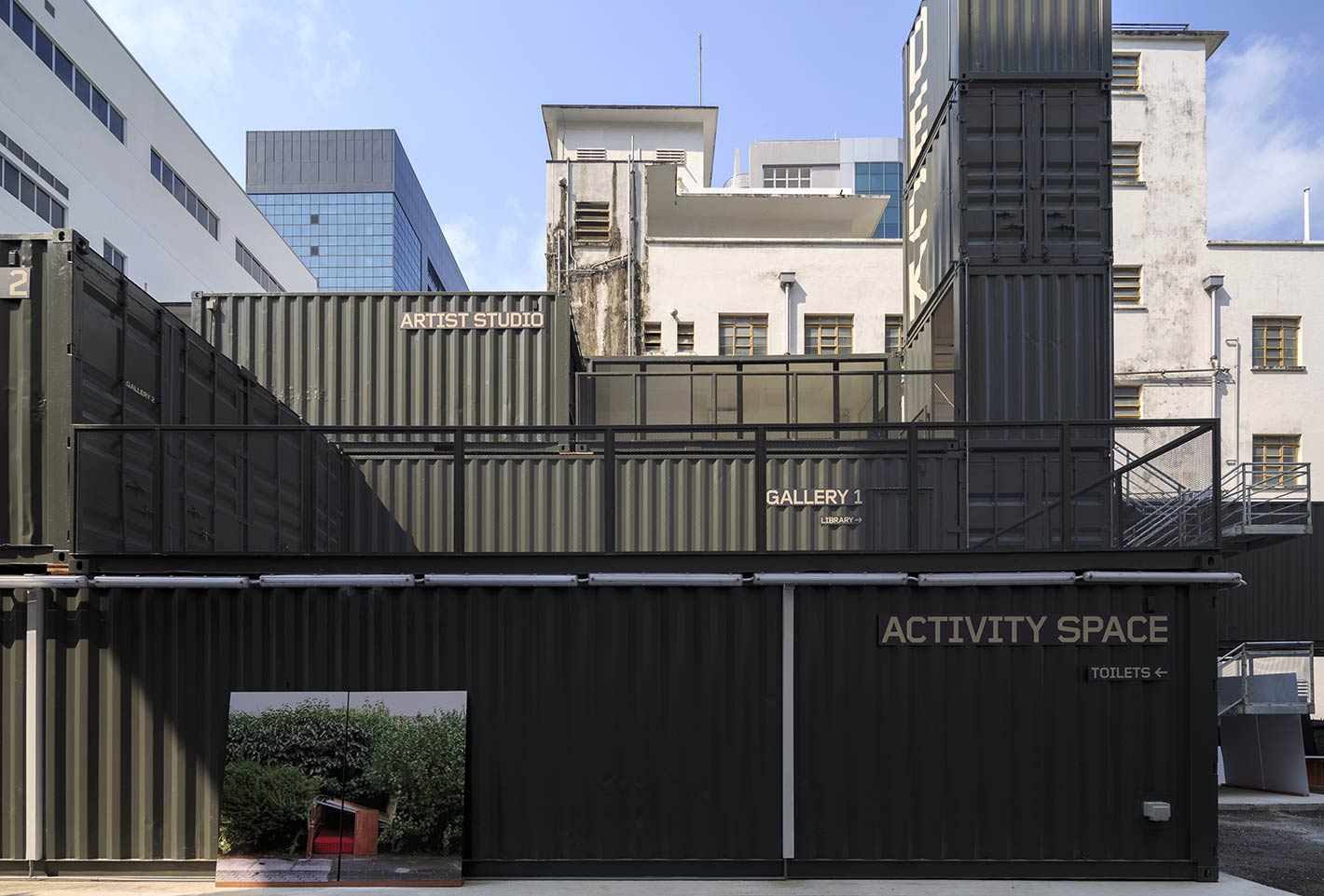
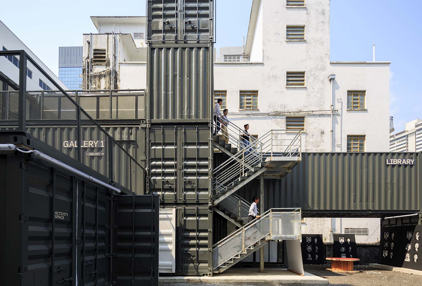
We were commissioned by DECK, an independent, non-commercial art space, to create its branding, design and wayfinding for its launch in October 2014. The nautical overtones in DECK’s name was considered – it is housed within 19 refurbished shipping containers (architecture work done by LAUD Architects). The name also signifies the open, multi-tiered platform that the space offers for people and communities to celebrate art and photography in Singapore.
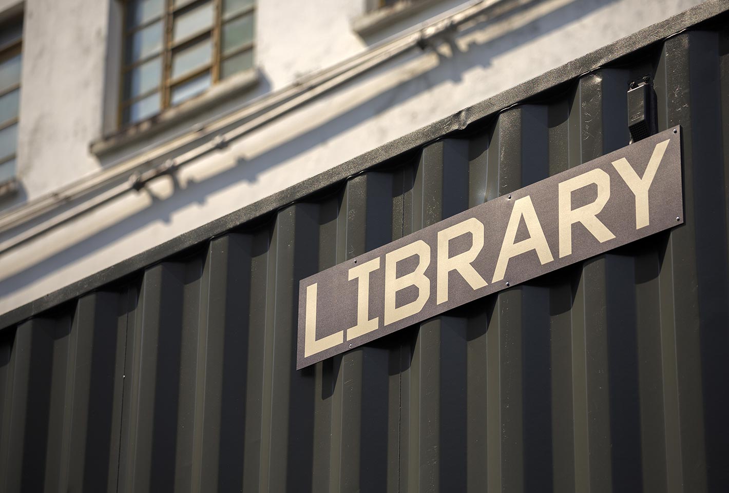
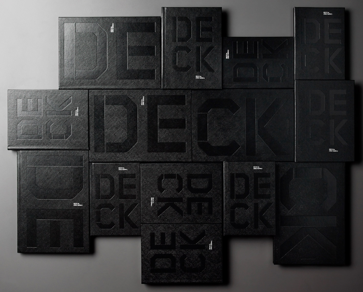
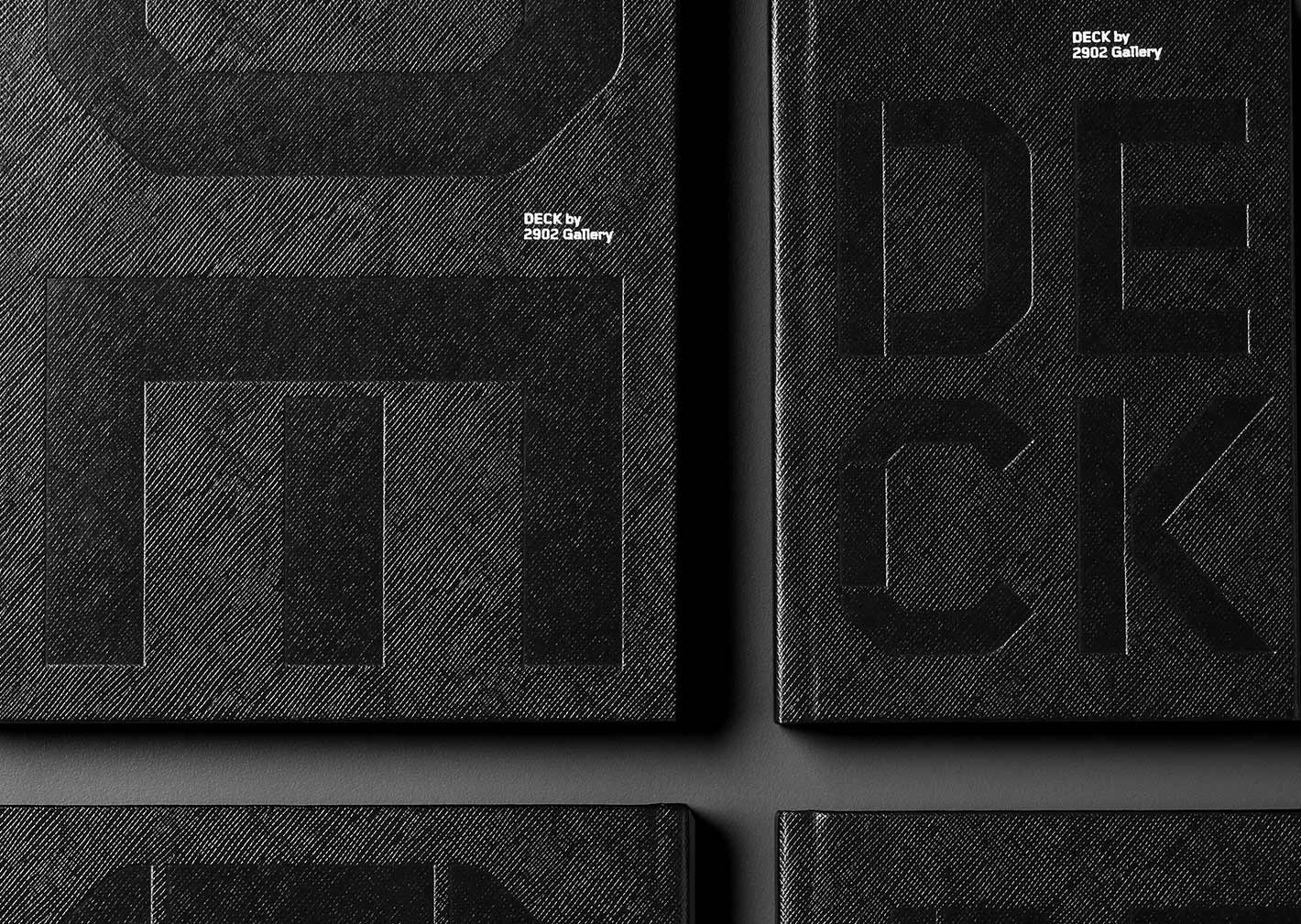
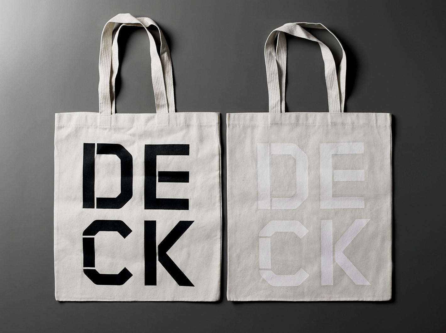
For the brandmark, we made modifications to Foundry Gridnik, a typeface originally designed by Wim Crouwel for the Dutch PPT and Olivetti Typewriter. Charmed by the typeface’s history and its association with community, communication and public service, we tweaked it to incorporate the shapes of the re-purposed containers that make up the art space.
The logo also shows off the modular nature of containers, with different iterations allowed for use across containers, posters, tote bags, notebooks, and other assets.
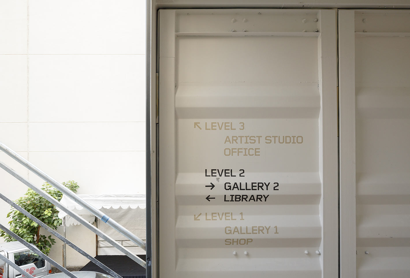
The wayfinding system and signage also incorporate a graphic language to embrace the raw and industrial aesthetic of the space.

