It takes two hands to clap. If you like what you see and are interested in working together with us, let’s chat.
GET IN TOUCHA. Lange & Söhne – The No. 25
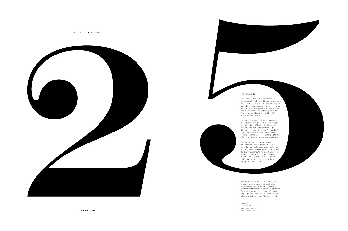
We were approached by 品 PIN Prestige magazine as one of four artists to contribute a double-page spread artwork for its August 2016 issue. As a presentation of one’s favourite watch, &Larry’s contribution was centred on A. Lange & Söhne – more specfically, the significance of the number 25 for the watchmaker and Larry.
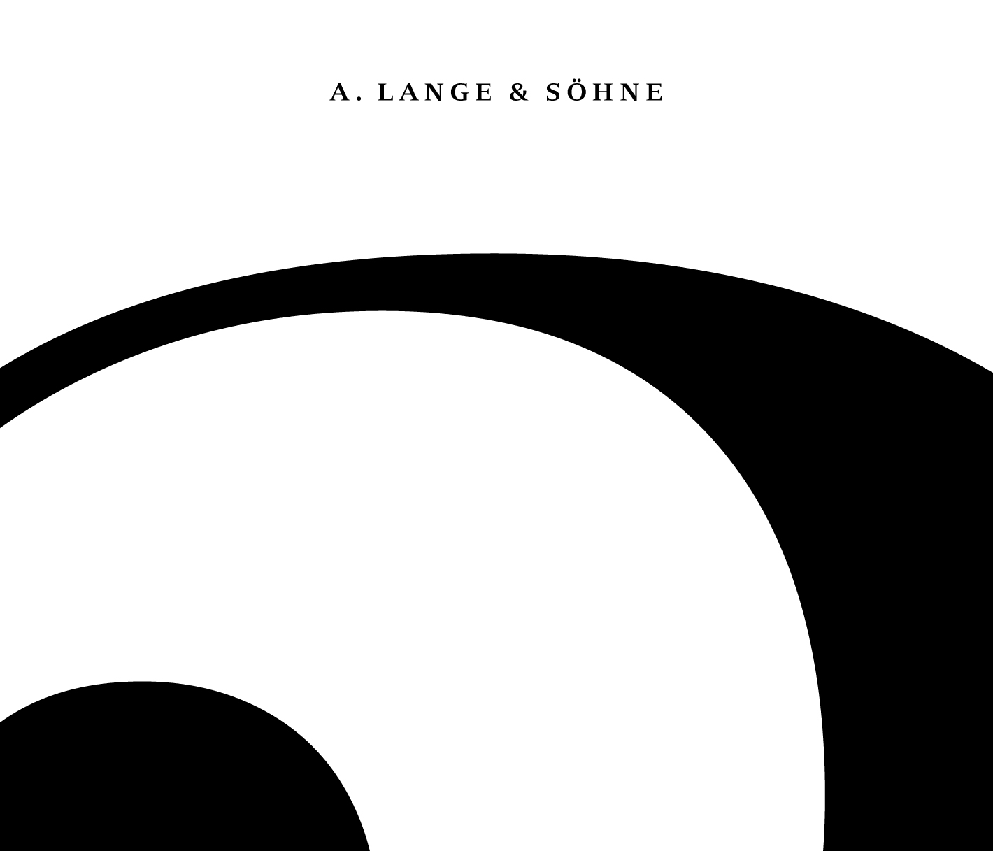
Inspired by Lange’s outsize date, our response was a re-appropriation of the iconic window within the printed form of a magazine.

Artist’s statement:
I was born on the 25th of the month. Coincidentally, both my children were also born on the 25th day of their birth months. Despite a number of coincidences in my life involving the number 25, the most memorable of them was when I was conferred Designer of the Year on my birthday at the President’s Design Award Singapore 2014.
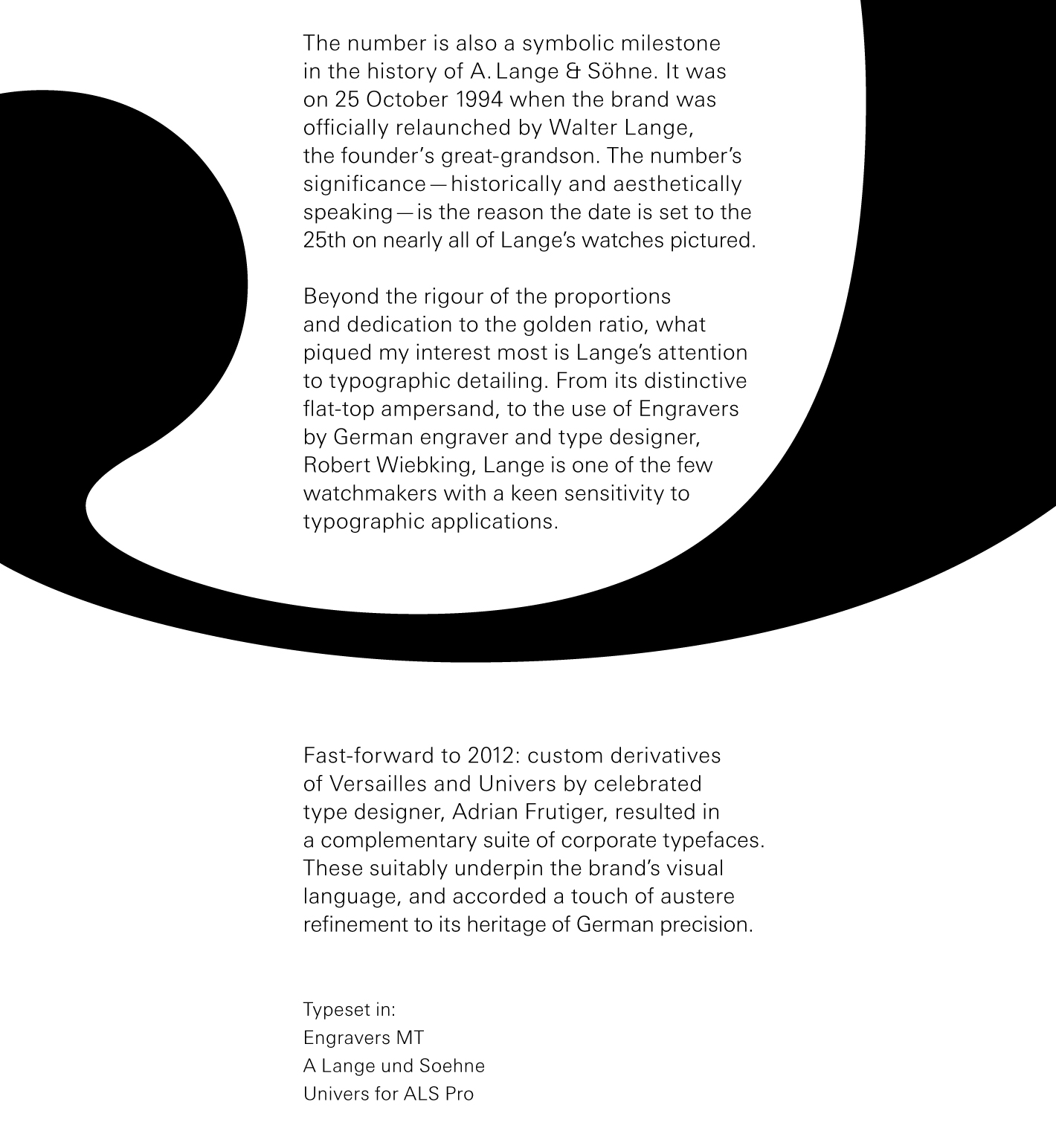
The number is also a symbolic milestone in the history of A. Lange & Söhne. It was on 25 October 1994 when the brand was officially relaunched by Walter Lange, the founder’s great-grandson. The number’s significance—historically and aesthetically speaking—is the reason the date is set to the 25th on nearly all of Lange’s watches pictured.
Beyond the rigour of the proportions and dedication to the golden ratio, what piqued my interest most is Lange’s attention to typographic detailing. From its distinctive flat-top ampersand, to the use of Engravers by German engraver and type designer, Robert Wiebking, Lange is one of the few watchmakers with a keen sensitivity to typographic applications.
Fast-forward to 2012: custom derivatives of Versailles and Univers by celebrated type designer, Adrian Frutiger, resulted in a complementary suite of corporate typefaces. These suitably underpin the brand’s visual language, and accorded a touch of austere refinement to its heritage of German precision.
Typeset in
Engravers MT
A Lange und Soehne
Univers for ALS Pro


